It's a question every front-end developer has asked themselves at one point or another. With the ever-growing number of people using mobile over desktop to access the web, should I be creating my next website mobile first?
I get it, its hard to decide right? Mobile first can make it difficult to think big when it comes to desktop, but do things in reverse and the mobile experience ends up feeling less cared for. Before you decide one way or the other, I’ve pulled together some of the main points to consider before making a decision:
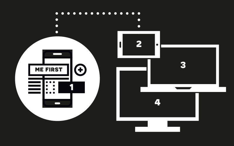
USER EXPERIENCE
Ultimately, a good user experience should be the main aim when creating a website, so think to yourself: is the end user more likely to be viewing this website on mobile or desktop? Is there any analytical data from the previous website that shows that this is the case? These are the sort of things that can help you decide the way a website should be built.
BIGGER PICTURE
As I mentioned earlier, mobile first can make it difficult for you to imagine all the possibilities that a website may have. Having a bigger canvas to work with can make it a lot easier to envision what might be possible, whereas using a minimal subset can make you miss some promising ideas. Some people believe in creating a full-sized sketch version first - at least when designing mobile first - to explore all potential ideas on a wider space, making you consider all the possibilities when compacting to the smaller size of mobile.
MOBILE FIRST INDEXING
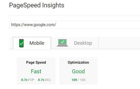
Ok, this one’s a biggie. Google’s mobile first indexing was released in March this year, changing the way Google views websites for crawling, indexing and ranking. This means that websites indexed by Google are first looked at for the mobile version, then the desktop, where previously this was vice versa. Google states this will be to “better help our primarily mobile users”. So, if you want to stay in Google’s good books the mobile version of your website needs to be up to scratch or you’ll start tumbling down the search rankings.
DESIGN & DEVELOPMENT
Mobile or desktop first isn’t a decision limited to the design stage, as development can also be done either way. After a website is designed, implementing mobile or desktop first during the development stage can be completely independent from this. Developing mobile first will allow you to consider all the elements that will exist at mobile, with media queries and the display of elements that will appear on desktop coming later, or vice versa.
BOOTSTRAP FRAMEWORK
As development is just as important as design with mobile first, it is important to note that the Bootstrap framework is mobile first, with its grid system that requires sites made for smaller screens first. As the most popular front-end framework for developing responsive projects on the web, this says quite a lot about opting for mobile first. Basically, if you’re using bootstrap to develop your website – and there’s a good chance you will be – then you are going to be developing mobile first whether you want to or not.
So, while we aren’t saying it’s time to throw desktop-first out of the window, you have to know which way the wind is blowing. Speaking as an apprentice developer, if you want to keep pace with technological advancements (not to mention your competition) the capacity to design and build mobile first is a no-brainer.
Posted 13 January 2018 by