
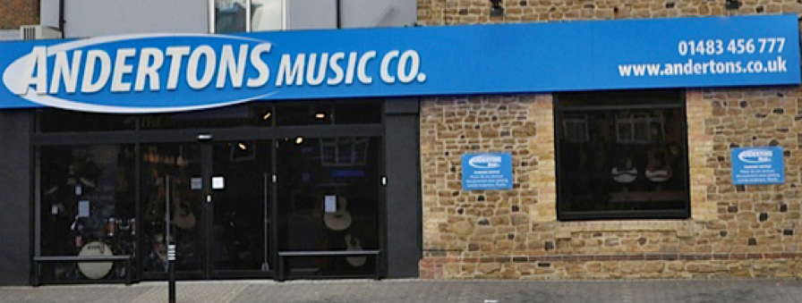
If you’re local to the Guildford area, you may know Andertons as an unassuming shop in the no-mans land between the town centre and the superstore-dominated outskirts. Taking in at a glance the shopfront’s aggressive blue colour scheme and Microsoft Office 2007 aesthetic, you’d be forgiven for thinking that this is where you’d go to have your ailing PC looked at. But register the subtitle “Music Co.”, along with the plethora of beautiful guitars and other instruments on display, and you’ll start to get a picture of what this place is about. Clearly, it’s a music store. It’s obvious what they do: they sell instruments.
Close – but no cigar, as it turns out.
DISCOVERING ANDERTONS
To state the facts, Andertons are a leading supplier of contemporary musical instruments boasting a physical store in Guildford, an online store with global reach, and Andertons TV – a successful music YouTube channel with nearly 300,000 subscribers. They’re a lot bigger than their image suggests.
What we didn’t realise when we took on the project was Andertons’ amazing history, the depth of loyalty they inspire in their customers, and the journey of brand rediscovery we were about to embark upon.
We started by conducting both quantitative and qualitative research which revealed a large disparity between the performance of the business and the image of the brand.
It turned out that Andertons was much loved by a hugely enthusiastic fan base. However, their uninspiring blue colour scheme, logo, uniform and website were un-loved by both staff and customers.
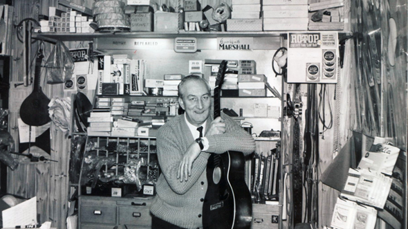
It also turned out that Andertons has wonderful provenance and a great backstory. The business was established in the heydays of 1964 when bands like The Rolling Stones and The Who were billed in local pubs. Founders Harry and Peter Anderton were friends with local drum shop owner Jim Marshall, who re-invented the guitar amplifier at the specific request of a visiting Pete Townshend. Andertons is rooted in the most iconic era of rock and roll, and has played a small but significant part in rock history.
So Andertons aren’t just another music store; they don’t just sell instruments. For 50 years they have been dedicated to making musicians by providing them with inspiration, expertise and encouragement. And in what sometimes seems like a secondary outcome, they’ve also sold quite a few instruments in the process.
Our challenge was to transform the brand to tell this story.
THE CHALLENGE
Overall, we concluded the brand had two main issues. The first was obvious: the reality of the brand is way better than its image suggests. As an agency, this is the best kind of problem to be faced with. We saw huge potential to reboot Andertons’ visual identity and revitalise the brand.
The second issue was more nebulous, but perhaps even more essential: how could Andertons be more than just a retailer? Andertons is a business with a love of music at its core, whose overarching mission isn’t simply to sell stuff but to cultivate and foster music culture, generation after generation. Going forward, we want Andertons to broadcast loud and clear that they aren’t simply a shop to purchase kit, but an extended experience of music making.
THE JOURNEY SO FAR
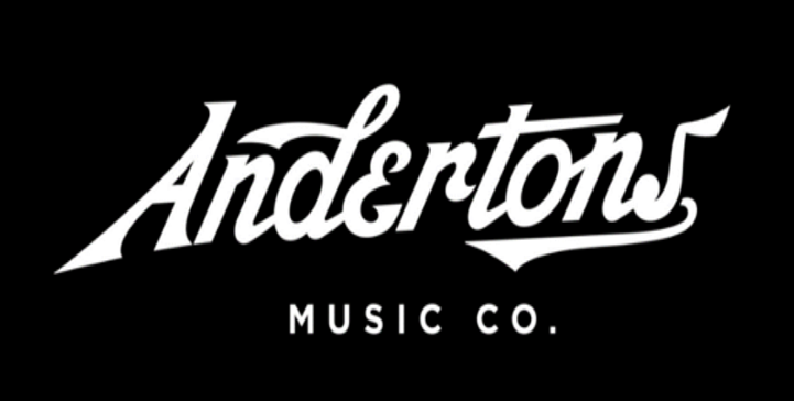
The main logo was clinical, impersonal, lacking texture, and gave the impression of a chain store – a total misrepresentation of the brand personality and experience. A representative comment from our customer survey was that the visual identity was “very dated. Has the look and feel of a large online, pile ‘em high sell ‘em cheap, retailer, not the pro store that Andertons actually is.”
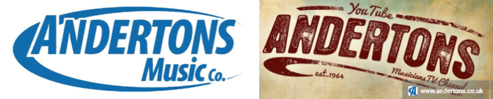
Another problem was the inconsistency between the main branding of the store and website vs. that of the Youtube channel, which had a completely different logotype in a distressed, crafted style – much closer to what we were aiming for. However, the effect of the inconsistency was to make the brand seem both confusing and confused.
We designed a brand new logo to be implemented across channels. It draws its inspiration from classic 50s and 60s hand-drawn logotypes, reflecting the half-century of music heritage Andertons has under its belt. We think it looks pretty sweet.

To help update the brand, we also created an adaptable icon. In the age of apps and social media, when frequently the only space you have to convey your brand identity is a small square, traditional logotypes aren’t always the way forward.
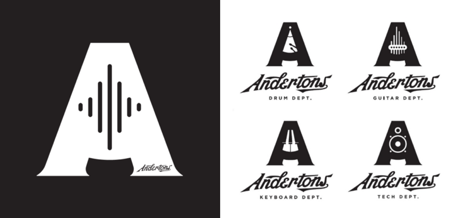
The nifty thing about the icon is its adaptability. There are variations for different departments, which allows for much clearer signposting and a smoother shopping experience. The icon’s flexibility gives Andertons the freedom to expand into new areas in the future with the assurance that they’ll always have an iconic brand imagery to make them easily recognisable.
We’re chuffed with the work we’ve done so far – and by the sounds of it, so are Andertons!
THE ROAD AHEAD 
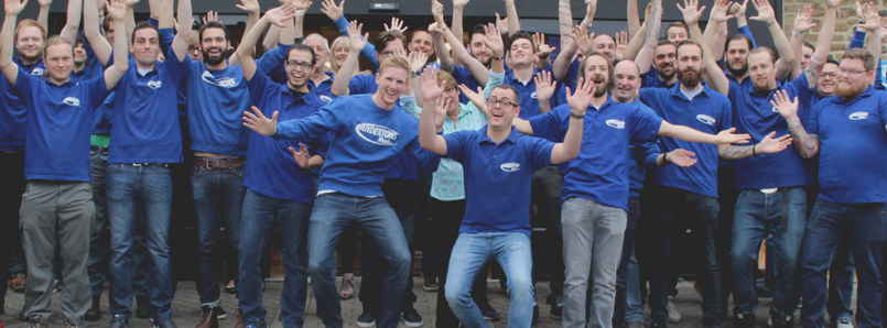
The staff uniforms have already been given a makeover to reflect the new brand and, while still functional, the old website had a lot of issues that needed to be addressed, so we’re helping to design and build a brand new one.
More than a store
Additionally, to reflect the mission of making musicians, we want to transform Andertons into an experiential brand. The goal will be to create experiences that build awareness by spreading the love of music making. We won’t go into too much detail right now… but watch this space!
We’ve loved every second of working with Andertons so far, and we can’t wait to continue taking the brand forward into 2017.
Posted 16 February 2017 by