For those who play electric guitar, effects pedals are ingrained in the fabric of life!
For those uninitiated and frankly perplexed, they are like the proverbial sweetie shop for those with a sweet tooth!
Effects pedals are exactly what they promise to be; a variety of clever boxes that, when introduced into the link between guitar and amplifier, manipulate the sound output to achieve all sorts of incredible tones and effects such as Fuzz, Delay, Flanger and Phaser. An eclectic mix!
Think Jimi Hendrix and his Wah-Wah pedal used on the famous track ‘Voodoo Child’ and you’re there.
To the guitarist, they can be addictive! As such the market is saturated with a plethora of brands with weird and wonderful titles. It’s actually a very creative space where pretty much anything goes. With names like ‘The Tube Screamer’, ‘The Big Muff’, ‘The Pork & Pickle’ or ‘The Catalinbread Sabbra Cadabra’, you can see it’s a hugely varied space.
From an external design perspective, the pedals are generally painted cast metal boxes with screen printed graphics and a variety of off-the-shelf components (knobs) to finish the look. As such it is difficult to stand out with something different. If ever you have looked at a pedal cabinet in a music store, it really is an assault on the eyes, yet incredibly exciting at the same time.

Enter Chapman Guitars, the UK’s (and possibly the world’s) fastest growing electric guitar manufacturer. The company was founded by the enigmatic and world-renowned guitarist Rob Chapman alongside third generation music instrument retailer and serial entrepreneur Lee Anderton. The pair first teamed up to launch Andertons T.V., a YouTube channel operated by and on behalf of Andertons Music Co. (Lee’s family music store). The channel has been a worldwide success with subscribers at over half a million.
As we all know, with success comes detractors, and Rob & Lee receive their fair share. But it was one particular troll who piqued Rob’s interest when he accused them of being SnakeOil salesmen. And thus, an idea was born!
With so many pedal brands on the market, there is some scepticism of what they claim to achieve. That fuelled Rob & Lee’s thinking; when partnered with the SnakeOil comment it conjured up images of early advertising and the ridiculous products that could be found alongside their equally crazy benefit claims. Products such as ‘Electric Belts’ that claim to ‘cure nervous and chronic diseases’, or the ‘Curves of Youth’ machine that claims to be a ‘chin reducer and beautifier’! Not tempted? Well how about Dr. Batty’s Asthma Cigarettes? Just nuts!

Rob and Lee had wanted to dip their toes into the guitar effects market for some time, and in fact Rob had been working with an electronics/sound engineer to develop two new pedal concepts. However, the right brand vehicle hadn’t shown itself, until now. SnakeOil Fine instruments was born. A tongue-in-cheek brand that they could have some fun with, yet also delivered high quality and aesthetically striking products.
Both founders are particularly creative and immediately put their minds to developing names and associated ridiculous claims. Cue The Pull Agency! Over a particularly hilarious meeting in which we explored some of the outrageous advertising from the late 1800’s/early 20th century, Lee briefed us on what they hoped to achieve and put us in touch with their go-to product development genius, Simon Clark from Straight-Edge Manufacturing. Simon knows the product development process inside out when it comes to the amplification business and beyond, and he perfectly completed our like-minded triumvirate – strategist/designer/maker. Key to the success of the project.
So, straight into research, further exploring the style and characteristics of early advertising. It was a time of technological restrictions with lithography being the most widely used printing technique (though it was becoming possible to print photographs by the late 1800’s), so ads relied upon typography to create standout alongside illustration as etchings. As such typography was elaborate and used lots of ‘ornaments’ and glyphs to bring the ad to life. It’s really characterful and playful.
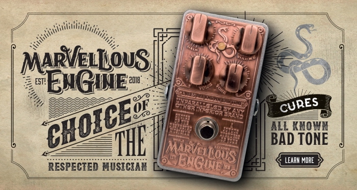
It was obvious, but nevertheless seemed a no-brainer to implement that style to some degree. Though there was something about screen printing it onto a painted surface that didn’t feel quite right, and more to the point didn’t differentiate the product enough. It was the name of the first pedal to be designed that got us to change direction slightly – Marvellous Engine. It spoke more of a steam-punk vibe – not at odds with the 19th Century ad world, but more industrial. We looked at mechanical objects from the period – printing presses, steam trains etc. Many display heavy embossed metal plates that identify the maker or origin, serial numbers etc. And the strong use of typography carried through. It seemed to fit perfectly.

But how to achieve this with a painted case and screen printing? After a bit of digging we discovered a fantastic label manufacturer called Signet in Peterborough. They create beautifully crafted self-adhesive aluminium plates mainly for high-end alcohol bottles (as well as other embellishments!). They are beautifully and accurately machined metallic sheets that allow embossing and debossing alongside print if required.

We managed to get hold of a sample, at the same time sourcing a pedal enclosure in its base form – cast metal. The finish of the box was perfect as it arrived. It had a subtle patina to the metal that felt aged and machine-like. It would have been a shame to spoil it by painting it. We applied the sample plate directly to the raw case and the magic happened!

It immediately had the feeling of a steam engine footplate. The beauty of the embossed characters in the bronzed material with its aged appearance looked perfect. Importantly the information was incredibly clear and readable without any print applied and felt all the more authentic as a result. We had our solution!

Having run the idea by Simon at Straight Edge first, there was an initial concern about cost. However, we were cutting out a painting process by simply using the ‘off-the-shelf’ unpainted casing and were saving some printing costs too meaning the solution was viable. All we needed was the thumbs up from Rob & Lee, who saw the potential immediately and backed us to continue to design and prototype.
Before leaping into designing the label, we wanted to begin by creating a logo for the brand. Something that represented the journey so far and where we wanted to go with it. Something to set a benchmark that everyone could rally around. Importantly these pedals were likely to appeal to the rock/blues guitarist, so we needed to include a flavour of that scene; pick up on a familiar vibe. We thought this would be a good place to introduce an illustrative element, connecting with the early advertising style we had researched. However, we had to be careful to create something that wasn’t too intricate so that it would successfully emboss into the soft aluminium plate.
We also wanted to create a logo that could be reduced from its full configuration down to a recognisable marque, allowing huge flexibility in its use. And of course, it had to have a sense of the period feel we were inspired by. After some sketching the snake motif began to take shape, wrapping itself into the initial letters of the brand and the rest fell into place alongside.


Next step was to begin creating the ornate feel of the typographic label itself. We decided that, whilst we needed to develop a family feel to the pedals to ensure a strong SnakeOil branded link, each should be suitably different. That could be achieved by using a variety of metal finishes and alternating font sets. A good chunk of time was invested in selecting a set of typefaces that not only fitted the period style that we were shooting for, but also complimented each other. We also took inspiration from found artworks to inspire the typographic ornaments and glyphs that add the finesse to each design. Finally, we took time to craft an individual logotype for the name of each pedal; Marvellous Engine and The Very Thing. The pedals would then be able to be marketed under their own artwork to create individual personalities both on and offline.
We needed to be careful with composition, allowing for the components to be added i.e. the ‘stomp’ switch, power indicator and the sweep of the control knobs. Once these were mapped onto the design the typography could be arranged around them.
Rob & Lee had some fun copywriting some of the ridiculous claims that appear on the plates, while others were influenced by classic ads from the period in question.

Our initial plan for the control knobs was to try a contrasting material and introduce bakelight controls. However, Simon managed to source bronze controls. Somehow, they just seemed to work, completing the full machine vibe.
The final result couldn’t have been better! Both designs could have sat on a workbench during the Victorian period. As they are used by the musician, they will become scratched, battered and dented, which will only serve to make them more authentic!
With the first two products complete, we set to extending the visual language to create a distinct style for both on and offline applications, devising a design palette of textures, and ornaments that could be developed into striking supporting materials, even working on associated merchandise. It was important to ensure that the creativity and vibrancy of the theme was carried through for a consistent brand experience, making sure that the ‘SnakeOil world’ is rich with attention to every little detail.


Rob first exposed the pedals to the world during the music instrument industry’s biggest and most prestigious event in California – The NAMM show – a monster exhibition featuring the biggest and brightest brands. The response was phenomenal. The first batch from an initial planned production run sold out in two days of the show. When they were introduced to the public the guitar community went crazy – all waxing lyrical about the beauty of the design and production.

Rob and Lee have since filmed a show for Andertons TV solely featuring SnakeOil, in which Lee predicts that people will buy the pedals on the basis of the appearance alone.

The journey culminated with us taking home the award for Best Physical Product Design at the 2019 Drum Awards, the prestigious programme run by the Industry publication, in which we found ourselves in the company of some of the countries finest agencies. A fitting end to a marvellous journey.
The guys have plans for more pedals – so it seems the fun will go on!

Posted 1 June 2019 by Darren Cornwall