


How accessible is your brand?

It’s a familiar story. You’ve got a great new brand and you are now implementing it on the web, but is it actually suitable for a web audience? Does it work at all with varying levels of needs? Making your brand accessible can be tricky, but if you are considering it right at the start of the branding process it shouldn’t be a headache to implement. This article lists the key considerations and how they can help your thinking in the brand building process.
CONTRAST
Your brand colours are an important reflection of your identity and can convey your personality to a visitor as soon as they arrive. This coupled with font use and imagery are the building blocks of your design system. But this is irrelevant if certain users can’t understand it.
This is why contrast guidelines can help. There are tools online which can help the process, but in essence, you have to ensure your copy is readable, and calls to action are clear when used with your brand imagery and colours. If you have a script font for headings, just how readable is it in different situations? Does it have a good level of contrast?
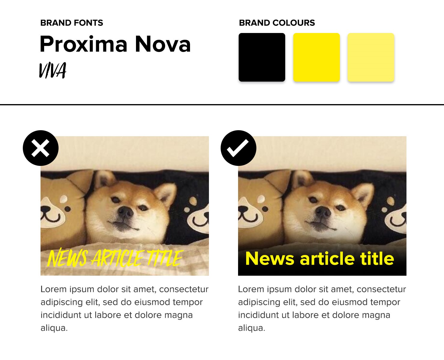
You can quickly see in the above image which article title is the most readable through more appropriate font use and a background gradient to add contrast. A balance needs to be struck between your brand identity, and usability for all. Coming up with a style guide of all the elements used on your site (hero images, signposting, news articles etc) and how they are designed can help you spot potential problems in the brand implementation, which can then be addressed quickly.
ANIMATION
It’s becoming more and more prevalent to see flashy animations on the web. Coupled with a strong identity, they can add a rich and immersive, kinetic experience to your site. It can also act as a distraction and severely impair user experience if done badly. Being mindful of different types of visitor to your site should help decide how much animation is ok to use. Nobody wants to be forced in to watching a lavish introduction when all they want to do is find a product, or search for some contact details. The user experience comes above all else. From research of the types of visitor to your site, or the demographic your brand is aimed at, you can establish whether going animation heavy is the right thing to do.
If you want to tell a story, and to immerse the user, animation could really augment the experience. If you’re an ecommerce site selling wellness products to people over 55, they might find a lot of movement hard to follow and confusing. The main goal should be to direct users to product pages as quick as possible with minimal distraction. These embellishments could impact sales and take the focus away from the products themselves.
USABILITY
You’ve probably heard the term ‘mobile-first’ a lot by now, and with good reason. How often do you use a computer at home to browse the web and purchase things? Exactly. A user needs to be able to find everything on your site, regardless of the screen size they are using. This is why an uncluttered layout and intuitive navigation is essential. Buttons need to be big enough to touch, and text needs to be big enough to read. Making sure your site has clear, readable hero areas, well written copy and intelligent signposting will be beneficial for both visitors and SEO. If you are forcing too much copy in to your pages it’s going to affect the user experience. If you are saturating your site with brand furniture and lots of cosmetic touches it might put people off finishing their task. These are problems which can be identified easily with a mobile first approach as it can amplify the issues which may not be apparent on a desktop layout, which has much more space available to it.
SITE LAYOUT AND CONTENT
During the design and build process, it’s essential to have solid wireframes and a content strategy. This stage can often be glossed over as people just want to get to the ‘fun stuff’ and implement brand into the designs. However, your site layout has an impact on screen reader users, as the pages need to make sense for them to read (logical order of headings, signposting and copy etc)
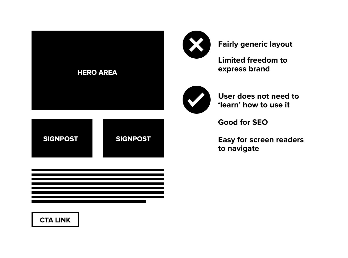
It’s often an argument that the web has become uniform (see image above), and that all sites look the same, but the counter argument is that users take time to learn anything new. The more familiar layout you have the better it will convert. This is not to say creativity should be throttled, this is in fact where a strong brand identity and a creative way to implement it can create a unique look and feel, without impacting conversions. Knowing your audience is key to how far you can push it. It always beneficial to test layout changes in small increments then you can gauge if they are improving conversion. This can then help you decide to inject more of the brand feel in to a particular area, or indeed strip it back if it’s harming the user experience.
DESIGN TRENDS
The web tends to follow trends in a lot of its design. Some of these can be more accessible than others, but it’s worth thinking about if you wish to revamp your presence with the freshest look and not compromise your visitor’s experience. Brutalist design is set to gather further momentum this year. In case you are unaware of the style, it can be a mixture of high saturation colours or overlapping elements and is intentionally rough/old looking. Almost un-designed and slapdash, which (funnily enough) can impede the user experience. Sometimes it intentionally throws usability out the window altogether, so it’s probably not very appropriate for a lot of sites, but again, it depends on your users.
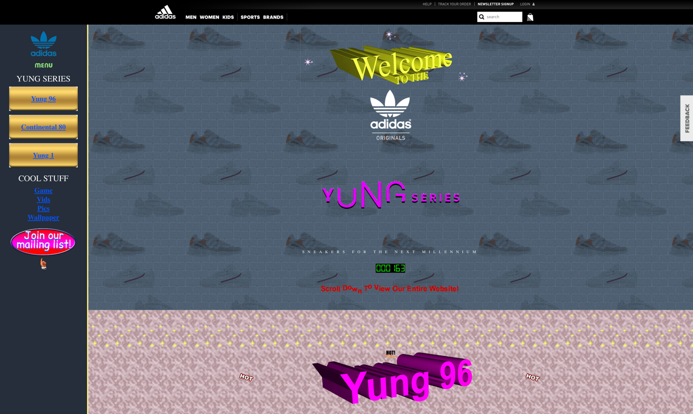
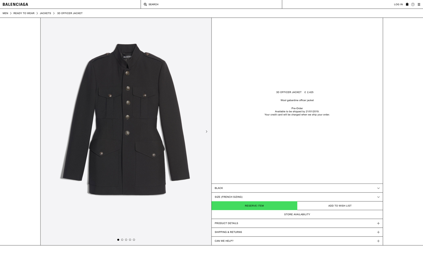
Adidas employed brutalist design for a new range of trainers, firmly aimed at younger people. It’s quite a radical design and basically looks like a site made in 1995! But in terms of accessibility it’s not the best. Brutal to navigate you could say. Everything is fighting for hierarchy, and a user doesn’t know what to look at first. But it’s supposed to be that way to appeal to its young, non-conformist audience (but assumes they have full visual ability). On the other hand, other brutalist sites consist purely of high contrast text and colours with little else, which is actually great for accessibility, if a little jarring to look at. See the Balenciaga site for an example of this. It almost looks like a wireframe!
Another trend is the custom illustration style which has also become more and more popular in the last couple of years.
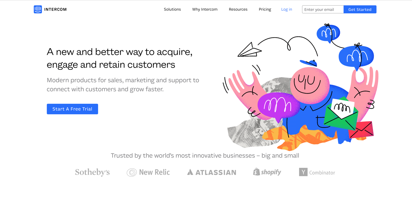
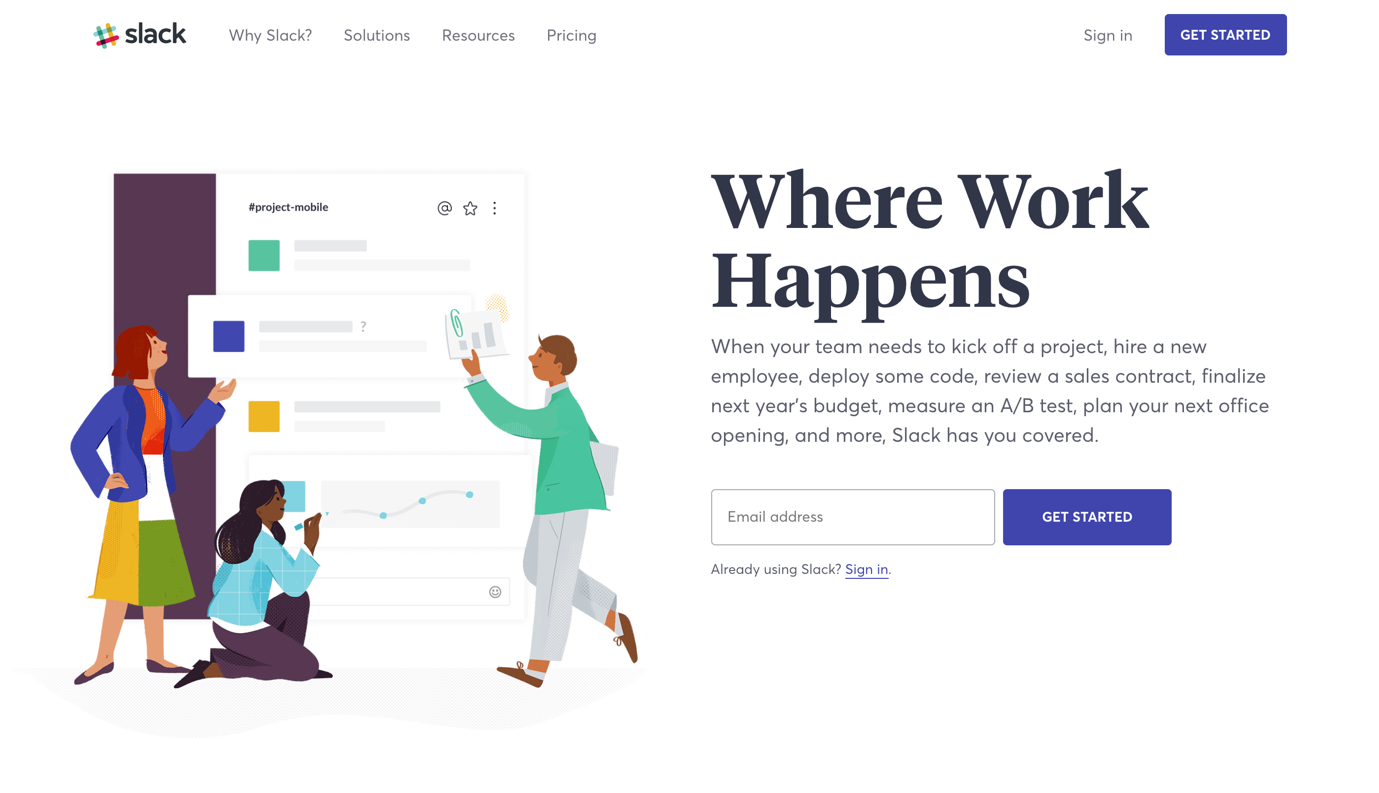
The above examples of this style from Intercom and Slack show their creativity in the illustrations, and a more standard page layout. The accessibility of the brands is much better in comparison to Adidas’ take on brutalism, with the illustrations being an accompaniment to good copy and signposting. The calls to action are clear and obvious. It could be argued they don’t have the initial impact of the Adidas site, but their brand looks more consistent.
Brutalism relies on shock as the initial impact, not necessarily a strong brand. It does work in the right context, but good luck getting that Adidas site past a contrast checker tool! If you are to follow one of these trends, keep in mind how you might tweak the brand to meet more user needs.
This has been a pretty high-level skim over some issues faced when implementing a new brand identity on to the web. Keeping accessibility at the forefront of the design process is important to ensure all your visitors are getting the experience you want them to. And we haven’t even touched on the actual site build process and best practices. So, to make sure your brand is as accessible as possible, here are the takeaways:
- Check your brand colours and typography are flexible enough to pass contrast accessibility guidelines without impacting the brand. Your site copy could be used in many ways (hero areas, signposts, navigation, body copy). As such your fonts of choice need to be readable at varying sizes, and work with different background colours/images.
- Consider the impact of animation-heavy layouts on users with problems perceiving motion, or any users who don’t want distractions when browsing your site.
- Make sure your site is easily navigable on any device, and ‘brand furniture’ doesn’t impede the browsing experience.
- Ensure the page content hierarchy is well ordered, well written and makes sense to both users and search engines, but the user comes first.
- Investigate new design trends, being aware of their strengths and weaknesses before taking the plunge.
Further reading:
Web accessibility Initiative
Posted 9 January 2019 by Shaun Levett