
LUCOZADE - MIS-STEP OR MASTERSTROKE?
Lucozade hopes its biggest brand refresh in 97 years will “unleash its potential” and help stave off the threat of private labels.
Do you ever think: “Oh a brand has done a thing. But I’m not sure I really know what it is?” Considering that it is supposed to be a simplification, Lucozade’s new branding takes some unravelling to understand what they have done to what they had.
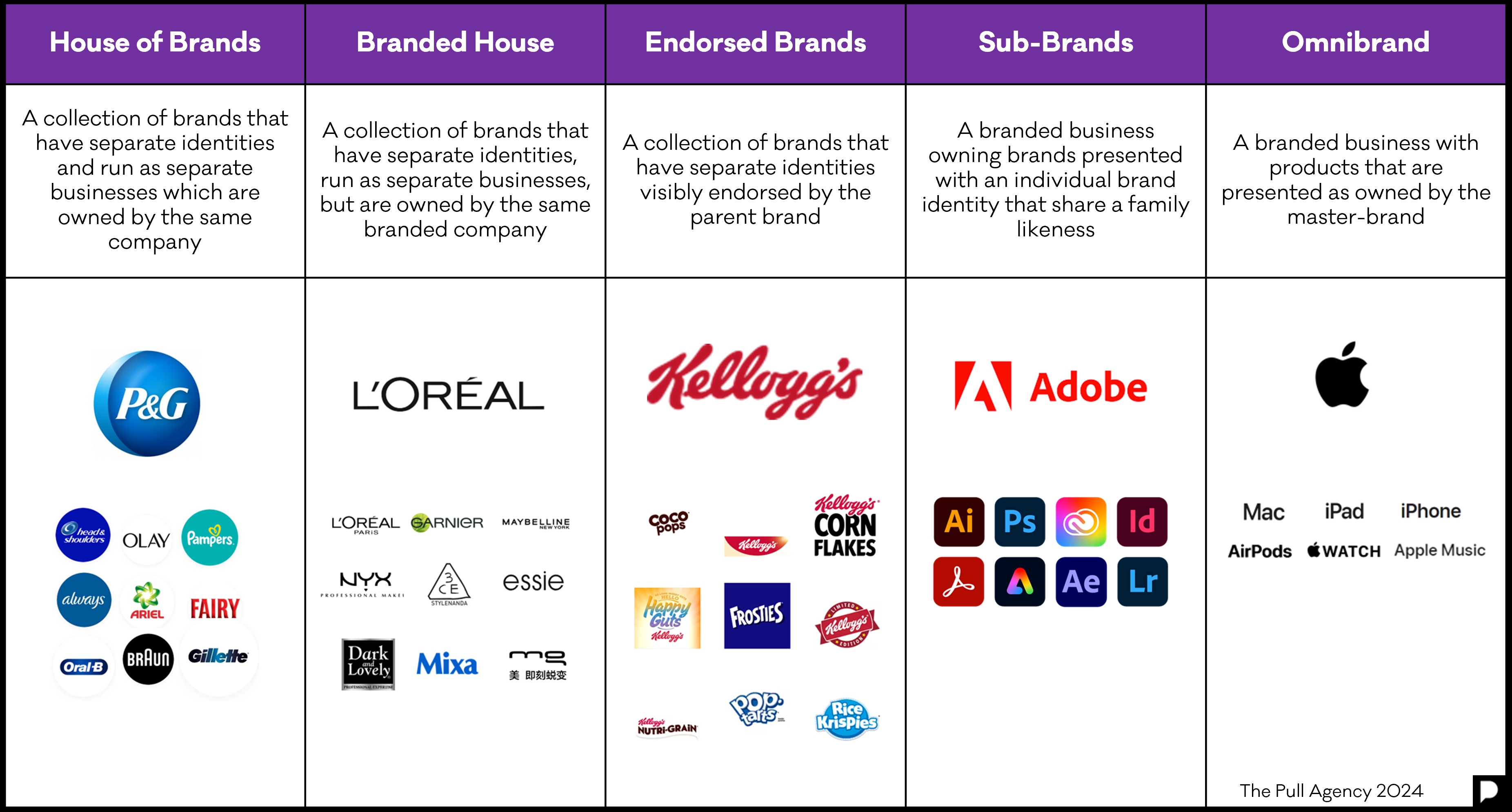
But that’s what this Substack exists for. Having (not as controversially as I expected) proposed a 5th brand architecture model in my recent Brand Architecture article, I was intrigued to see how well the before and after Lucozade branding fitted in my model.
SPORTS & ENERGY
So let’s look at how the brand has previously been organized, and where they have gone to. The ‘before’ situation included the following key features:
- Two distinct sub-brands: Sport and Energy.
- The sub-brands featured two different expressions of the Lucozade logotype used vertically on both.
- Two different bottles – the sports one with the ‘trademark’ flipable Sports drink lid.
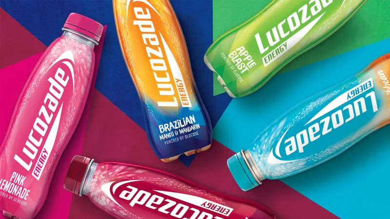
- The packaging is also colour-coded on Energy to denoted the flavour, but not on the Sport.

Before: Sub-brand Lucozade Energy
Before: Sub-brand Lucozade Sport
AFTER
The changes to the product’s appearance can be summed up as:
- A new logo and larger ‘arc’ lock-up with horizontal lettering used in the same way on both energy and sports drinks.
- A more subtle differentiation between sports and energy with a ‘mesh’ treatment for the sports packaging and a bubble treatment for the energy packaging.
- A new treatment for Zero (sugar -free with white at the top of the pattern)
(What hasn’t really changed is that the packaging is also colour-coded on Energy to denote the flavour, but not on the Sport.)

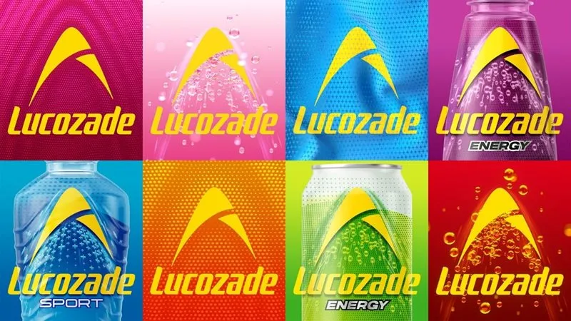
After: Lucozade as Omnibrand
SO WHAT IS THE NET EFFECT OF THESE CHANGES?
I think many consumers won’t notice anything much more than the new logo lock-up. At least regular buyers should easily be able to find their favourite tipple.
So where were Lucozade in terms of architecture model, and where have they gone? Using my 5-variant model it seems something interesting has happened along the lines of a trend I discovered in my last article. I think the best fit variant for where Lucozade were previously at was the Sub-Brand model. The brand was Lucozade and they had two sub-brands: Energy & Sport which each used the Masterbrand differently.
What they have done is simple demote the differences between the two sub-brands so they now share the same branding. The two sub-brands have simply become products.
So here is another brand that has moved from the Sub-brand model to the Omnibrand model following in the footsteps of both Apple and FedEx. Like logotypes themselves, well developed brands tend to simplify over time.
There are other quite interesting things going on as well though. Suntory Beverage & Food GB&I marketing director Elise Seibold states that:
“In the past, we used to treat Lucozade and Lucozade Sport as if they were totally different brands. . .
We had two different strategies, two different bits of packaging, two different brand positionings, two different pipelines.”
Well perhaps they weren’t two different brands – but we know what she means. As I pointed out in my previous article:
“Remember, running two brands will cost you twice as much as one.”
There may be distribution advantages and cost-savings too. These would come from selling and distributing one range of products instead of two.
We also know that Lucozade’s owners Suntory are locked into a battle with retailer own label. This is a war that the retailers are slowly winning – especially in jurisdictions like the UK where retailers can mimic brands very closely – the only legal test is one of a need to avoid ‘passing off’ - i.e. deliberately posing as another brand. Lucozade’s previous incarnation relied more on a form that would have been easier to mimic - especially by retailers like Aldi and Lidl in the UK who have pushed this to the limit. With the new logo occupying more real-estate on the packaging, that makes it harder for retailers to create a look-alike.
And it allows Lucozade to run one high-impact campaign on the same platform: ‘Bring the Energy’, which is exactly what they are doing to coincide with this re-brand. Bring the Energy is what the total brand can be famous for – it’s always difficult to be famous for two things.
Posted 22 April 2024 by Chris Bullick