


Next stop binary
But hold the ketchup, mustard, onions, gherkin and anything else with flavour!
I’m about to be a massive hypocrite!
Last year I wrote a blog aimed at the ‘new logo haters’ of the world. You know the type; the people that love to jump on the critique bandwagon and throw some mud at a newly launched visual identity. No sooner has the thing launched than they are bashing out some literary bile on their keyboard without having seen the full extent of the designer’s work, how it will be applied and come to life out in the world. I argued that this knee jerk reaction was short sighted – how can you criticise work without the whole picture?
Seems I’m not alone. Just this weekend Simon Dixon, co-founder of brilliant UK agency Dixon Baxi, went further; ‘There’s a steadily growing trend of immediate [and cheap] hits on other people’s work. Why? It doesn’t help the industry, and it certainly doesn’t add critical thinking or value. It’s just mean spirited’.
I totally agree.
But then….
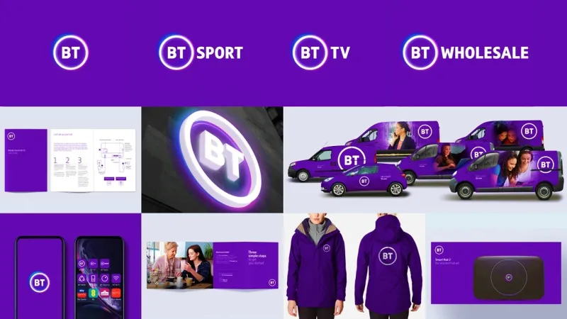
We’ve all just been shown the new BT identity.
And well, I’ve kind of seen enough!
As predicted, the cheap-shot merry-go-round is off and running, but my concerns go beyond this single project, (though they are perfectly symbolised by it).
‘Stop this anti-design train – I want to get off!’
I’m seriously troubled. First and foremost, for my own sanity! You see, everything I ever thought I knew about design and branding seems to be coming apart in front of me.
The thing is, graphic design and branding in particular, is about communication; creating a connection, transferring a message, translating an idea or even sparking imagination. Indeed, Falmouth University’s design and advertising courses are taught in a part of the campus called ‘The School of Communication Design’.
As we all know, good communication is a multi-layered thing. As a human skill it’s more than simply words; body language, gestures, expression, confidence, empathy. The same considerations apply through design, especially when it comes to brand. It should of course be a clear identifier, but what about personality? What about symbolism – giving SOME clue as to what it stands for?
It’s true that often the greatest ideas are the simplest. Students are taught as much. Jon Unwin, Senior Lecturer at aforementioned Falmouth says he encourages his students to ‘view simplicity and clarity as the aim, rather than being a slave to visual trends’.
Jon echo’s the view of the great Paul Rand. But Mr. Rand perfectly identifies simplicity as the result of good design, not for its own sake. ‘Simplicity is not the goal. It is the by-product of a good idea and modest expectations’. In other words, beautiful well considered design will deliver the answer, and as a result will most likely represent purity and clarity.
There is of course a place for brutalism in graphic design – mainly in battle! Its purpose, to be clearly identifiable on the battlefield. As far as I know the only battle brands have to wage are for hearts, minds, differentiation and distinctness, all leading to revenue!

Pragmatism can go too far. Great design should demonstrate other characteristics on its way to simplicity; intelligence, emotion and craft being three. Characteristics that it seems to me are in danger of being cast aside in the relentless drive toward misplaced ‘minimalism’.
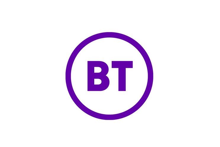
Where does it stop? If we follow this trend to its logical, stripped-back conclusion does it mean we’ll end up using binary code to symbolise a brand in the end, maybe a barcode, or will we be afforded the total luxury of typing the name out in Helvetica (maybe enclosed in a circle if we’re lucky)?!
Ludicrous I know, but I worry that we are driving visual identity towards a precipice of despair – unappreciated, undervalued, untrusted.
We are obviously in a time that requires a great amount of justification, be it ROI, surveys etc. Not without justification of course. And agencies undertake a comprehensive stage of discovery and research to understand the audience, their behaviours, the marketplace and attitudes. Many of the design decisions are made as a result of those findings. But there’s one thing the research can’t provide – the magic. It can lay the path and provide a framework, but the intelligence and skill of the design team are what should be relied upon to deliver the killer solution. You just know when it happens. Somehow, I can’t imagine the BT team having the same epiphany!
To be slavishly driven solely by the research can be a mistake. Indeed, Ogilvy’s Rory Sutherland argues in his new book for the value of the irrational. ‘We should never forget that our need for logic and certainty brings costs as well as benefits. The need to appear scientific in our methodology may prevent us from considering other, less logical and more magical solutions, which can be cheap, fast-acting and effective. As he told Creative Review, ‘the mythical ‘butterfly effect’ does exist, but we don’t spend enough time butterfly hunting’. He goes on to say, ‘It’s true that logic is usually the best way to succeed in an argument, but if you want to succeed in life it is not necessarily all that useful; entrepreneurs are disproportionately valuable precisely because they are not confined to doing those things that make sense to a committee. When you demand logic, you pay a hidden price: you destroy magic. And the modern world is becoming a more and more difficult place to practise magic – or even to experiment with it.
Rory obviously has the same misgivings about the path we’re on.
And another thing – I’m sorry, I don’t buy the whole ‘it’s a digital thing’!
In a Marketing Week article, a BT spokesperson said: ‘The previous logo was put together for a largely pre-digital world, where most of our brand touchpoints were in print compared to today where 90% of our brand touchpoints are on screen. The new design is far better suited to be equally effective in all the mediums we need it to be’.
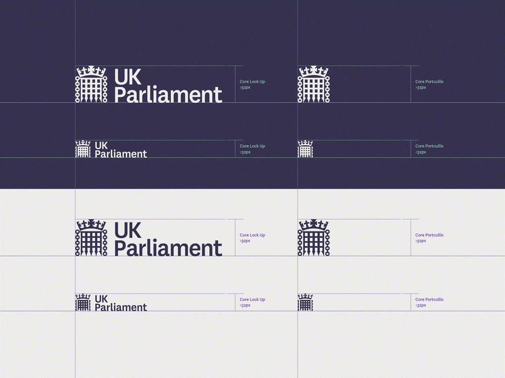
That’s a poor excuse for the reduction of a creative solution to base level. Fantastic UK agency SomeOne recently redesigned the identity for the UK Parliament, largely driven by the need to make it work in a digital environment. The logo consists of a crown and portcullis. If they can make that work in a digital environment, then there’s no reason to ‘dumb down’ design to this end!
Harry Lang (Marketing Week) then goes on to question whether brand even matters. ‘Who needs a flashy logo anyway? Will it ultimately affect BT’s bottom line if products, services, customer-centric strategy and delivery and employee motivation are on point?’.
Well there’s plenty of research to suggest it does, both journalistic and academic! Here’s one I discovered; ‘both corporate image and brand image can support or destroy consumers belief of acquiring value, thereby directly influencing customer attitude and behaviour’*. Here’s another; ‘Brand orientation and brand innovation were found to be the two most critical factors influencing brand performance and, in turn, financial performance’**. And one final observation by another academic study; ‘brand characteristics that are easily recognisable, yet which do not convey the brand’s symbolic and functional benefits or do not provide aesthetic gratification, fail to take full advantage of their full potential’***.
And what of the client?
The same spokesperson said, "Our chief executive has been very clear that the new mark symbolises real change."
Really? Well I’d like that one unpicked for me! Everything I thought about symbolism has just been blown to pieces if that’s true. Maybe the CE is right in the sense that it’s different from the previous marque, I suppose that is change!
If I had to guess, I’d say that our colleagues at Red & White have provided far more emotive work than this, they are a supremely talented bunch. But you have to wonder who drove the resulting solution.
Whatever happened to the delight of a beautifully crafted and distinct identity? Who decided we didn’t need it anymore? I remember graphic design being a craft, and thought it still was! Let’s not allow it to drain down the plug hole of ignorance. Let’s celebrate creativity and bring its full power to bear. Let’s celebrate the richness and diversity of design thinking and rebel against this trend of uber-dilution for the good of both agency and client alike.
By the way, don’t stop here if you want to know what’s possible. There is some incredible work going on out there to buck the trend, just explore the output of our great creative agencies. The likes of Pentagram are even integrating AI into some of their projects. Whilst others are working on design that becomes adaptive identities – we ourselves are working on a logo that is a direct representation of the product and flexes for various screen sizes and applications (watch this space!).
* International Journal of Management. The Effect of Brand Image on Public Relations Perceptions and Customer Loyalty. Chia-Hung, Ling Tung University, Taiwan.
** Journal of Product & Brand Management. The Performance Benefits of Being Brand Orientated. Ho Yin Wong, Bill Merrilees.
*** Asia Pacific Journal of Innovation and Entrepreneurship. The Impact of Brand Concept on Brand Equity. Joo-Eon Jeon, Anyang University, South Korea.
Posted 22 May 2019 by Darren Cornwall