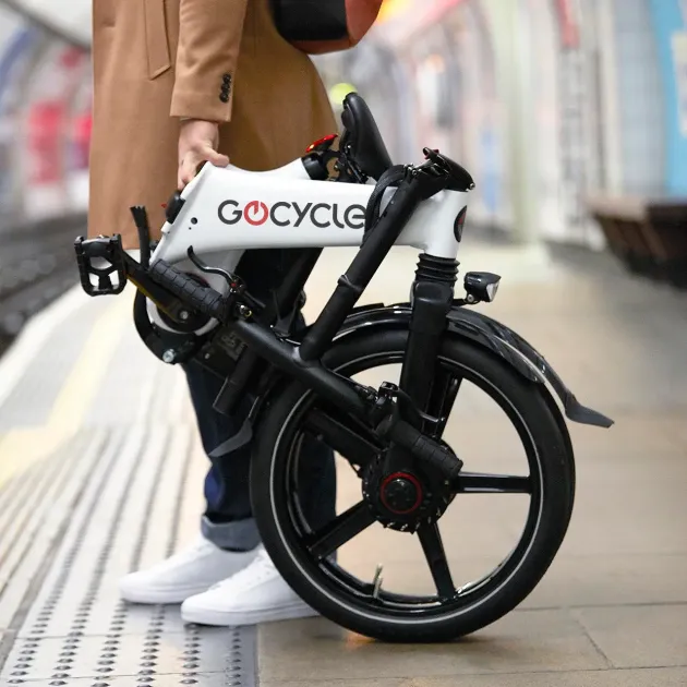
Unique, distinct, iconic & innovative design - Gocycle deserved a marque and logo that reflected its personality
- Client GOCYCLE
- Scope BRAND STRATEGY \ IDENTITY
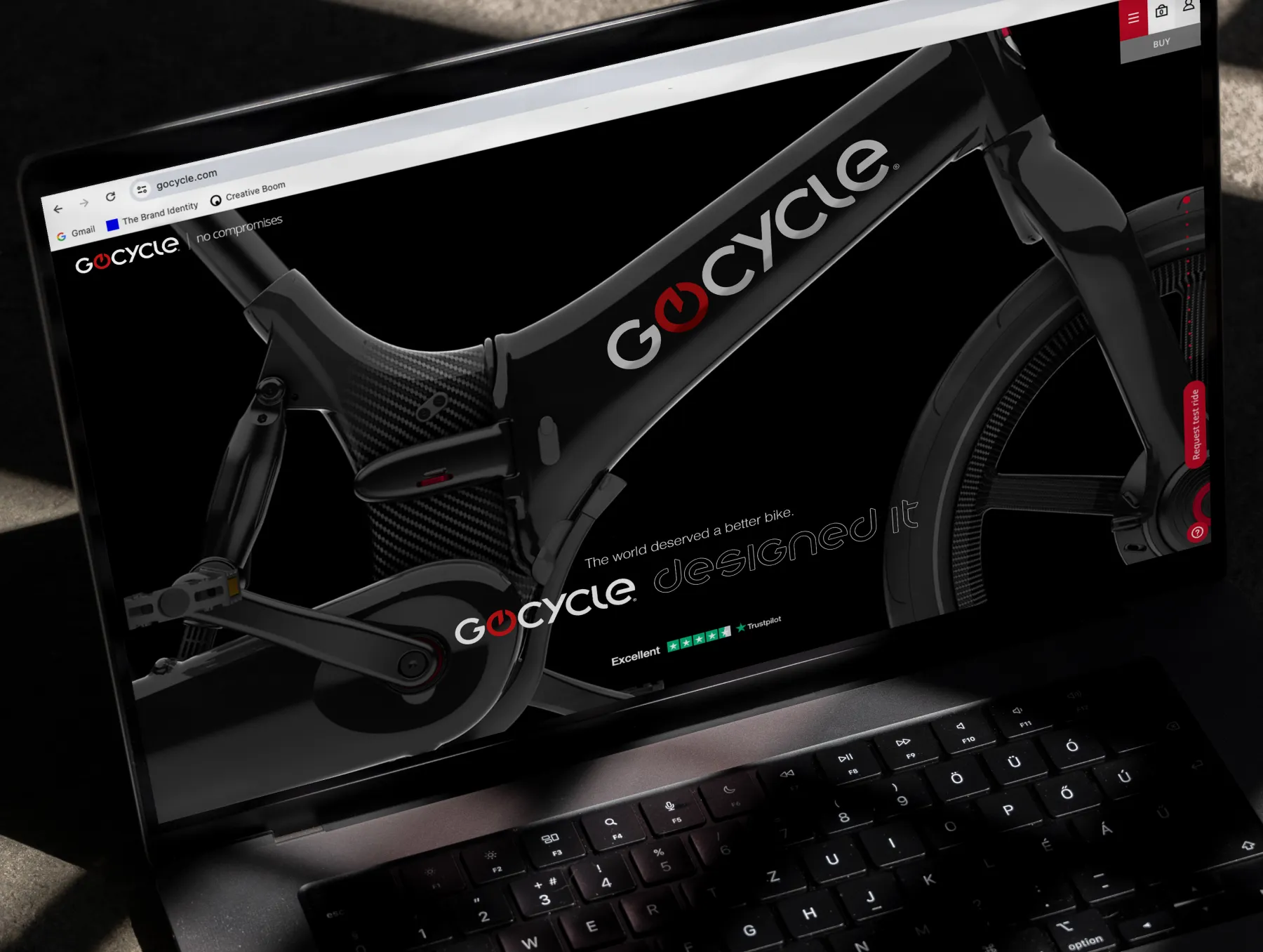
THE WORLD DESERVED A BETTER BIKE
Gocycle is the brainchild of ex Maclaren cars designer Richard Thorpe. Richard set out to achieve the impossible: Improve on the bicycle and re-design the wheel. He achieved both. The Pull agency developed a brand strategy to reposition Gocycle. We also re-designed the logo and marque. Here is how and why we did it.
BRAND BLUEPRINT™
Previously sold on a ‘performance commuting’ tagline, Pull researched the profile of Gocycle buyers and defined the brand’s mission as a promise to offer the world a better bike. This mission statement evolved into the headline used to introduce Gocycle: The world deserved a better bike – Gocycle designed it.
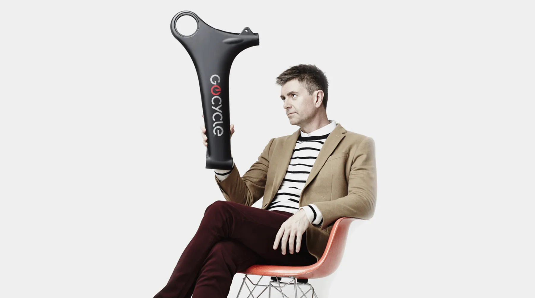
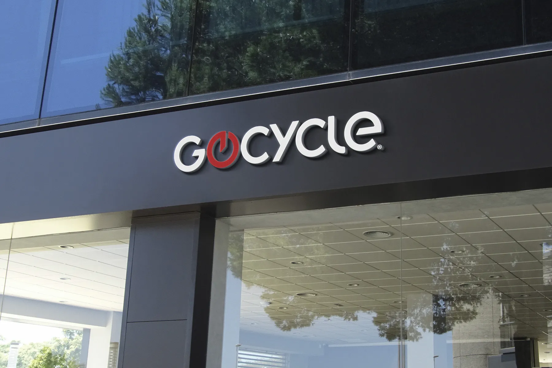
THE MARQUE
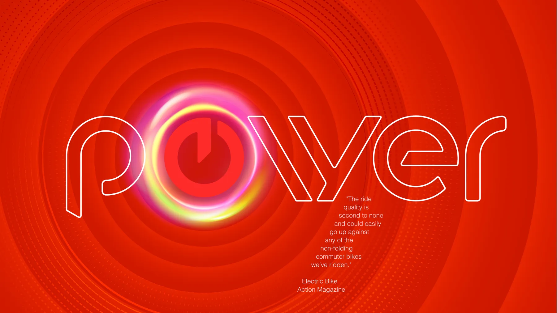
The previous marque evoked an on/off power button. It had a two-piece construction which added a small complication to the production process of the bike's badge.
We evolved the symbol into something more distinct, stronger and simpler. It is a positive, contemporary progression with a more dynamic character that is more reflective of the product. It also has a sense of a lower case ‘e’ - a subtle link to 'e-bike'.
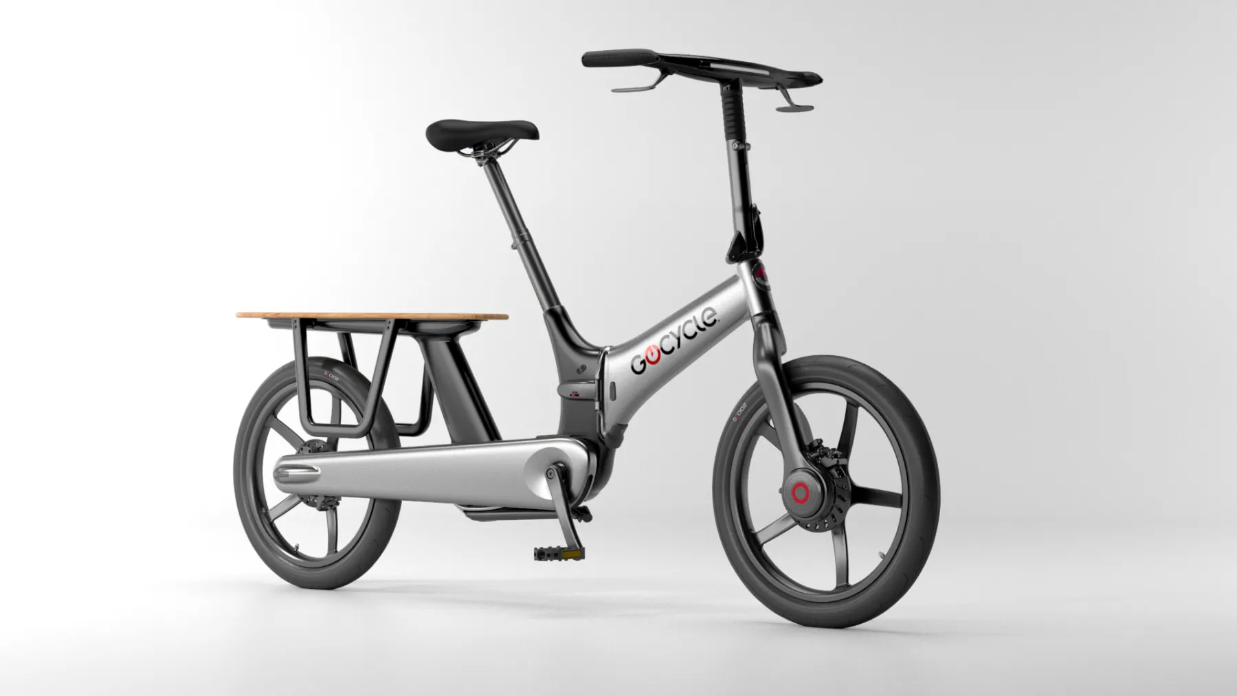
INSPIRED BY GOCYCLE DESIGN
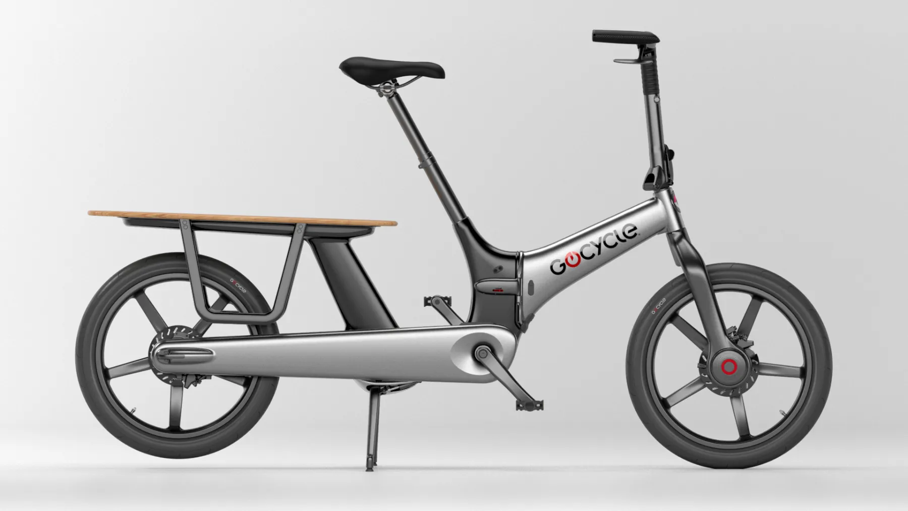
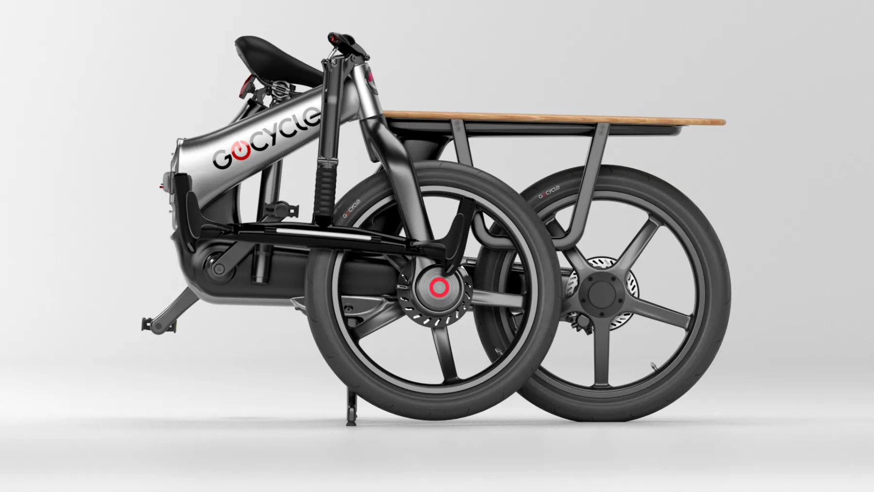
The design of Gocycle has endowed it a unique and iconic look. Meticulously developed by its creator to be better without compromise, its lines and shapes give it a specific character, with every detail beautifully considered. The new logo and marque were designed to complement the provocative but thoughtful design of Gocycle.
SYMBOLIC
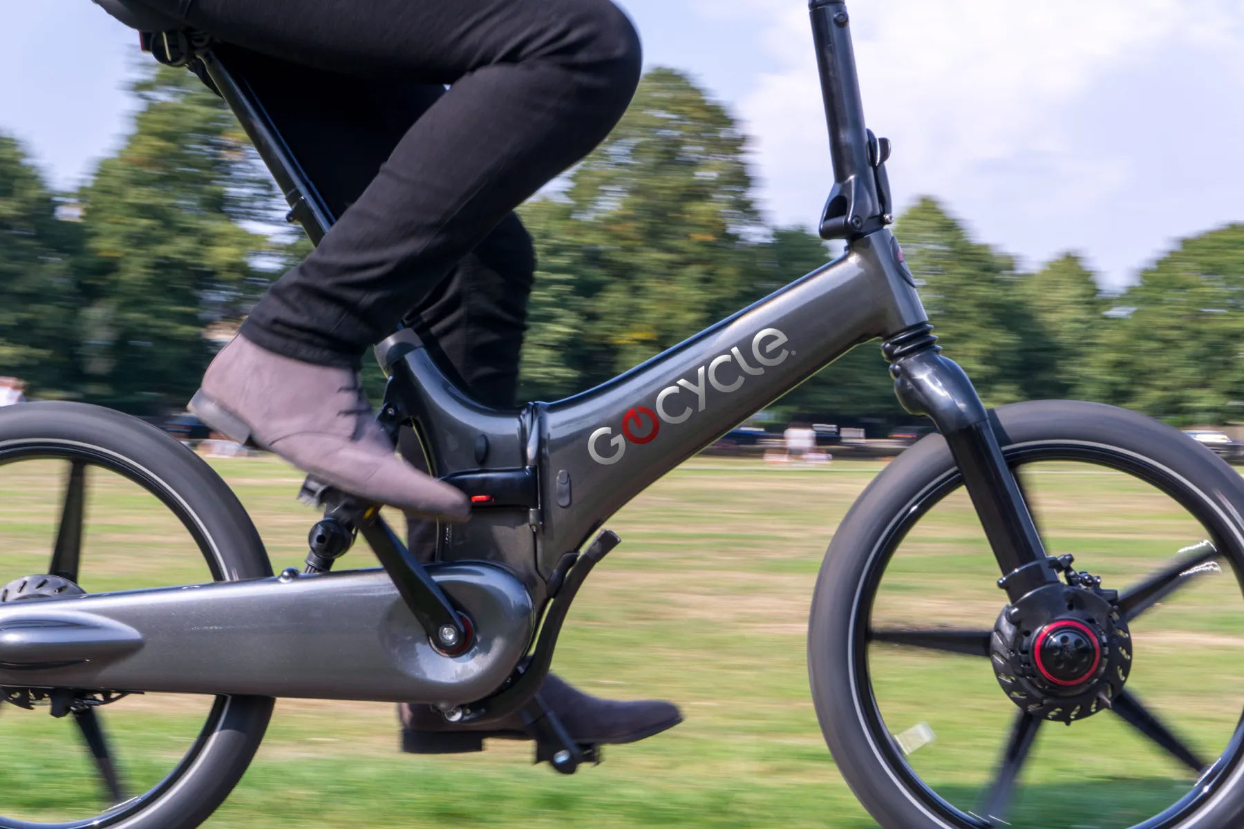
The marque directly represents the red ‘power disk’ that appears on every Gocycle G4 drive - the revolutionary front wheel motor that drives Gocycle and makes it (with thte rider) a unique two-wheel drive bike.
The two-piece design of the original marque was addressed by redrawing the marque to a single component design; more iconic, more impactful and easier to manufacture as a traditional metal frame badge.
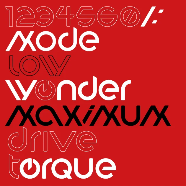
BESPOKE FONT
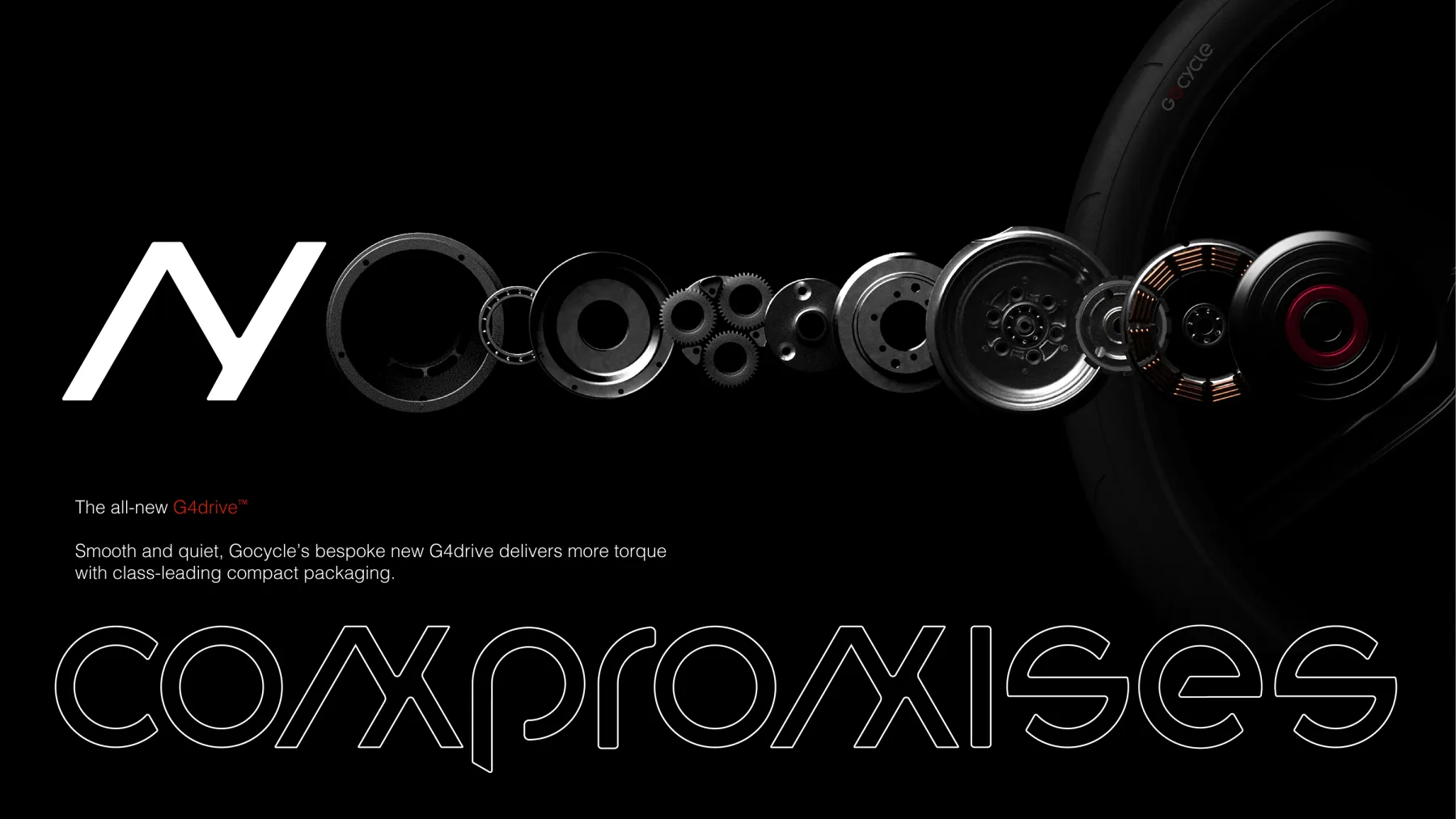
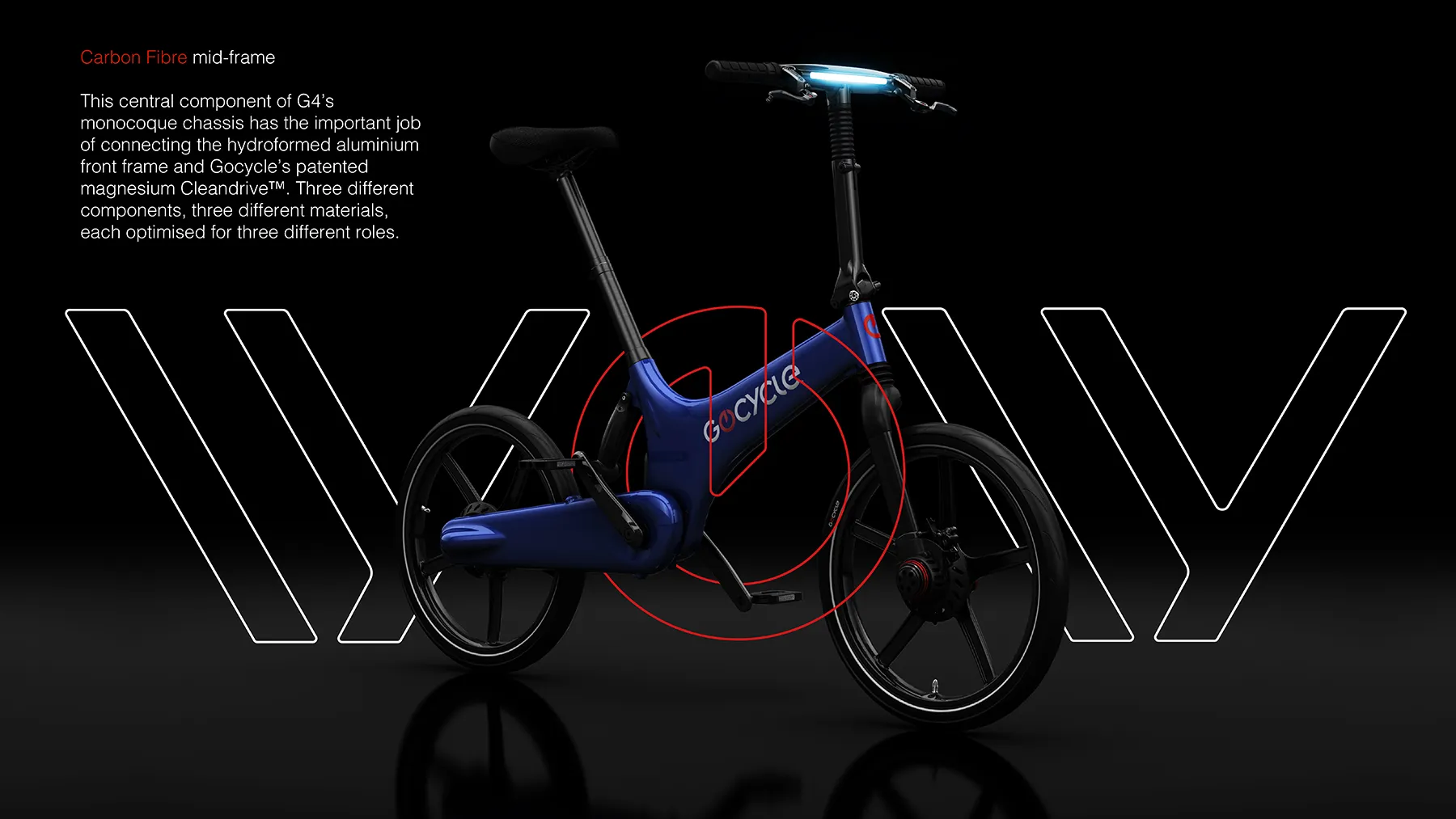
To accompany the new marque and logotype, Pull developed an extended typeface design for the brand, providing a strong visual tool to denote the model hierarchy and unique features.
DIGITAL IMPLEMENTATION
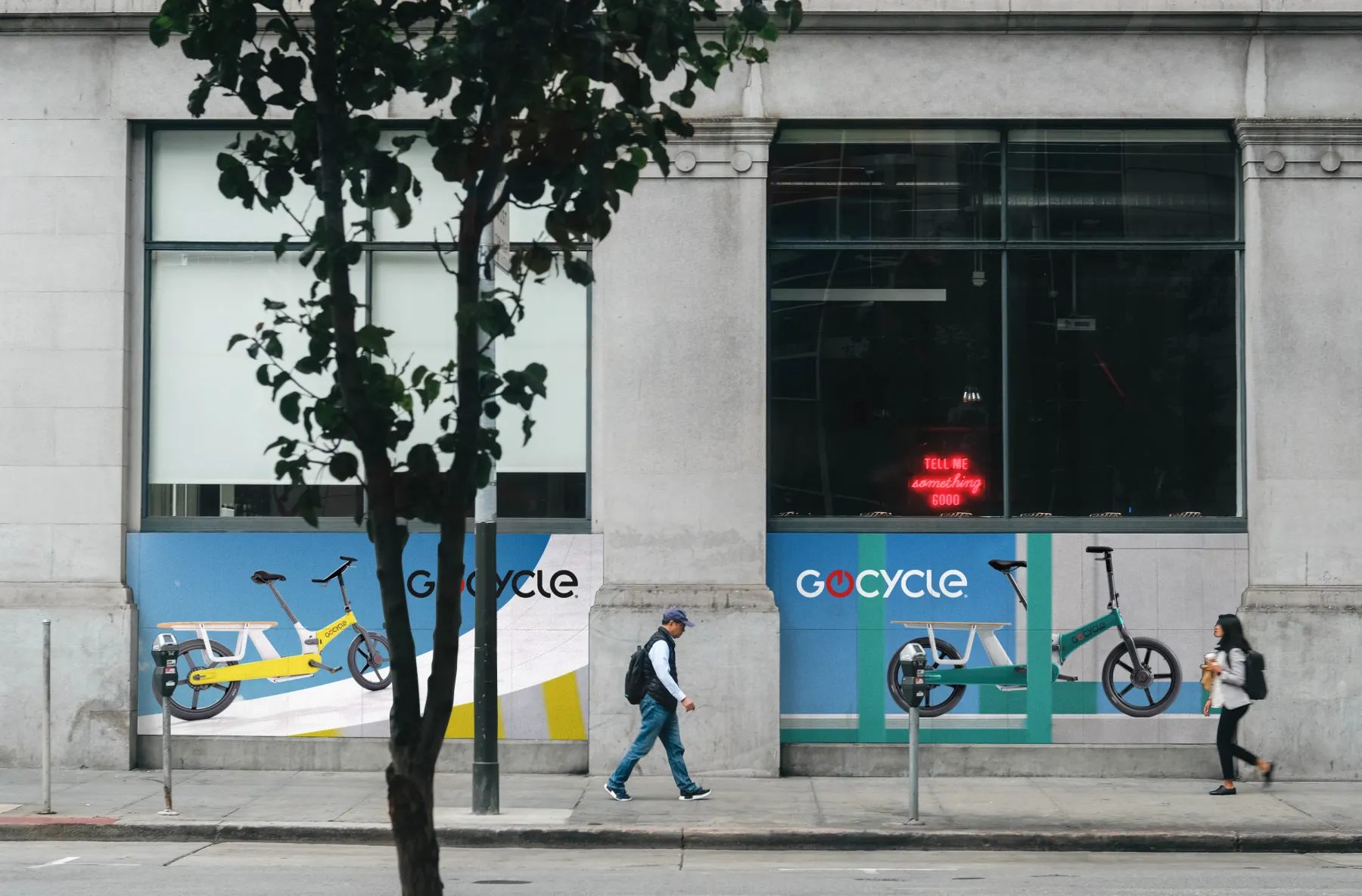
The Gocycle design language extended into its digital characteristics. Among many e-bike firsts, Gocycle was the first to come with a Bluetooth app. This turns an owner’s smartphone into a digital dashboard which attaches neatly to the Gocycle handlebar.
VERSATILITY
An ever expanding palette of livery colours requires the logotype to be adaptable to work across different tones and shades, from monotone to vibrant, unmissable colours. The new logotype is simple and strong, flexing well to deal with any placement scenario.
PROPRIETARY DESIGNS
Our bespoke typeface allows us to develop logotypes for Gocycle’s proprietary technology such as their Cleandrive®, Lightpipe® and Flofit® designs, all aimed at building a set of branded components that add value to the end consumer.