WE CRAFTED THE PERFECT IDENTITY FOR SKINCARE START–UP TRUE. THAT’S WHAT THE DRAGONS THOUGHT
- Client True Skincare
- Scope Brand Strategy and Visual Identity
Creating a new British beauty brand
With a storied background in the British beauty industry, Emma Thornton decided to launch her own range of high quality, affordable, organic skincare products, and achieved listing in 70 stores nationwide in June 2018. Following the success of the brand’s launch, True is now stocked in six leading UK retailers; Ocado, Holland & Barrett, Look Fantastic, Feel Unique, Boots and Birchbox with more to follow in the second half of 2021
Pull worked with Emma to conceive and craft an identity for the brand. Bringing the brand’s twin values of honesty and transparency to the fore, TRUE skincare was born.


The Challenge
While most oils and skincare products on the market claim to be organic, the real percentage of ‘organic’ ingredients is in fact very low. Emma resolved to create a truly organic range, whose purpose was one of honesty. But how do you turn this into a meaningful brand? How do you visualise a concept like ‘honesty’ and convey that across a range of packaging and digital assets that need to stand out among a crowded marketplace?

What we did
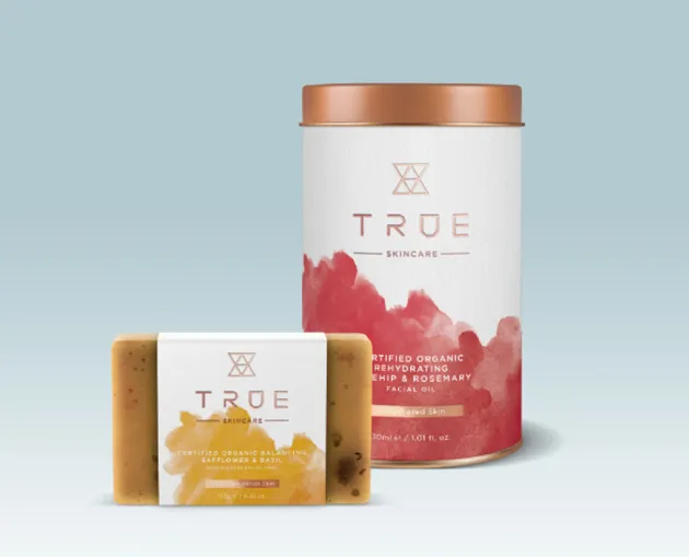
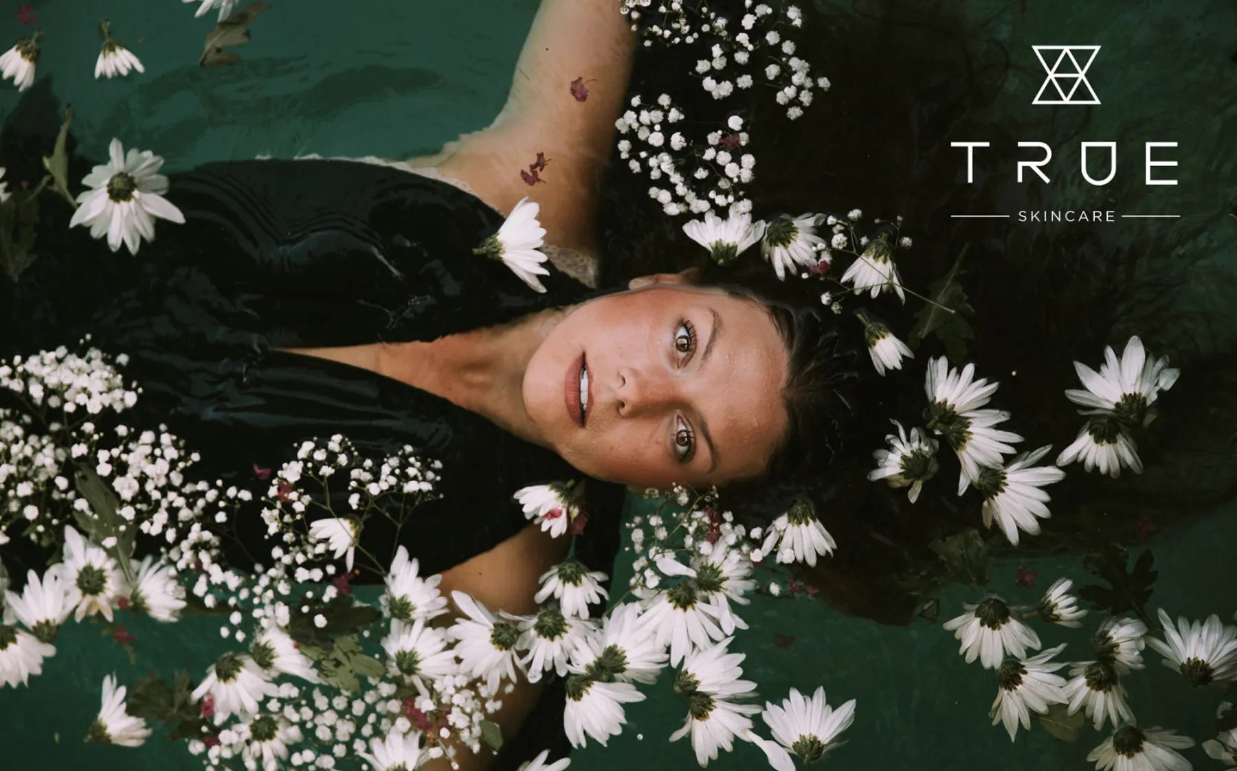
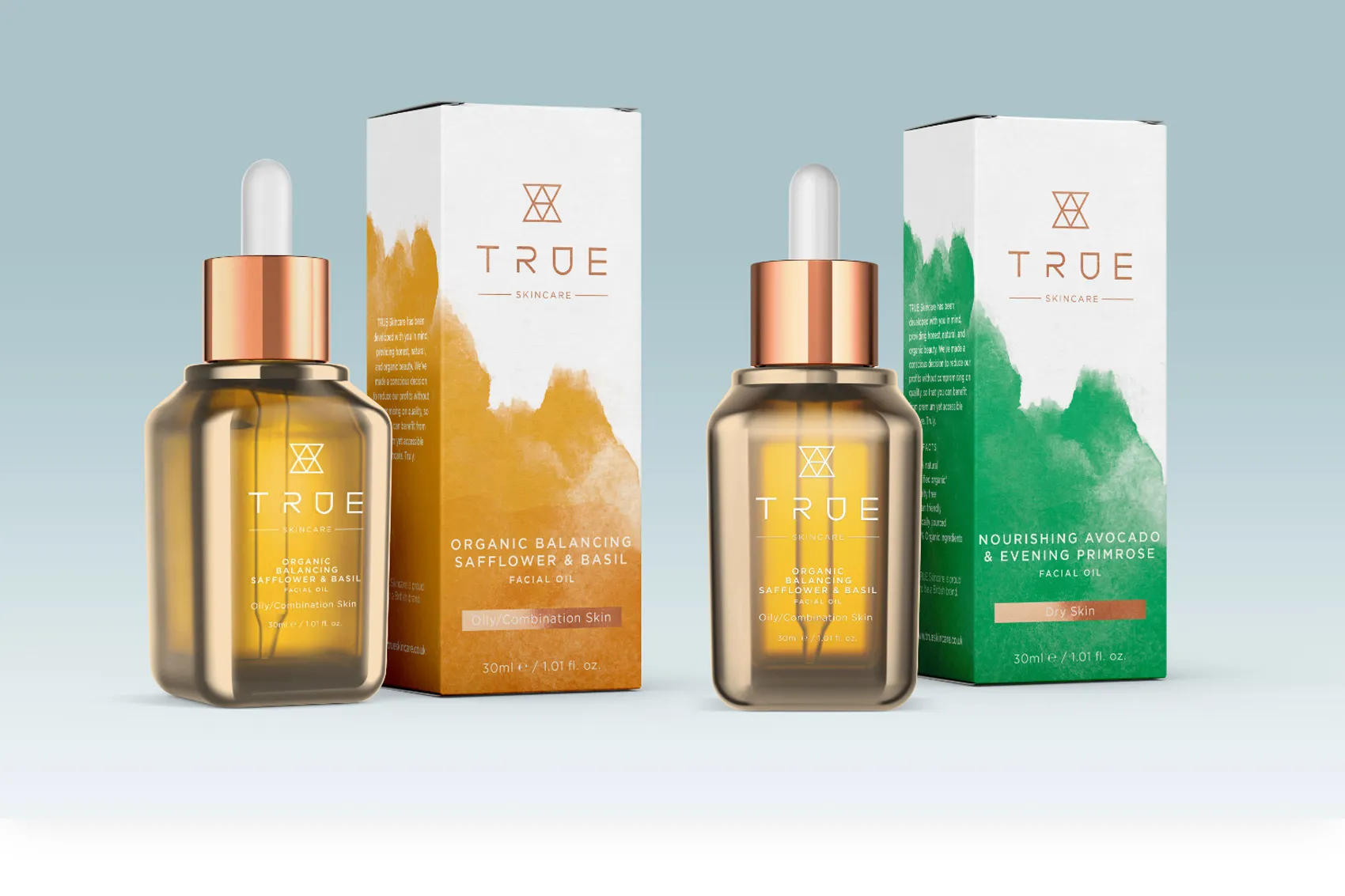
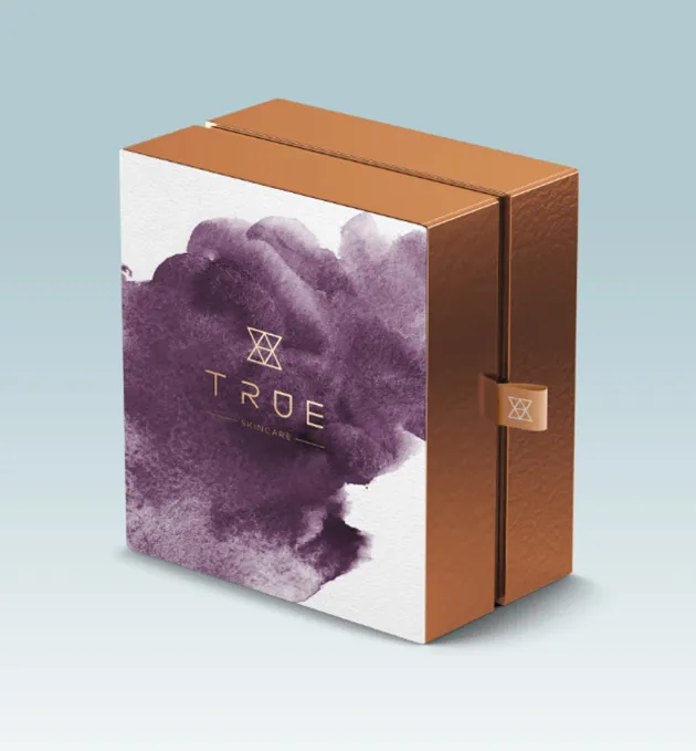
Our creative team explored what ‘true’ meant; literally, metaphorically and in symbology. What does the concept of truth look and feel like? Essentially, it’s about stripping away the superfluous and unnecessary and getting back to the essence of what matters. This took us in the direction of origins. Raw, untainted elements. Unadulterated ingredients. The basic elements - Earth, Air and Water.
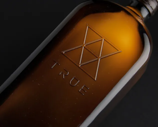
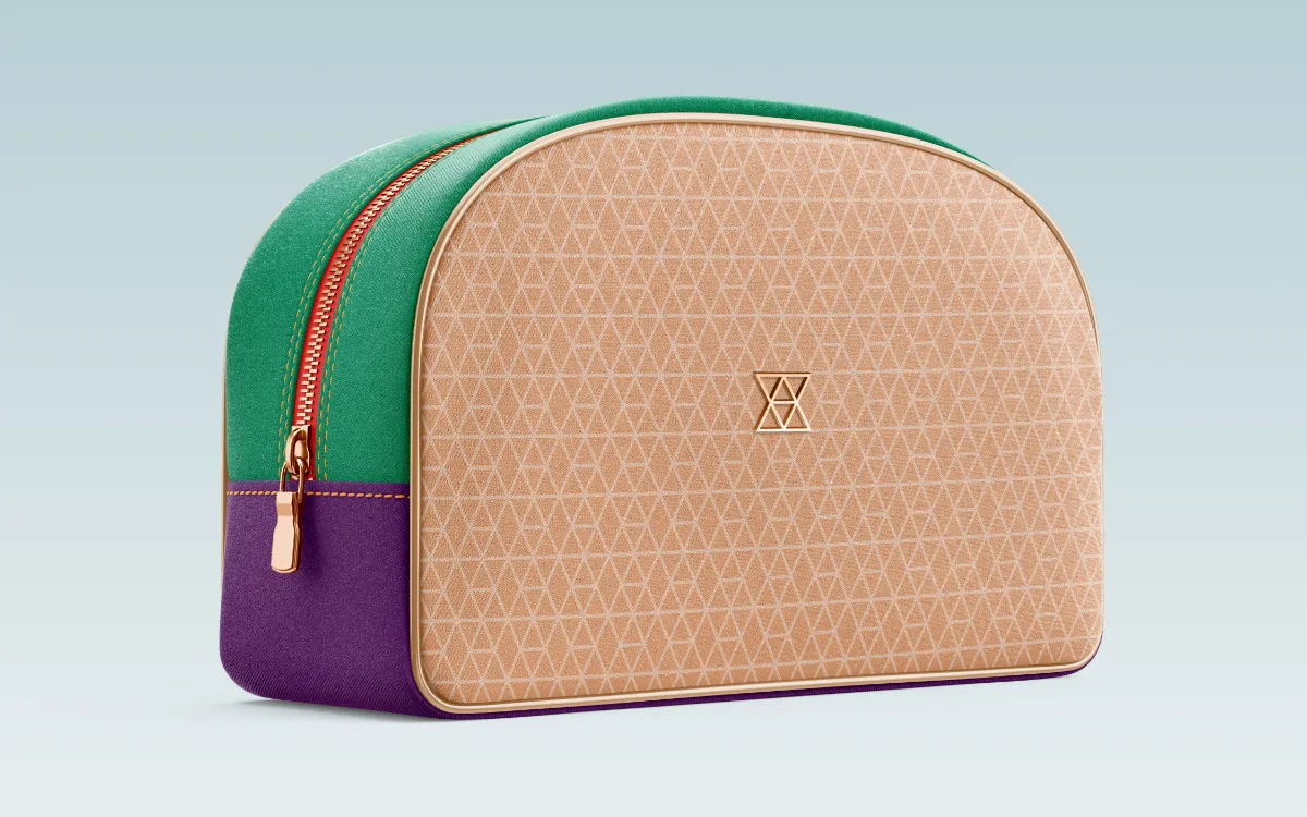
Using these elements as a starting point, we looked to the ancient rune symbols for Earth, Air and Water. A series of triangles inset with horizontal marks, when overlayed these three symbols create the TRUE marque. We also developed a simple sans serif custom logotype that has a ‘rune style’ and compliments the marque.
The Results
Within the first six months of launch, TRUE skincare could be found in 70 stores and was selling fast. The number of stocking stores increase to 230 in 2019 and the brand was listed with Boots in 2020. By 2021 True was stocked in six leading UK retailers: Ocado, Holland & Barrett, Look Fantastic, Feel Unique, Boots and Birchbox.
To date True Skincare has won 15 awards including ‘Best Value Skincare Brand in 2020’ and is regularly featured by UK beauty editors.
But another chapter in the history of TRUE was about to unfold.
TRUE SKINCARE MEETS THE DRAGONS
In April 2021, True skincare founder Emma Thornton appeared on BBC TV Dragons’ Den. Her pitch was one of the best ever received and led Dragon Sara Davies to say:
“Great product – the branding, the packaging. . .is fantastic”
True received investment offers from four of the five Dragons (Deborah Meaden, Peter Jones, Tej Lalvani and Sara Davies). And after some negotiating, she struck a deal with Deborah Meadon.
“From the moment I mentioned my vision, they just got it, delivering something truly unique, thoughtful and beautiful.”
“We’ve received such an incredible response since launching the brand and I can’t thank the Pull team enough for making this vision a reality.”