Putting wellbeing at the heart of a traditional mail-order supplement business
- Client WOODS HEALTH
- Scope CONSUMER RESEARCH \ BRAND STRATEGY \ IDENTITY
INTRODUCING WOODS
Established as a mail order brand in the eighties, Woods were in a way ahead of their time. Bypassing high street distribution, they were able to offer low prices, and our consumer research indicated a large and loyal audience of older people. The Pull Agency’s Brand Blueprint™ for Woods aimed to evolve the brand from an old school mail order company to a vibrant and up-to-date looking brand with a clear proposition and some emotional impact. Thus providing appeal for new Gen X & Millennial customers targeted by online campaigns, while not alienating Woods existing customer base.
SETTING THE SCENE
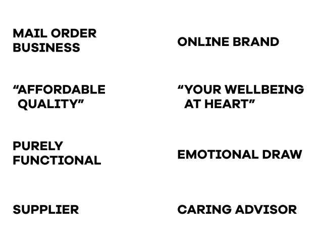
Attracting new, younger customers to a loyal ‘Boomer’ base, and evolving Woods from a traditional mail order business to a more vibrant, more caring online brand.
Woods Healthcare started in the mid-eighties offering supplements via press ads and home-delivery. Buying healthcare supplements is an act of faith. But people still shop around. The consumer’s dilemma is: I want good value – but I also need a brand I can trust. Customers have no empirical basis for believing that their purchase contains either the exact ingredients or strength of formulation stated on the pack.
Our research showed that Woods customers appreciated the brand’s excellent value, and experience had taught them to trust what Woods said on the pack – something they had learnt not to with some other value brands.
BRAND BLUEPRINT™
These methodologies rely on consumer research and an approach that results in a Brand Blueprint™. The Blueprint contains immutable building blocks that defines (among other things) the purpose, vision, values, personality and narrative of the brand.
The Blueprint created a basis for evolving the brand with a personality to suit a new customer demographic, while at the same time retaining appeal with the existing customer base. It recommended evolving the personality of the brand as suitable for new online campaigning that targeted generations of consumers not currently buying from Woods, but who were also interested in the role that supplements could play in their health and wellbeing.
We determined that the brand should be evolved as shown, and this implied the need for a new identity to reflect the evolved personality capable of generating a positive feel and real affection.
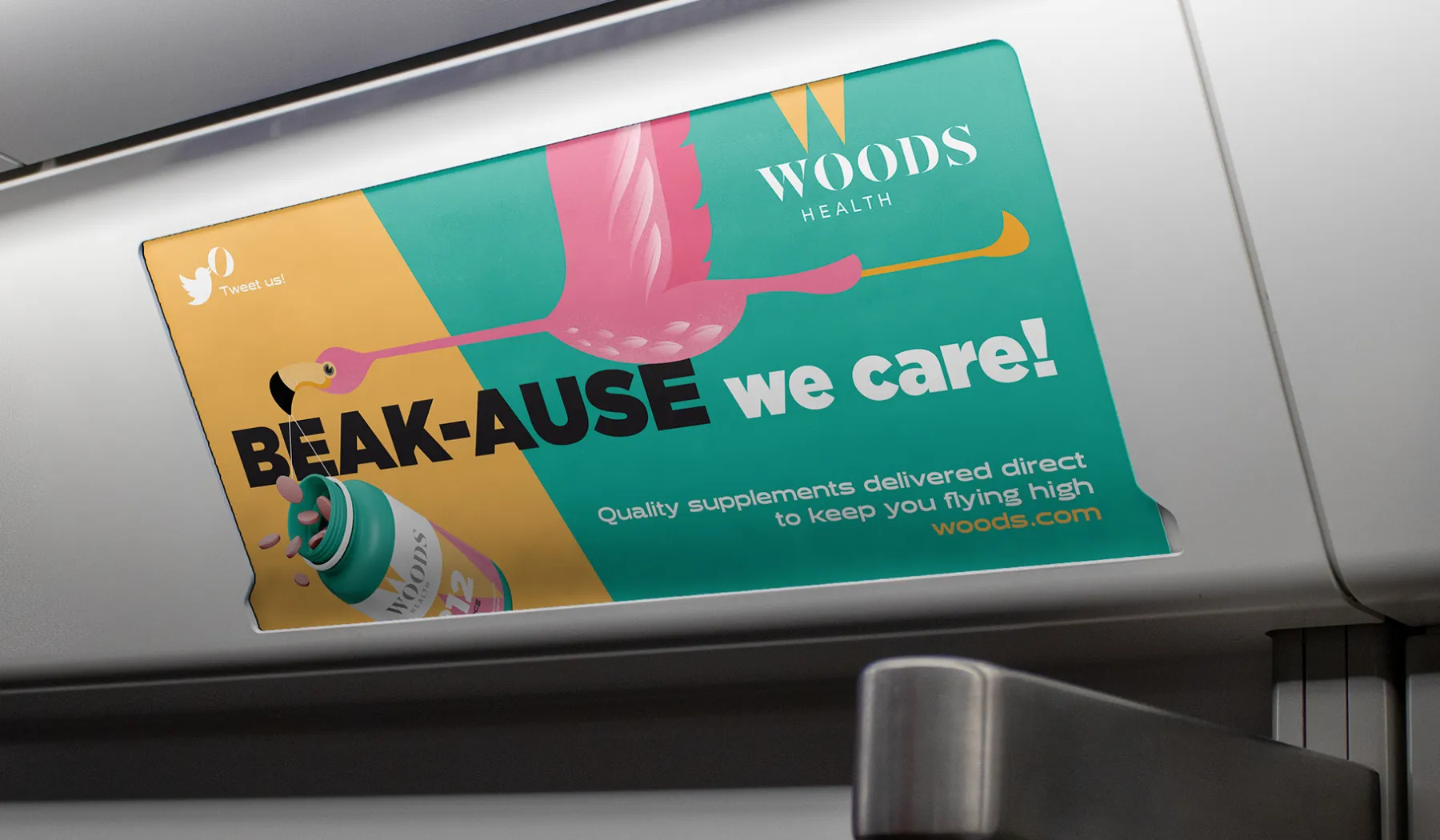
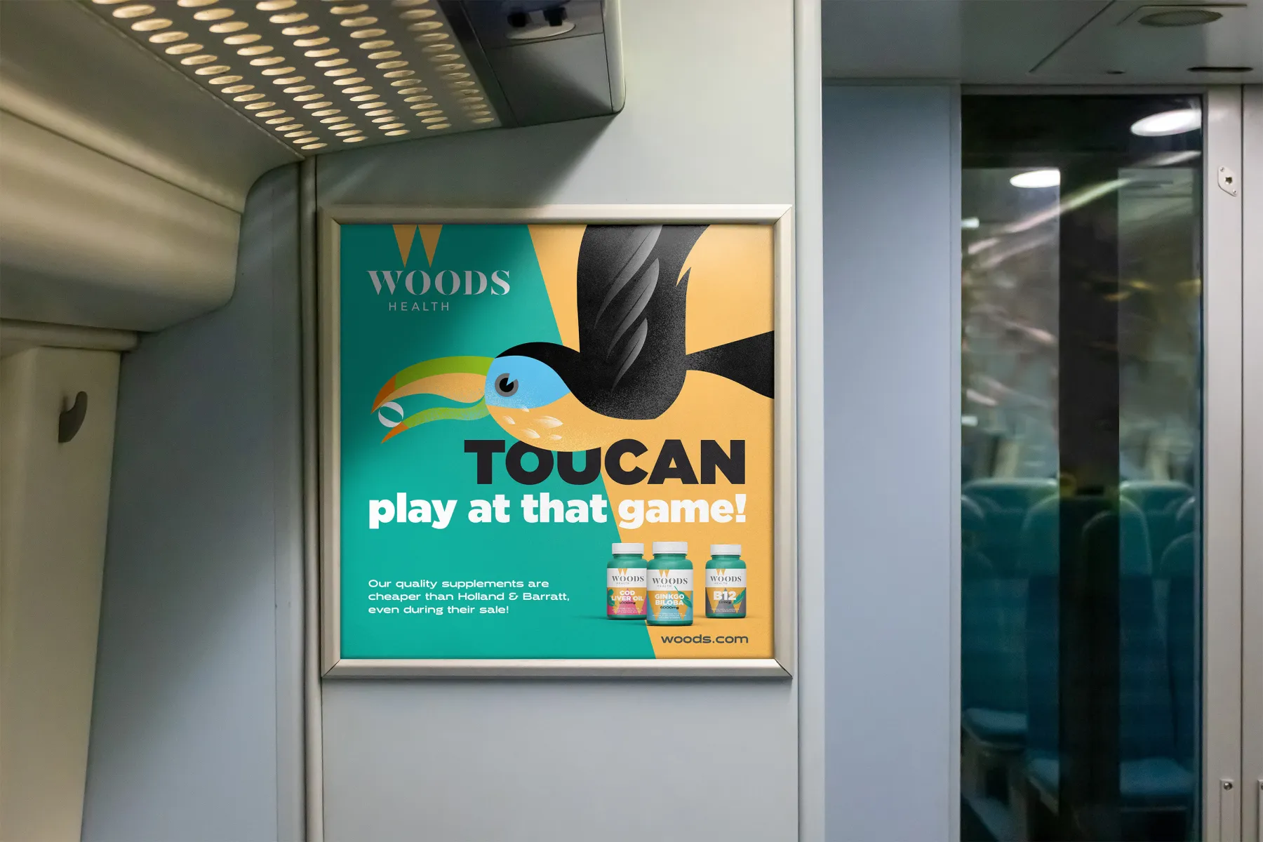
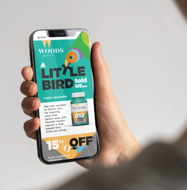
WHY BIRDS?
“Woods health cares, reliably delivering quality vitamins & supplements at the best possible prices”. The brand promise distilled down to our tagline, Your wellbeing at heart, called for something that could evoke an emotional engagement with the audience. But that symbolism needed to be more than just warm and fluffy - it needed to represent a deeper meaning from the brand allowing us to convey an authentic brand essence with confidence.
Our research found that birds are commonly used to symbolise care, but are also used to represent ‘delivery’, offering direct synergy with Woods history as a mail order company. Alongside the opportunity afforded by the variety of species and their character as well as vibrant colour, birds seemed an obvious solution.
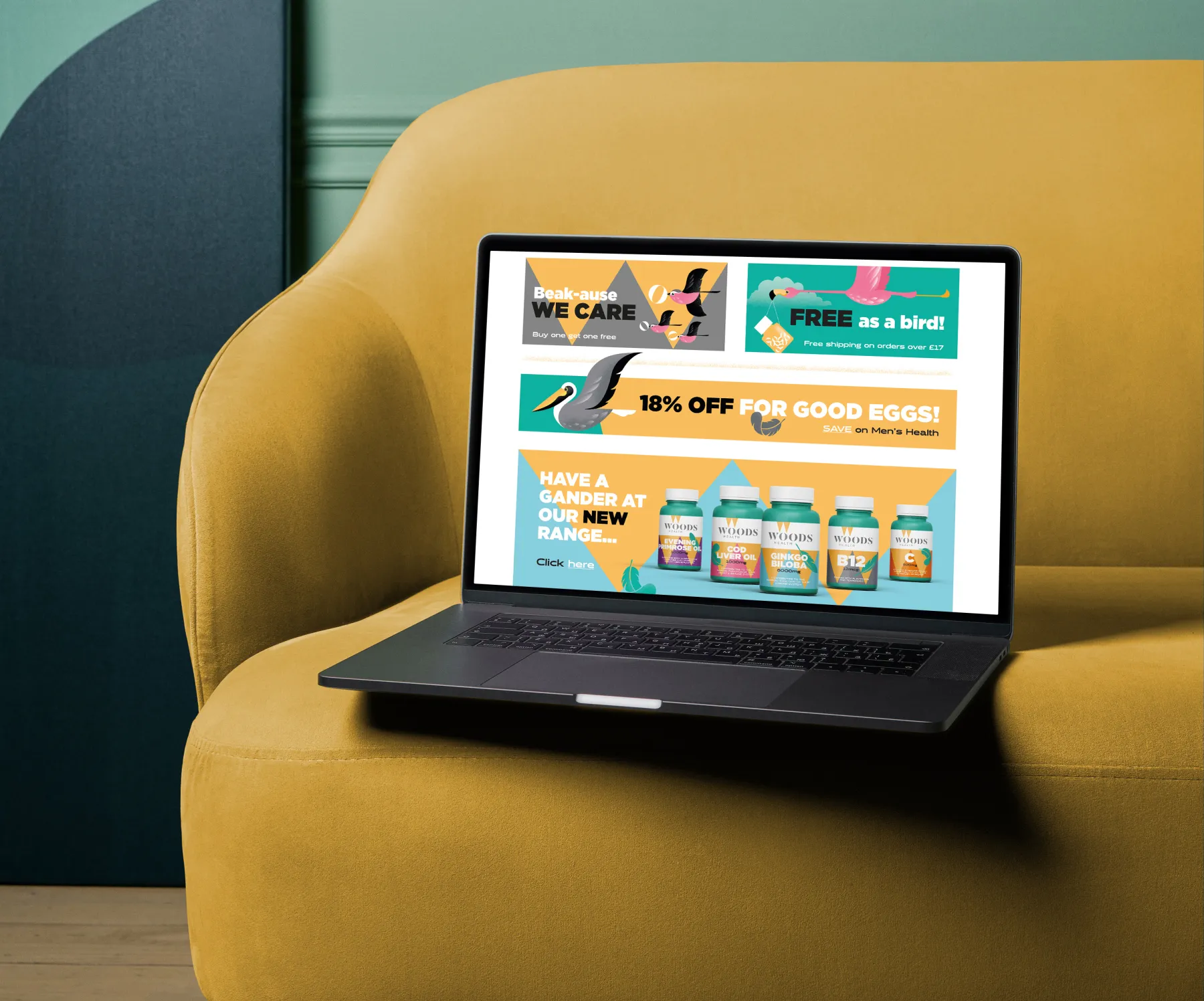
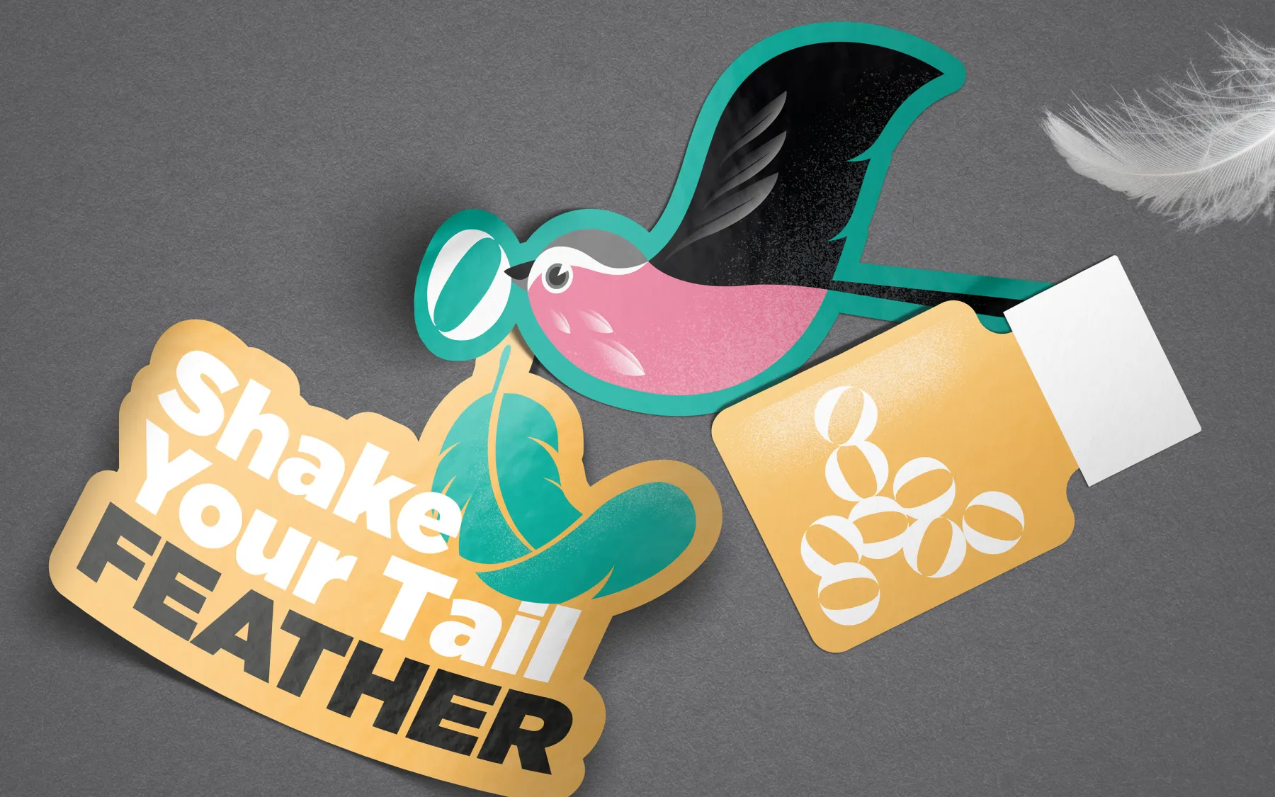
THE FLOCK
We developed an illustrative family of birds as the foundation of the identity. The Woods ‘Flock’ then give us a visual narrative, in the first instance acting out a story as the deliverers of Woods supplements to the customer. Secondly becoming advocates for the brand with their bright, healthy plumage.
Our chosen set offers a good selection of sizes, colour and character, allowing flexibility in the way we use them, bringing the brand to life.
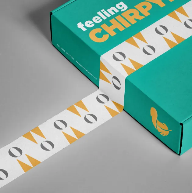
In order to strike the right balance, the birds are reserved for marketing purposes. To maintain the link a feather is used on-pack, suggesting that they have been left behind by the birds during delivery.

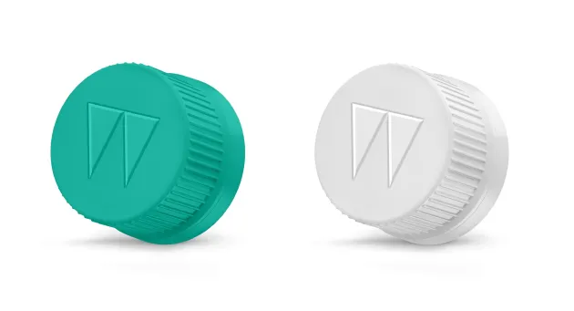
THE LOGO
Our bird narrative led directly to our logo marque for Woods. While exploring the theme of a bird delivering the supplements to the customer, its beak offered itself up as the perfect ‘W’ insignia - too simple too ignore, too beautiful a link to dismiss!
When looking for a logotype style, the double-O character combination within the Woods name seemed a gift in that it already goes some way to mimicking supplements/pills.
When we looked closer at some common pill shapes the perfect character style became evident.
Woods where also reticent to show photographic pills in all instances, so developing an illustrative impression gave us the perfect vehicle to use when representing a generic product set.
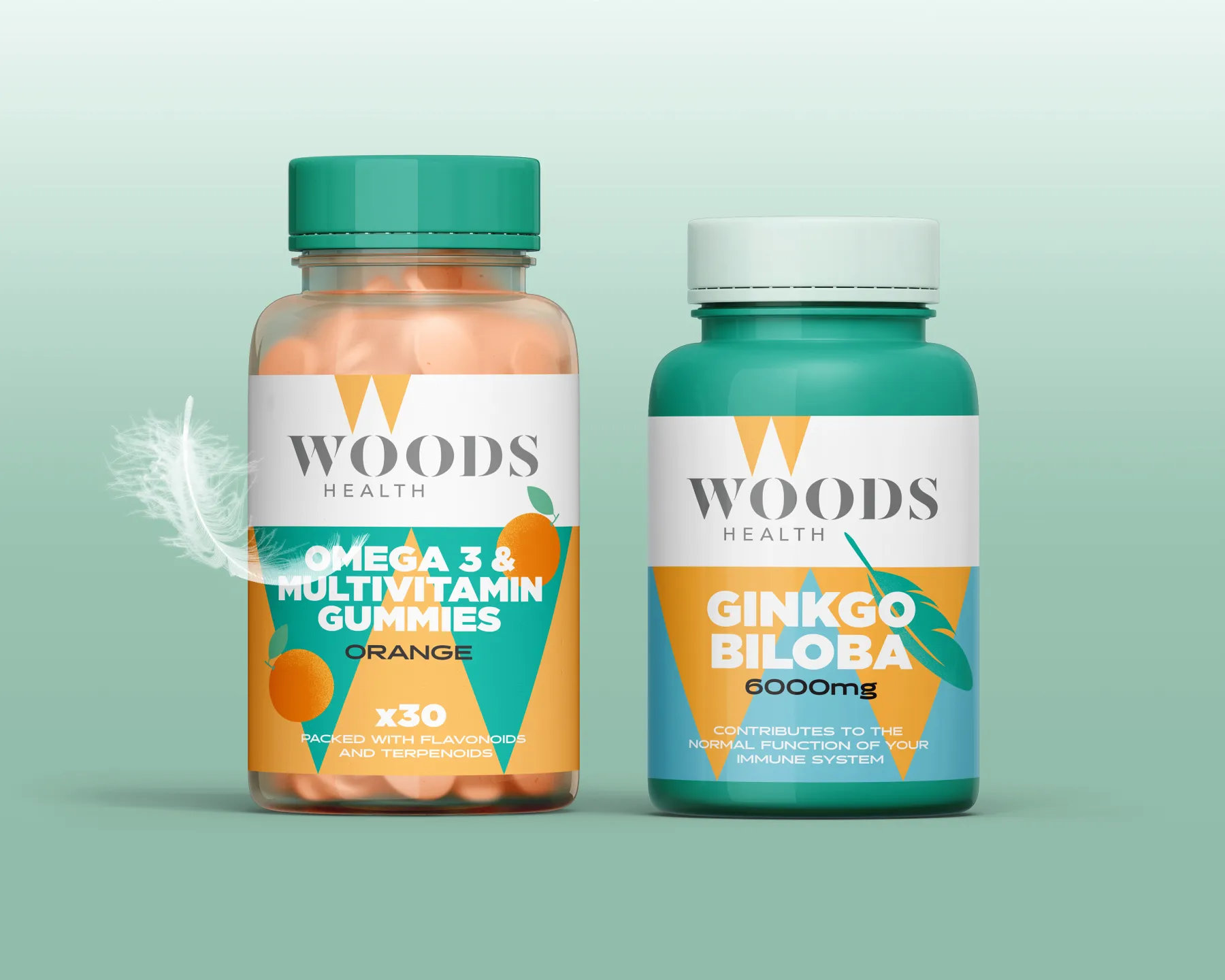
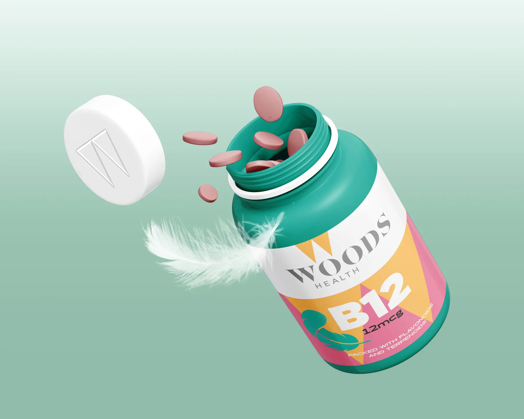
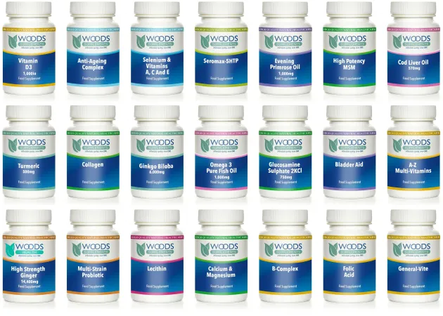
PACKAGING
Much of the market display busy, complex labelling with little personality. Simple, bright, easy to select and read with clear benefits was the plan, alongside distinct, uncluttered branding.
COPYWRITING
The bird theme also lends itself to playful and characterful copy, further injecting personality into what was previously a very dry approach.
DIGITAL
The brand toolkit provides strong, distinctive components and colours that enable a bold and confident approach, with a cellular design alongside cheeky copywriting. It also begs to be animated!
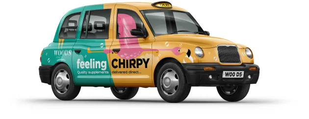
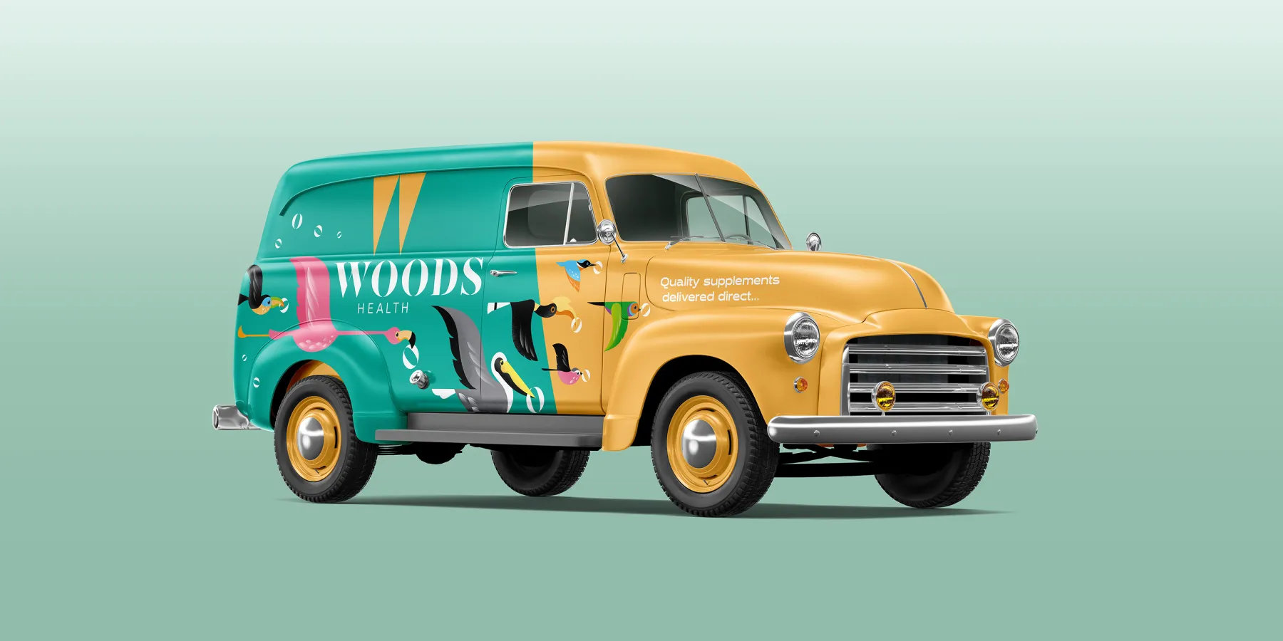
PROMOTIONAL
Our distinct brand assets bring any communication format to life, whether that be an event, pop-up display, a simple promotional element or the packing that the product is distributed in. Each develops a strong visual link to the brand.
“The Pull Agency were instrumental in helping Woods overcome our core business challenges. THEIR exceptional creative work expresses the brand personality beautifully, with a new and distinct look and feel that’s full of character and charm.”