
Why custom illustrations need to die…sort of
So, just to clarify right at the start of this blog, I’m not saying custom illustrations are necessarily bad. They can still add a fresh and unique feel to a site and allow the brand to show character.. The problem is custom illustrations are becoming so generic, in many cases, that they’re really not ‘custom’ anymore.
This particular style of website has been especially prevalent in tech and cryptocurrency sites, in an attempt to give some character, to a sometimes characterless and rarely physical product.
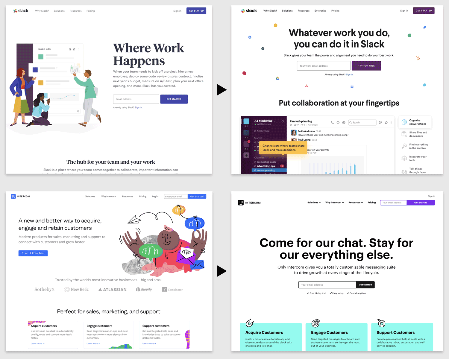
Well known products such as Slack and Intercom have all gone down the illustration route in the last year, but are already stripping their sites right back, as can be seen above.
They are just a few of many companies now hopping off the bandwagon, probably on to the next trend, as is the way with the web.
So, with that in mind, if you do want to go down the illustrated route what are the positives and the negatives of this approach? Let’s go through them now (as I don’t want to put you off entirely, I’ll start with the negatives and finish with the positives):
THE NEGATIVES
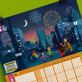
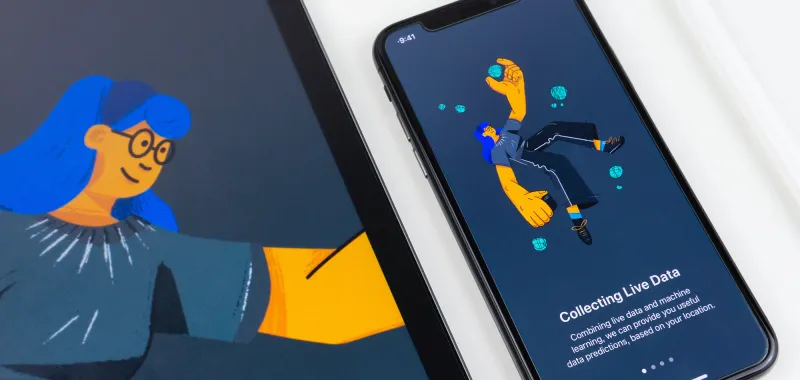
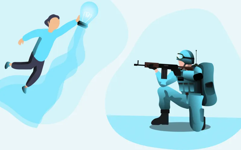
Looking generic
It’s a strange dichotomy, but in the quest to stay current and unique, many sites have proceeded to apply the same style and colour scheme to their ‘custom’ illustrations, making them look the same as everybody else. A quick Pinterest search will show you the issue.
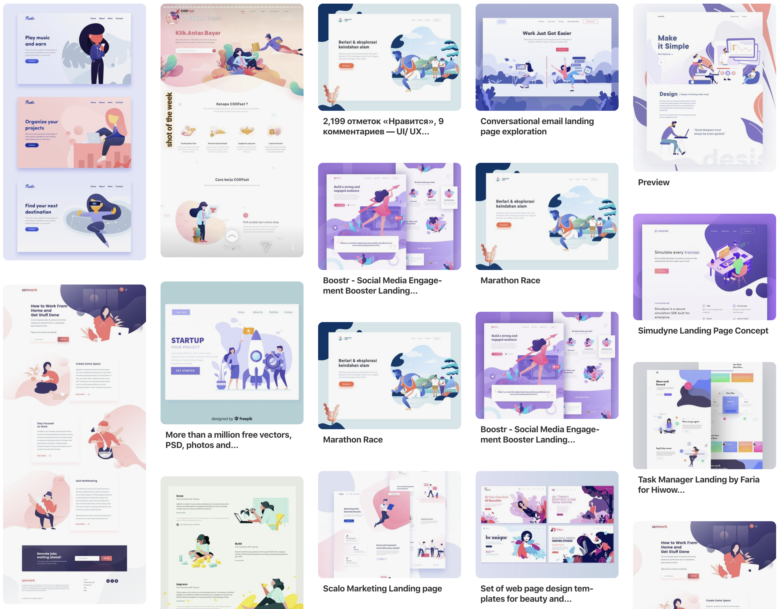
Flat illustrations, pastel colours, organic ‘blob’ shapes. If you are using any of these, you’ll probably need to do a site refresh within a year to stay unique.
Ability to create unique layouts
Another consideration, particularly if you have an active team constantly adding landing pages and new content to your site, is the ability to add new and fresh illustrations to convey your message. Being hamstrung by the same library of graphics can impede the ability to make quick changes and can lead to many pages looking the same.
Unless you have a library of hundreds of unique illustrations, you will start running out. Meaning you’ll have to pay somebody to come up with new ones. This is why 100% illustration-led sites are so challenging to keep fresh.
Illustrations that don’t work without explanation
In a similar way to which icons have to be understood by a user in order to make an interface work, illustration-led sites often suffer with visuals that don’t really explain their message properly. They are often nebulous and make no sense without accompanying copy to explain them.
This can be challenging for a user quickly scanning a page. It’s important the visuals alone can explain the message. It doesn’t have to bash a user over the head, but at least give them an idea of what might be going on, with the accompanying copy reinforcing the meaning.
THE POSITIVES
You can stand out from the crowd if it’s done right
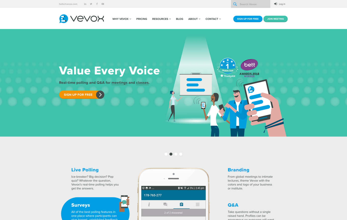
All the more difficult when everybody is doing the same thing, but when done well and avoiding common trends, you can create a very positive and memorable user experience. It’s definitely easier to get wrong than right, but here at Pull we’ve done a number of illustration-led sites (like Vevox shown below) which have really engaged users and help our client differentiate itself from competitors.
Complimenting photography
Nothing beats truly original photography, and if that can marry up with your illustration style you have a huge range of layouts available from a content standpoint and can avoid your entire site looking flat and pastel coloured like in a lot of the example images in this article.
The contrast between these approaches can add impact to a landing page and get people converting, which after all is what people are there to do.
Mailchimp have an interesting combination of illustration and original photography on their site.
Adding life with animation
An animation has the ability to convey a story that can enrichen a user’s experience. Sometimes it’s hard to only use words and static imagery to explain a function of your site, or the way a process works without it being boring. Illustration lends itself well to animation and can add an immersion that’s both informative and memorable to the user experience. If you can’t explain something easily, show them instead.
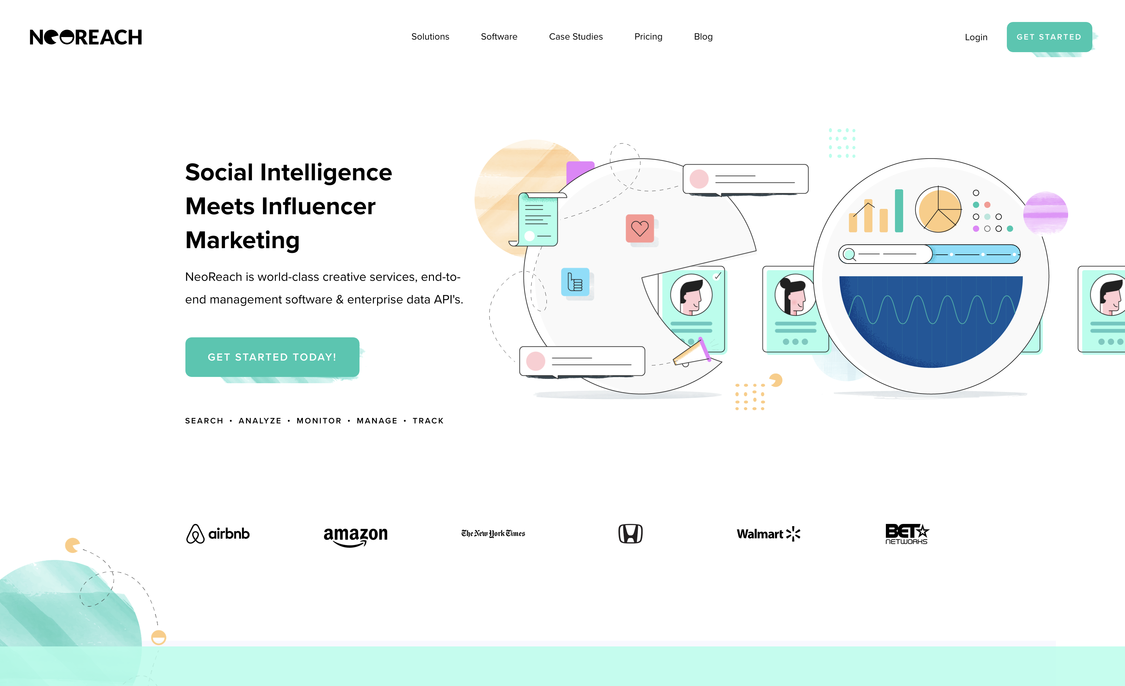
A site like NeoReach is an example of how illustration can be done well and stay unique. It uses original illustrations that don’t follow a lot of the trends you see. Yes, it’s still a ‘bit pastely’ but it feels clean and doesn’t use a lot of organic ‘blob’ shapes. It’s also a refreshing experience in the way it animates illustrations to convey a bit of character and meaning to the words alongside. It’s hard to ignore, but not in your face.
Custom illustrations are very ‘in’ at the moment. It’s true that the more on-trend you go, the quicker your site will date in a year’s time. If you are going to implement this style, then you have to make sure you aren’t using existing libraries of illustrations which might crop up elsewhere. Or of you do use common libraries then make sure they are modified to differentiate them.
The web has always been very trend-led; and being right on the upward curve is essential of you are going to follow them. The illustrated style is definitely on a plateau, but it’s not heading downwards just yet.
Just be aware the next big thing is just around the corner, with some sites already becoming more stripped back in direct response to the trend. But if you have a unique take on the style you can still really make an impact.
Posted 5 August 2019 by Shaun Levett