

Designing the Gocycle Dash App
Gocycle reinvented the wheel, we reinvented the Gocycle app... then we did it again! A look into the design decisions that went into the best e-bike app in the market (if we don't say so ourselves).

Avid followers of our blog might remember our post last summer about reinventing the Gocycle app.
Well, since then, we’ve tweaked a few things to make it even better!
The previous iteration was all about pre-setting the controls for the bike: modes to cycle in, speed, when the motor kicks in, power usage. This was very handy and allowed you to customize your ride in advance. However, once Gocycle had developed the technology, we set about updating the app to act as a dash for the bike itself – so you can customize your ride on the go.
The two key things we set out to improve were the visuals and the usability. If you’re using an app while cycling, you need to be able to read information and make changes without it distracting you from the road. Our challenge was to streamline and simplify the app while evolving the visual identity to make it more appealing.
The core questions we asked ourselves were: what is the most valuable information to cyclists while they are cycling, and how can we elevate this information visually so that users can absorb it as easily as possible?
The first thing we did was move the format from portrait to landscape, and to reduce the app to a single page. It needed to be simple, bold, and accessible.

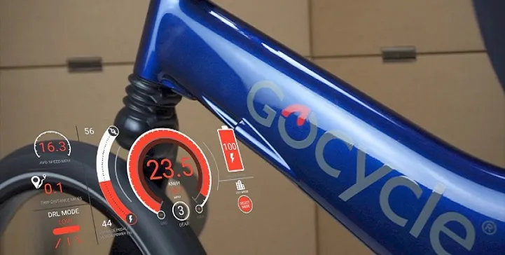
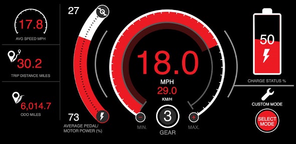
Our market research for Gocycle had revealed that their main audience were gadget-heads who love cars and value the automotive experience. So we took inspiration from car dashes when designing the app. The most prominent facet is thus the speed marker, but rather than using a more traditional dial, we went for a big red bar circling in an arc around a large number to indicate the speed: it’s impossible to miss, and neatly evokes the roundel shape of the Gocycle logo. The gear is clearly visible in a circle underneath. We echoed the speed dial’s curvature with a second arc to show the rider’s power input vs. the bike’s power input. We kept the traditional battery icon to make this crucial piece of information immediately obvious (you don’t want to get stranded with a drained bike!) and there’s also a clear button that allows you to change cycling modes easily.
Other information, including average speed and miles travelled, adds to the cycling experience, but is less essential during the ride itself, so we made these less prominent in order to declutter the dash.

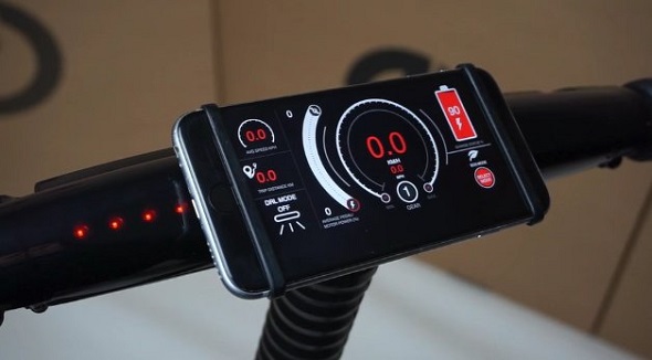
All of this means that, when combined with the Gocycle’s new smartphone mount, users have the most advanced e-bike app around, which forms an intrinsic part of the Gocycle user experience.
Read more about our work with Gocycle!
Gocycle Live Dash from Gocycle Support on Vimeo.Posted 1 June 2017