

'Future-proofing’ your designs

How do we predict the direction that Christmas design is going to take, two years in to the future?
For the past few years, Schwarzkopf Professional has briefed us to come up with the creative direction for their Christmas campaign. Working two years in advance can be tough, as the truth is, that we don’t know for certain what the general public will pick up as a trend and what won’t make the cut. So, how do we do it?
To get the best result possible we look to many sources and strategically plan our proposed concepts. These are defined through a rigorous research and development process that takes in to consideration the coming year’s trends, previous year’s Christmas themes and how current design trends are developing. In addition, we look to the worlds of fashion, art and design as well as leaning on trend forecasters.
The Brief
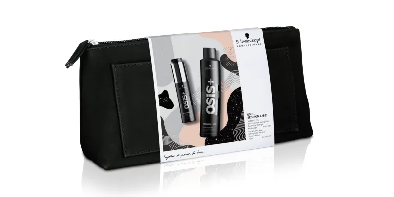
In the case of Schwarzkopf Professional, our brief was come up with a creative concept that will work across packaging and salon POS (point of sale) that communicates the luxury and prestige of Schwarzkopf Professional products. For the packaging it has to be customisable to each of the different ranges, of which there are many. For the POS, it has to embellish and enhance model shots while also working across digital platforms.
But what about Christmas? Well, another challenge is that the designs need to be ‘Festive’ not ‘Christmas-sy’ as we can’t include any overt references that are too literal for Christmas. This restriction rules out anything to do with reindeer, snowmen, baubles, candles, holly, etc. So, our Christmas concepts have to include subtle hints to festivity and we communicate this through colour palettes, print finishes and the overall theme.
From our extensive experience with partnering on Schwarzkopf Professional across multiple product rebrands and launches, we understand that they want a luxury but accessible feel. It should stay away from heavy dark colours that can look old-fashioned and traditional. The product needs to play a hero role in the design and not be over-powered by the design elements.
So, armed with all this knowledge, how do we come up with creative proposals predicting trends for two years hence? With the added paradox of creating a design for a Christmas campaign that doesn’t use any of the typical Christmas themes (but is exclusively for Christmas)?
The Process
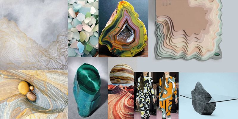
The first place to start is haute couture fashion. Haute couture always works well ahead of its time with themes being translated to ready-to-wear fashion within the next year and to the high street stores within two years. This timeframe is similar to the one we work to, so it is a logical place to start. As Schwarzkopf Professional works within the fashion and beauty industry, this is a deeply relevant area that they appreciate thorough exploration of. To begin, we ask questions around the thought process behind the designs; what are the themes that are emerging from the runway; where are the fashion houses finding their inspiration; how are they translating this in to a visual form? To define this stage, we build moodboards of the trend and explain our rationale behind examining the theme.
After this we look for references to the theme within fine art or art history to find more context. This helps to provide a wider frame of reference for the design, understanding when and where it’s been used in history and what the underlying message of the theme is. This can help with mapping how people will perceive and react to the design. If this turns out relevant to the design we find visuals of the examples and explain the role they play in providing context for a design.
Once passing these two checks, we look at current design and packaging trends. By looking at what is currently trending, this helps us to determine how these trends are developing, if there is a certain style that is emerging or the longevity of a trend. Some are short-lived (cue unicorn everything), whereas others have the potential to continue for years (pastel-coloured beauty products). We create a further moodboard that maps these influences and show relevant work and ideas for how to develop and differentiate from it.
A final check is to cross-reference the theme with exhibitions, design shows, blogs, articles and lectures. This ensures that there is a thorough search across multiple platforms to find out what has been done before in this theme, how a new spin can be put on it, or whether there is a gap in the market and occasionally to come to the conclusion there isn’t much design work done under a certain theme.
This year’s outcome

This year Schwarzkopf Professional chose to follow a geologically inspired contemporary pattern. We saw a lot of geological references emerge in fashion, particularly ready-to-wear and combined this with an up-and-coming packaging trend of flat contemporary patterns. Geologically influenced designs had been forecast as a trend for Autumn/Winter 2018. The multi-layered nature of geology and its beautiful rock formations are a visual metaphor for richly coloured hair. This theme combined the bold distinctive contemporary patterning with the fashion influences of intricate crystal formations with their subtle hues and details. This theme had the potential to be customisable for the breadth of the Schwarzkopf Professional product range and while being flexible in its application to various different POS.
The process of defining a trend, over a year in advance, that we 100% believe our client should follow never gets any easier, if anything it gets harder year on year. Consumers are increasingly visually-minded and even more focused on the look and feel of packaging and if it fits with their lifestyle. The wealth of beautiful packaging out there makes for pretty stiff competition, which is why we ground our conceptual thinking in a huge amount of research and references. This is what makes our work different and ensures that there is depth and meaning to the work we produce. We aren’t jumping on the band wagon, but looking to a range of sources for inspiration and finding our own path to the considered, and also beautiful, conclusion.
Posted 22 November 2018