


Back to the Future - Brand Style
Recently quite a few ‘big name’ companies have been going back to their traditional brand roots, CO-OP and Coke to name a few. We look into the phenomenon.

With the new Elizabeth line launching at the end of next year, we’ll all soon be seeing a splash of vibrant purple on our trips between Reading and Heathrow. This re-branding of Crossrail to the Elizabeth line seems to have been a relatively simple decision on the part of TFL, keeping the classic tube station roundel and apparently only costing £5k to rebrand.
This got us thinking that in some cases, where the brand is so well known, sometimes the simpler and more traditional the re-brand the better. Not only do you not have the backlash of a public that typically hates anything new, but you also maintain your strong brand identity.
Recently quite a few ‘big name’ companies have followed a pattern of going back to their traditional brand roots, CO-OP and Coke to name a few.
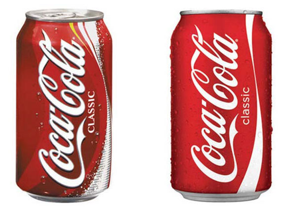
For brands such as these this is a smart decision, by drawing on the strong nostalgia that consumers feel when they see something from their childhood it not only makes them want to reminisce about how much bigger chocolate bars were ‘back in the day’ (and they were! We all remember the Toblerone scandal…) but it also highlights just how long that brand has been around. If you can boast like Coca Cola that you’ve been around since 1892, it shows that although inevitably the world does change, some things never do. This instils a, very hard to manufacture, strong type of brand loyalty and connection with the product which can’t easily be replicated.
Whilst some companies have gone back to the past for re-brand inspiration, there have also been cases in which brands ditch their classic brand identity. Receiving some serious backlash from the general public as a result.
This includes the re-brand of the clothing store Gap back in 2010, the new logo received an outpouring of negative comments on social media, and to be honest you can see why.
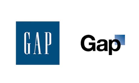
The problem with the re-brand was not only that the old Gap identity was so well known, but the new logo does nothing to recognise that fact within the new design, effectively throwing away any kind of brand recognition and loyalty it previously had. There’s nothing at all in the new logo that references the old, only a pathetic fading square of blue and some truly dull and corporate font.
The hate felt for the new identity meant that Gap hastily retracted its new logo, saying ‘we did not go about this the right way’.
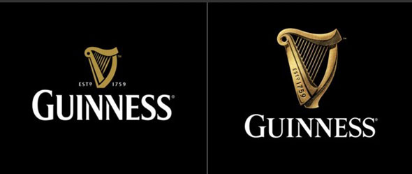
A more tasteful example of a re-design which recognises the strong feeling that the public have for well-known brands, is the new Guinness logo.
The new design keeps the iconic harp, slightly alters and updates the font and makes the ‘established’ date even more prominent, inscribing it on the harp. This re-design recognises that history is important, by not only keeping the general look and feel of the whole design, but by emphasising the historical date and making the harp larger, bringing the classic elements of the logo to the forefront of the design.
The logo draws on the strong sense of Guinness pride, craftsmanship and history and summarises what Guinness’s brand mantra is all about.
Posted 11 October 2017