We created a new British beauty brand for online beauty giants allbeauty.
- Client At1
- Scope Brand Strategy & Visual Identity
reviews
Combining research-led brand strategy & design to create At1 Skincare, a new British beauty brand
At1 Skincare was born out of allbeauty’s desire to create a new skincare brand with ethics and sustainability at its core. Because beautiful skin shouldn’t cost the earth.
Pull helped allbeauty bring this vision to life. A Brand Blueprint™ and naming options followed initial market research conducted by Pull. From there, we developed a compelling story and visual identity for the brand while running a research panel to evaluate product formulations and price sensitivity. Feedback on the finished brand in terms of consumer consideration was among the highest we have seen.
The Challenge
As one of the UK’s largest beauty retailers, creating its own skincare brand seemed like an obvious route for allbeauty. The overarching challenge lay in creating and establishing this as a skincare brand in its own right, not just an allbeauty own-label.
With ethics and sustainability at its core, allbeauty envisioned a range of natural products with an uncompromising approach to quality, efficacy ethics and the environment, but available to consumers at an affordable price.
Rather than a point of entry to the market, many of these characteristics are now hygiene factors to today’s consumers - how could we create a brand that was not only effective and sustainable, but with a compelling proposition that was distinct enough to succeed?
Developing the foundations of the brand
First, we needed to understand today’s skincare shopper. Beginning with a survey of 2,000 consumers and their skincare habits, we uncovered key insights into the allbeauty consumer, from their lifestyle & media habits through to their skincare needs and how they shop the category and discover new products.
This work was vital in distilling the customer journey, solidifying our target persona, creating detailed category insights and offering valuable feedback on key messages and value proposition; all of which would inform the creation of the brand blueprint™: a consensus on key brand components such as vision, purpose, and positioning - the foundation on which all further brand decisions, from design to communication strategy, are built.
Transforming brand strategy into a brand identity
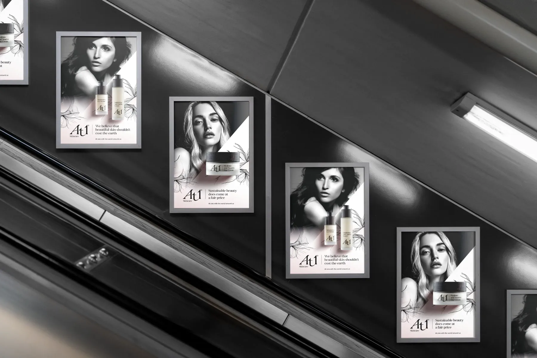
The next step was creating a visual identity that reflected the premium position desired by allbeauty. How could we bring these ideas to life across all their touchpoints, from the packaging through to digital?
To craft the brand identity, we followed our creative process, one where the science of research, visual audit, insights and behaviours are balanced with the magic of ideas, imagination and inspiration.
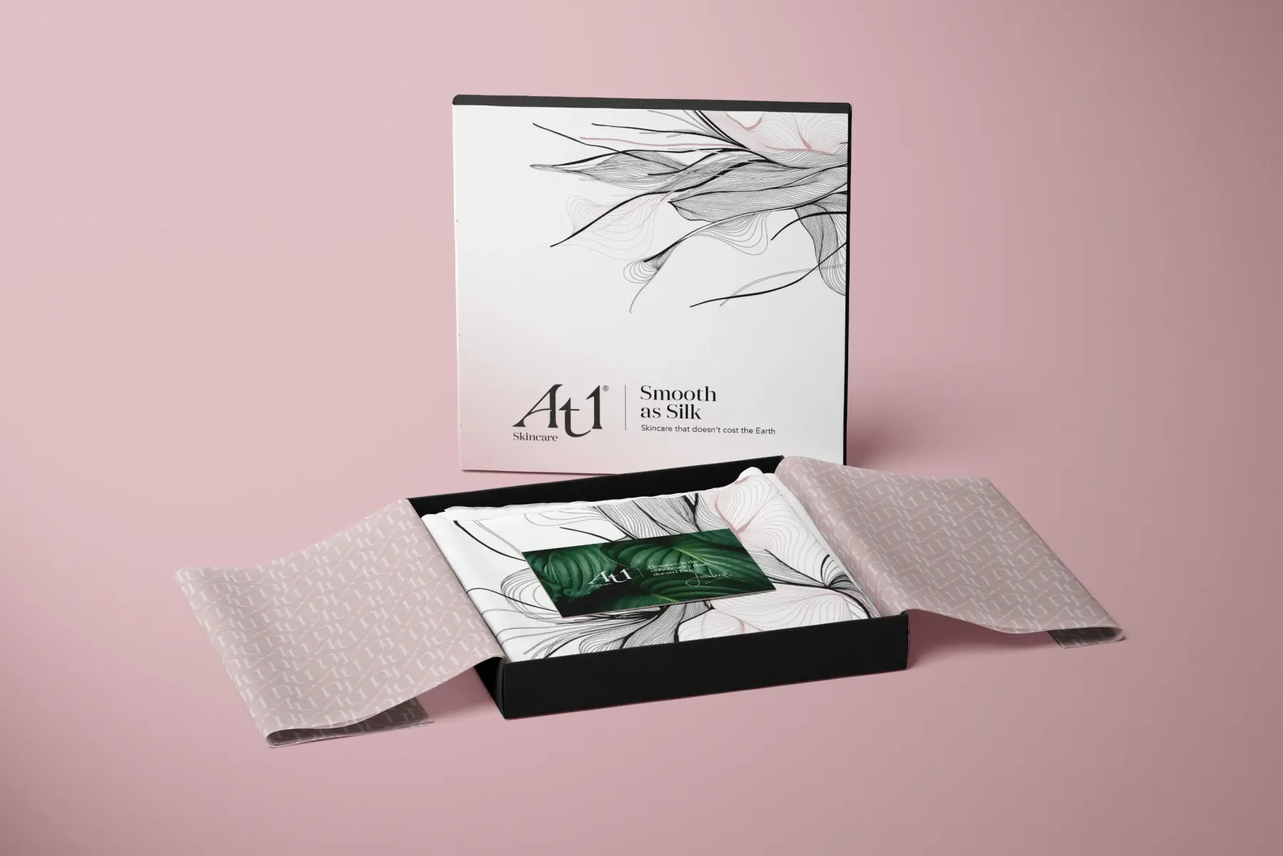
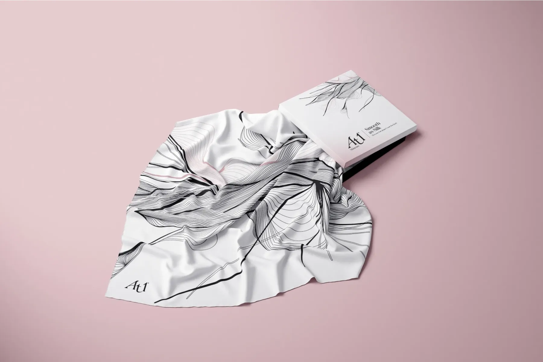
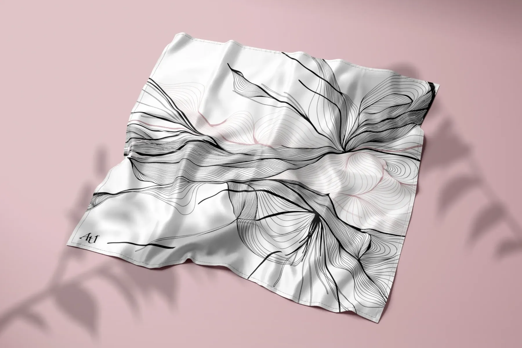
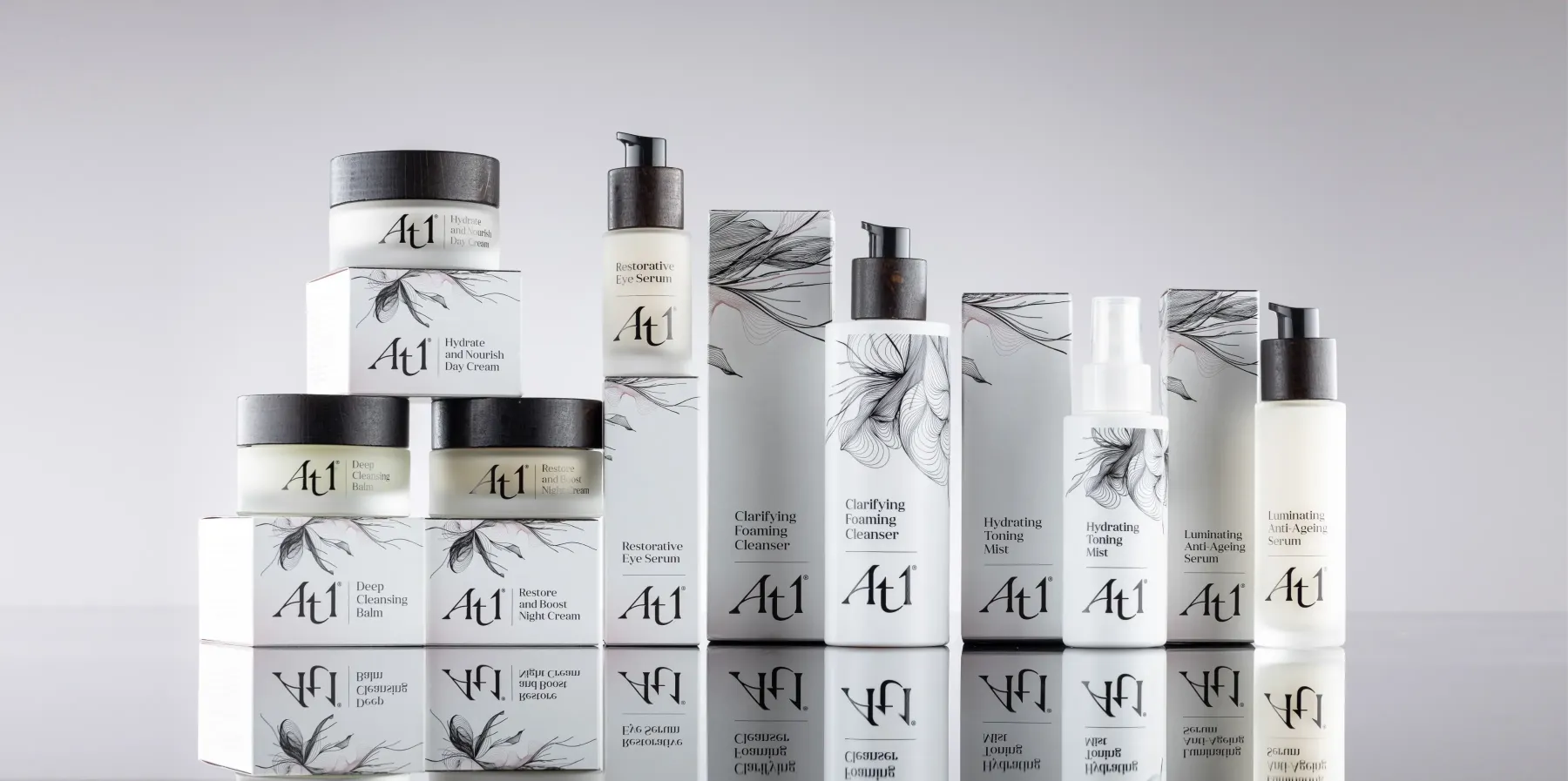
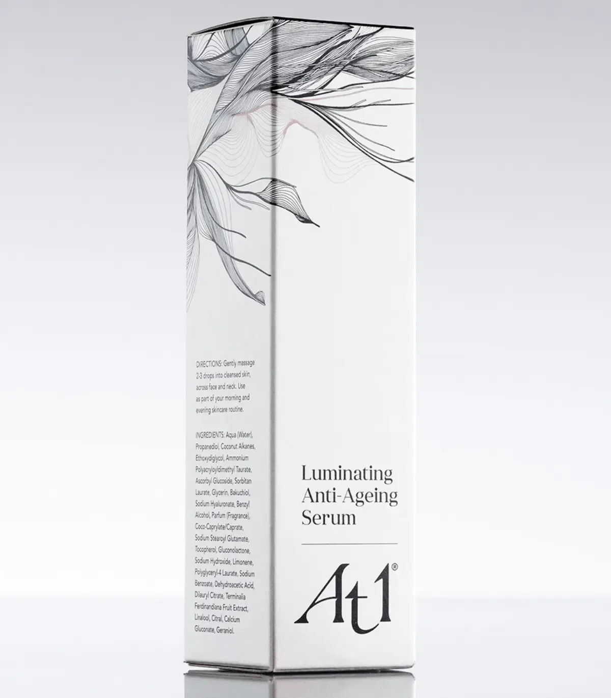
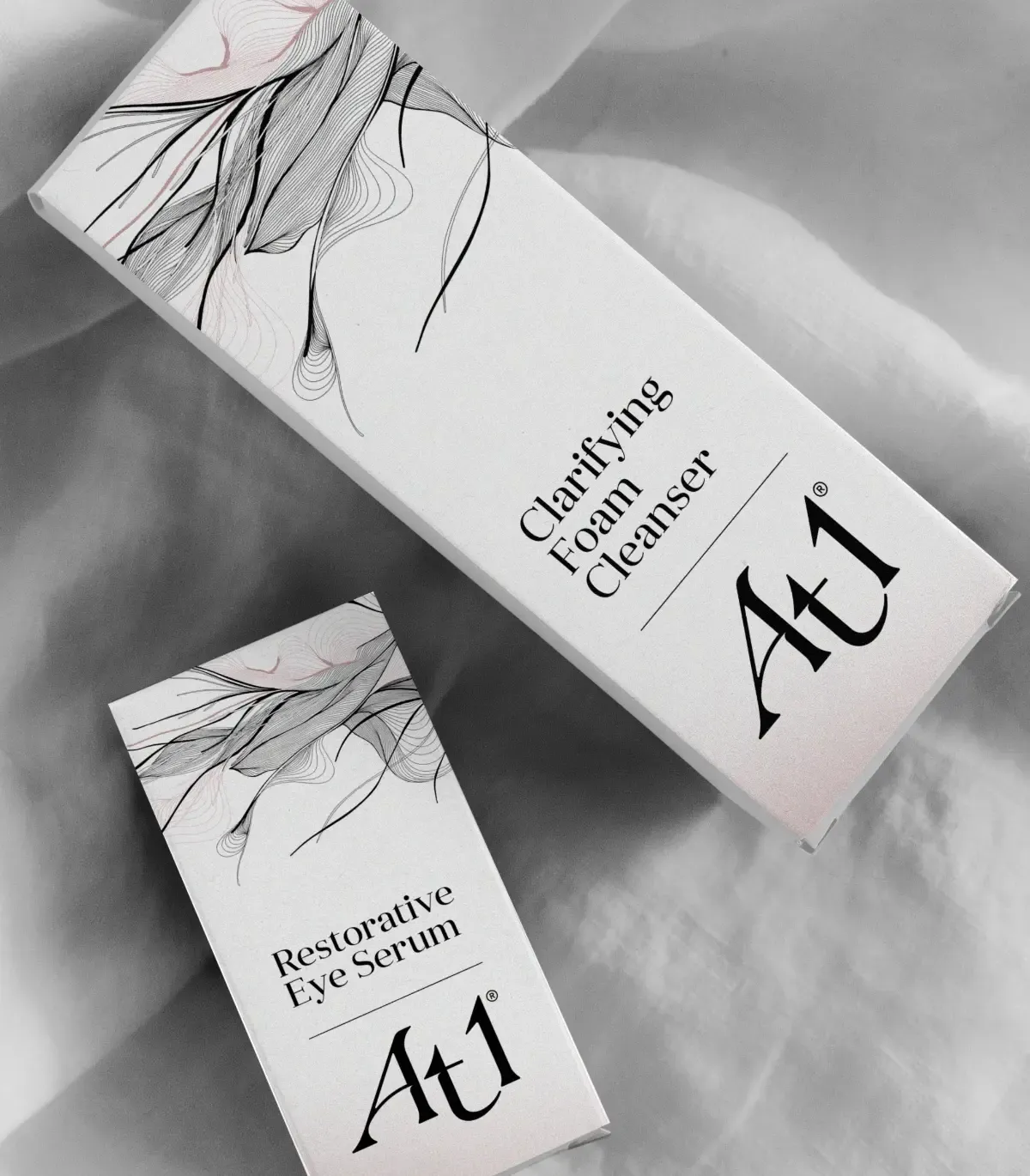
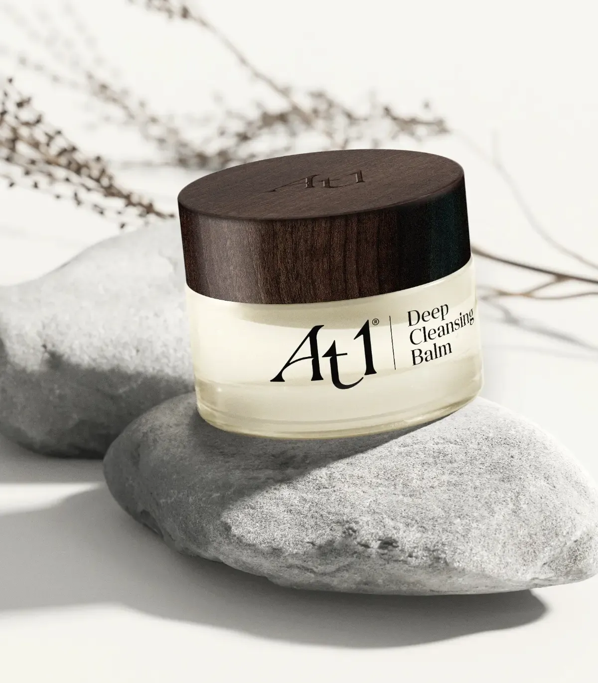
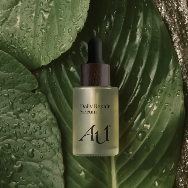
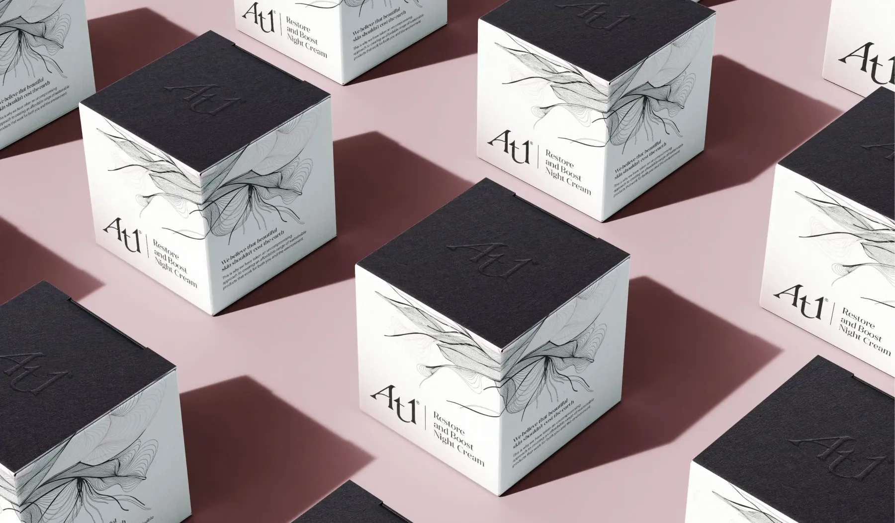
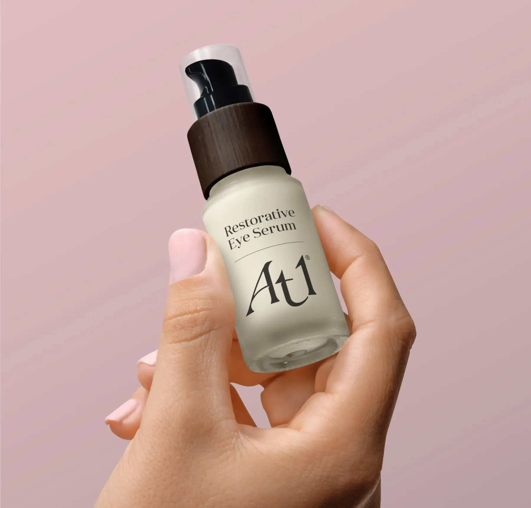
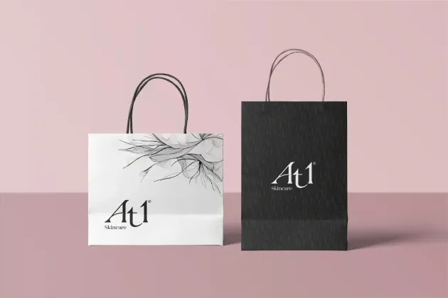
It was this process that spawned At1 Skincare. A brand with an intrinsic understanding of the category, its customers and their desires, one that is driven by a desire to be clear and honest, whilst having an innate connection to the earth, attuned to what it means to be clean and ethical. We discovered and collaborated with artist Justine Ashbee to complete At1’s visual identity. The outcome: beautiful ink drawings that were both fluid and organic with a lightness of touch, yet the detail within was precise and ‘constructed’, communicating that balance that we were looking for.
To help the brand flourish, this identity was brought to life through a fully-realised visual identity, including the creation of the At1 logo, brand guidelines, product packaging & POS materials and other creative assets including video and animation.
Product testing panel
The proof of the pudding is in the eating. Drawing on our extensive consumer research experience, we convened a product testing panel consisting of 100 women who we enlisted to test seven new products over a 4-week period.
From this panel, we were able to clarify consumer impressions of the product formula, both immediately and over time, confirm their preference on the brand’s visual identity while also providing insights on the brand proposition, packaging and price.
As well as validating the personas created during the Brand Blueprint™, this feedback was invaluable, allowing us to develop stronger claims and further refine and enhance copy and key soundbites.
The Results
The response to the brand and feedback on the new products was some of the best we’ve ever seen, described by our research panel as “beyond amazing”, while there was also praise for how the range came together: “I like how the individual products complement each other”. However, the reaction was best summed up by one user, who simply commented: “love, love, love everything”.
Consumer reviews on allbeauty.com like “Love this own range of beauty products by allbeauty” have led to 94% 5 star ratings. They are further testament of consumers’ passion for At1 skincare.