Everyone is familiar with the rise of Chinese brands in the West. But how do Western brands break into China?
- Client EMERGING COMMS
- Scope BRAND STRATEGY \ VISUAL IDENTITY
SETTING THE SCENE
Emerging Comms has a unique model with resources on the ground in China and a distinct approach that understands both East and West, and measures success through sales.
But the brand didn’t look distinct or even look like what it was. Categorised by B2B buyers as the least distinct brand in the category, it needed an identity that brough this vibrant business to life.
GENUINELY DIFFERENTIATED BUT NOT DISTINCT
What was revealed by our Blueprint™ process was that Emerging Comms was less a traditional advertising, marketing or digital agency and more a consultancy. All of their clients had the same problem. Achieving sales in China was essential to their plan, but they had failed that aim. This could always be traced to false assumptions about, and a failure to fully understand important cultural differences between Chinese and Western consumers.
Pull determined that the brand should be positioned as the serious player that actually delivers what the others only promise to. To do this, something about Emerging Comms’ unique insight into the Chinese consumer would have to be brought into the brand’s new identity. The revised identity and messaging should also help clients who not only want a presence in China – but have to win in China.

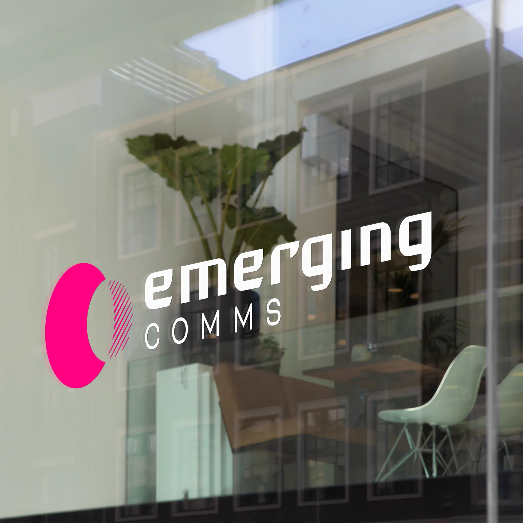
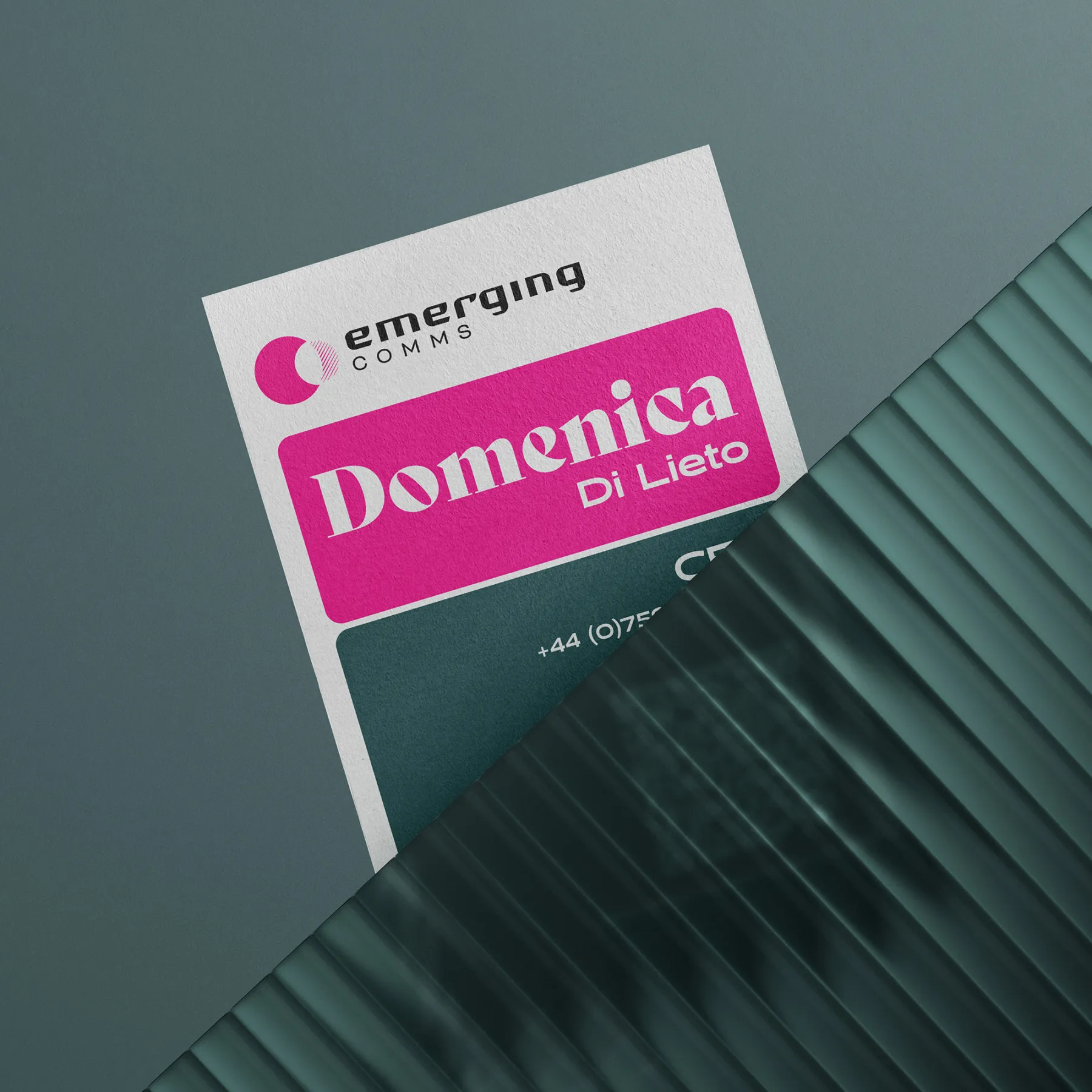
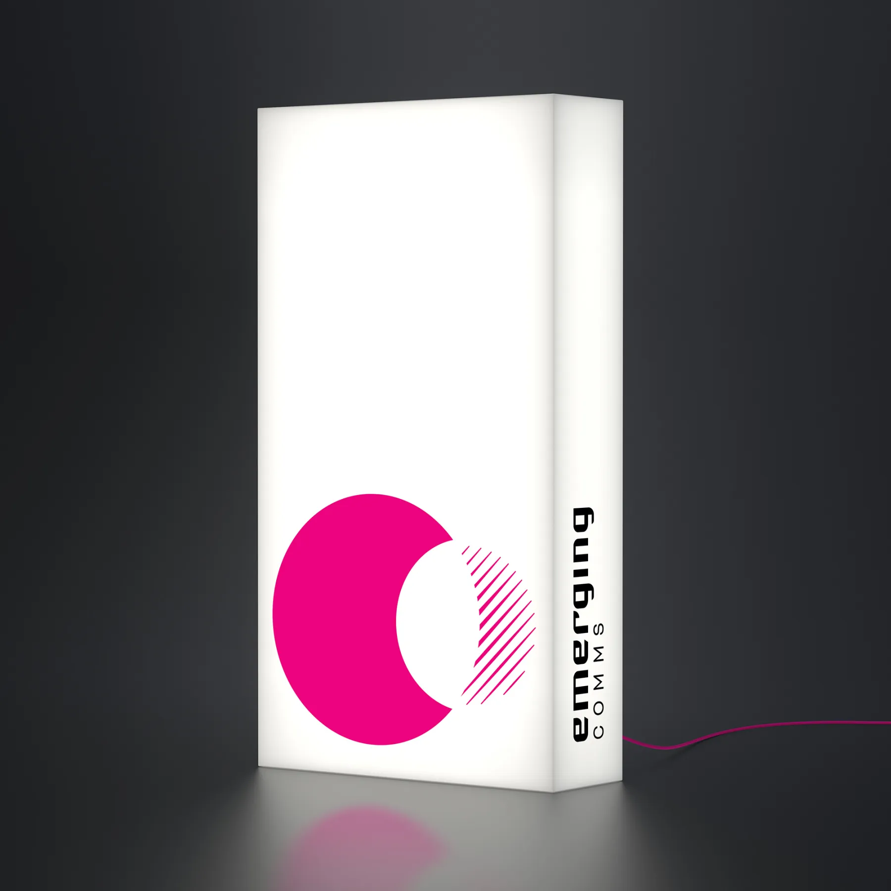
THE MARQUE
Can a logo marque tell a story? We think so.
Our Brand Blueprint™ process simplifies and extracts core positive truths about the brand that can then inform the design approach. In this instance two key scenarios inspired the Emerging Comms symbol:
The first is the underpinning function of the agency; to help organisations understand and navigate an unfamiliar Eastern culture. This can essentially be represented through a horizontal movement to and fro.
The second is Emerging Comms’ ability to take what is often a confusing and distorted view of Chinese culture and apply clarity through their expertise.
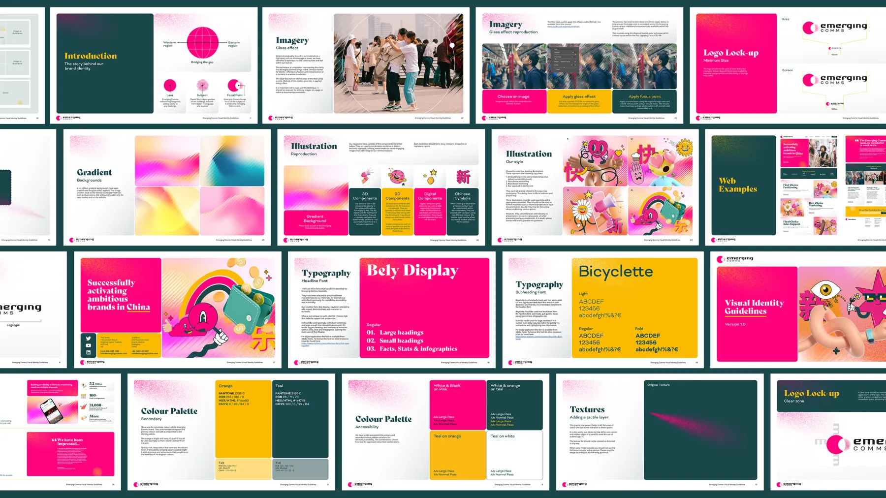
LOGOTYPE
Emerging Comms open their clients’ eyes to how advanced and vibrant the region is. Together with Emerging Comms we identified a wealth of unique and richly creative design and marketing that permeates Chinese popular culture. Most of this would not even be familiar to their clients. These were used to inform the new identity.
An example of this was identifying common characteristics within the contemporary Chinese typography we discovered, and weaving it into our logotype design.

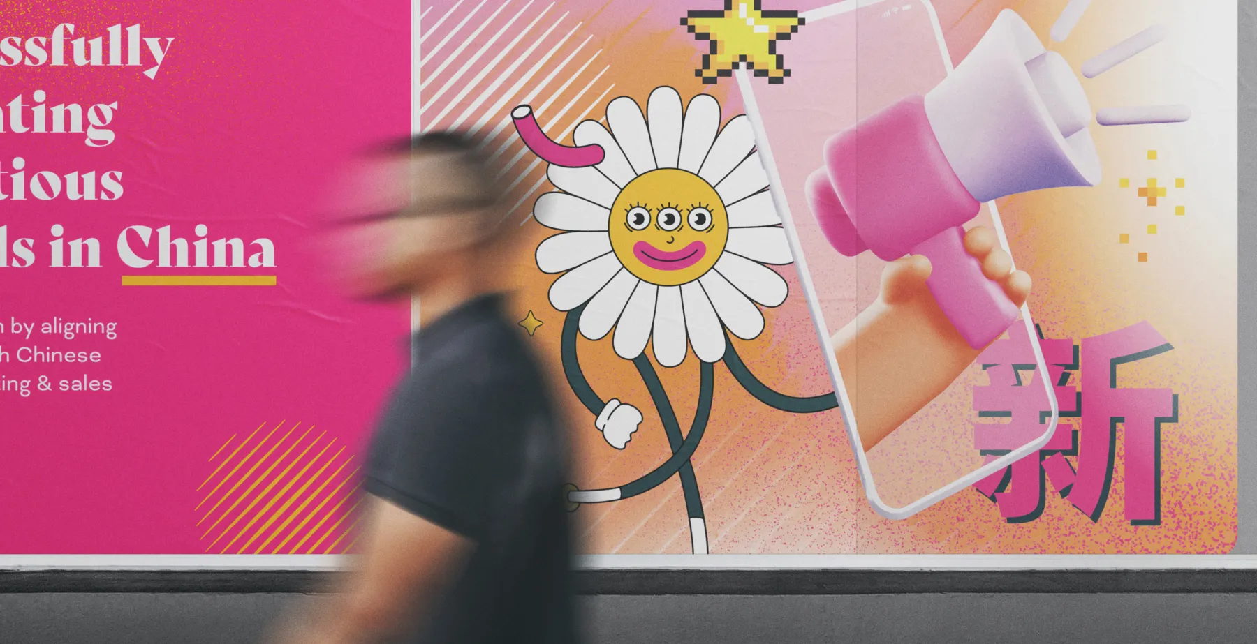
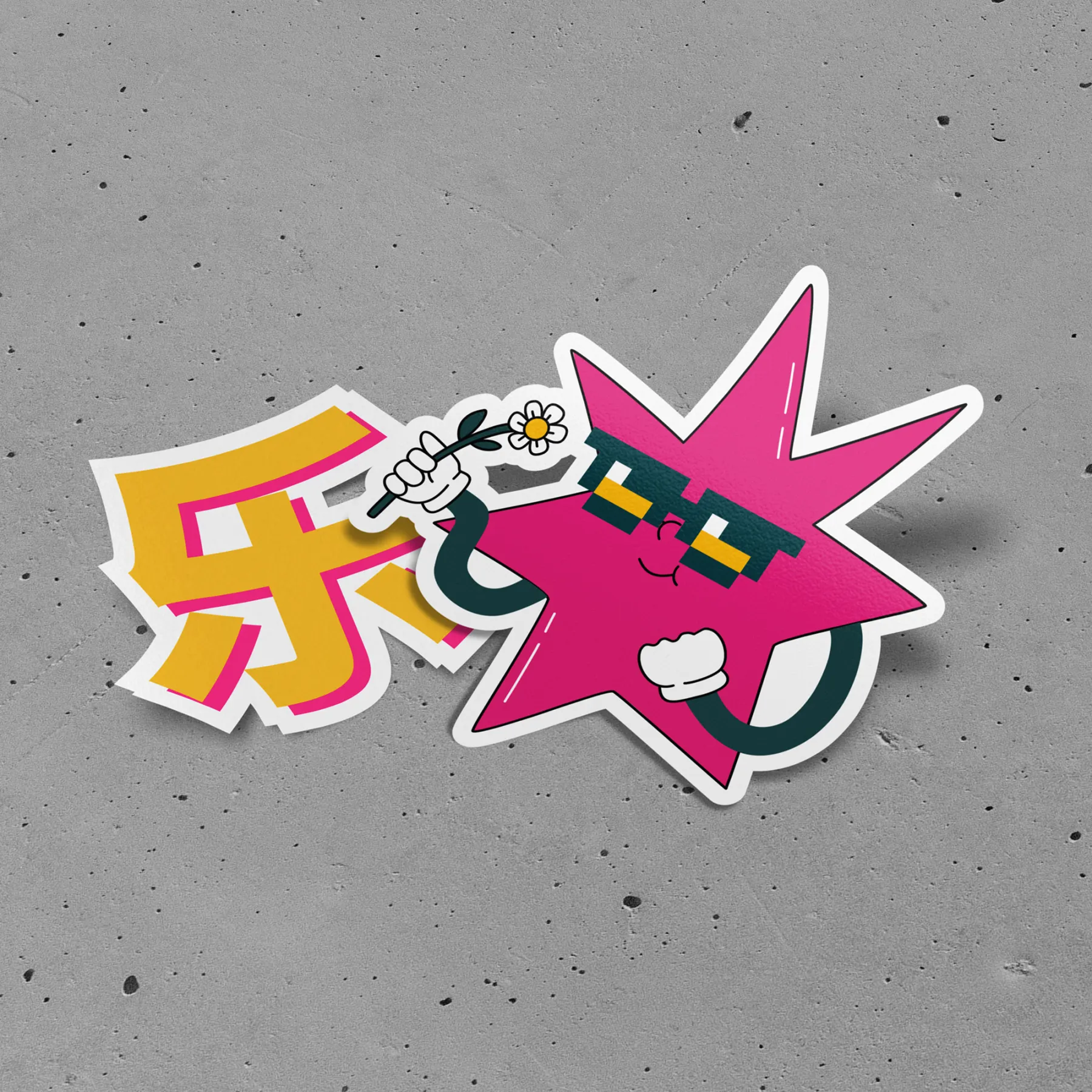
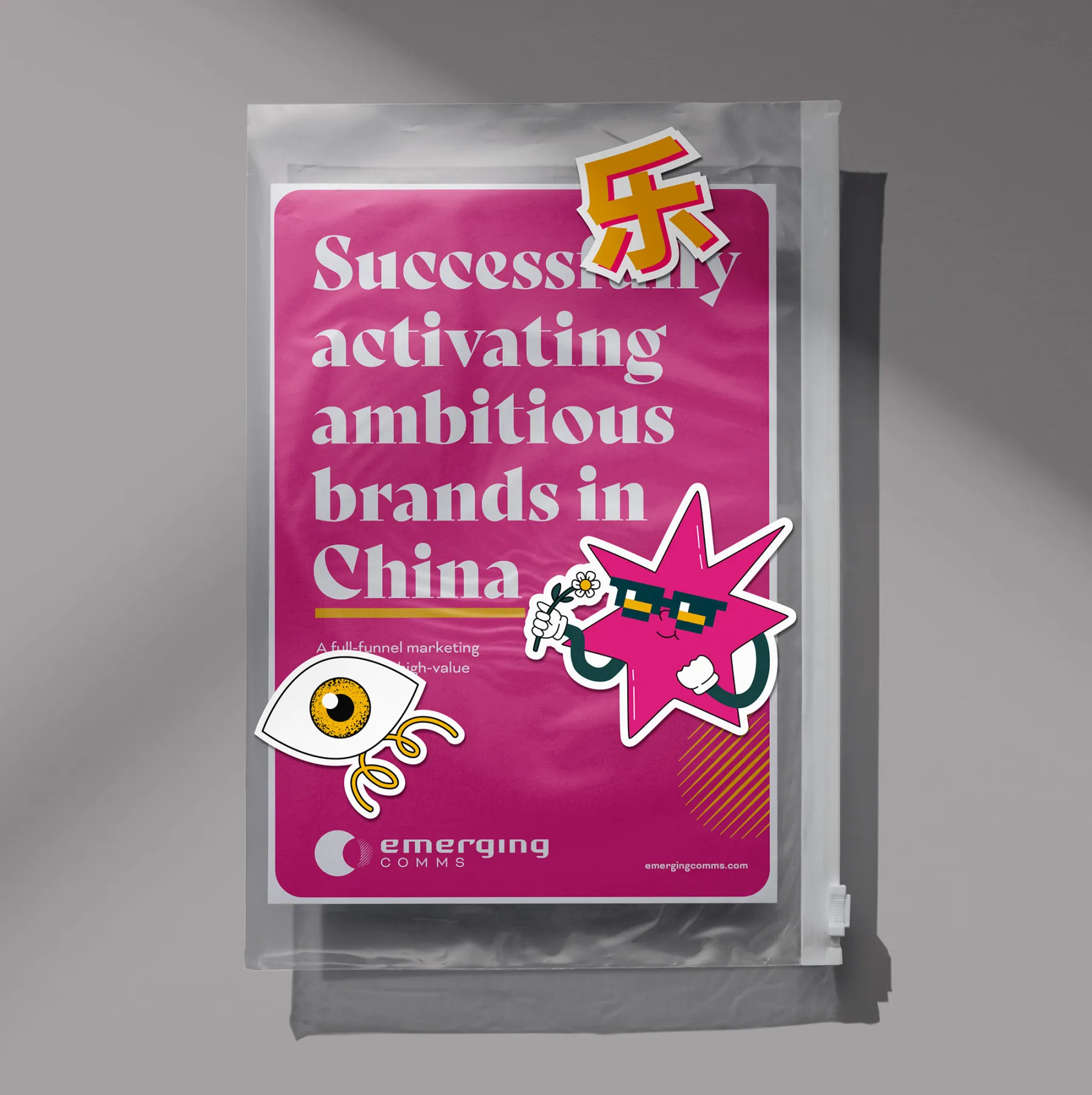
DISTINCTIVE ILLUSTRATION
In modern China, consumers enjoy a highly individual and vibrant creative design unfamiliar to the West. Bold, playful graphic imagery is everywhere you look, with an unbridalled and joyous approach to communications. This is often unexpected and misunderstood within Western markets. Therefore company propositions centred around the Chinese market or culture cane be patronising utilising stereotypical symbolism in an unimaginative way. To embrace a more vibrant approach not only bucks the trend of unremarkable design systems with superficial oriental overtones, it also symbolically projects a deep and authentic understanding of the Chinese market.
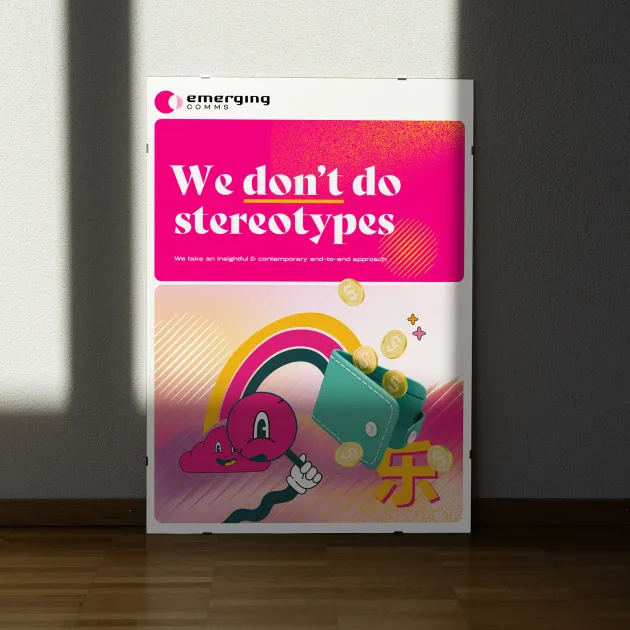
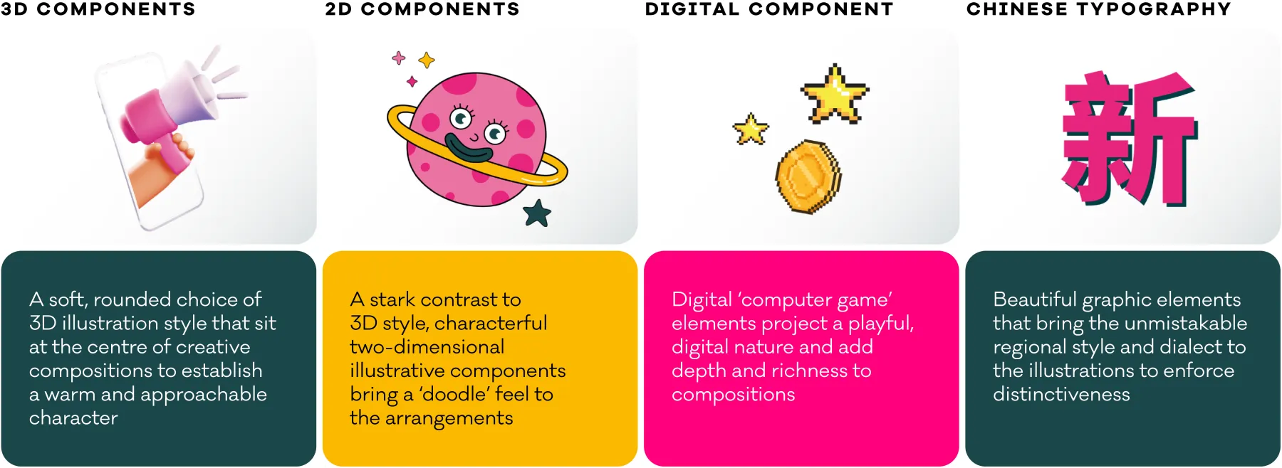
STYLE FORMULA
We developed our own illustrative interpretation, utilising a mix of styles to create a new distinctive creative from readily available components that could be built upon by in-house teams. This sits at the heart of the new identity.
The result is an unapologetic burst of colour and energy with a positive and spirited character that is as memorable as it is individual.
ANIMATION
The illustrative approach was designed with motion in mind; the vibrant colour palette alongside an eclectic mix of components lends itself to distinct, energetic sequences that bring the brand to life and set Emerging Comms apart.
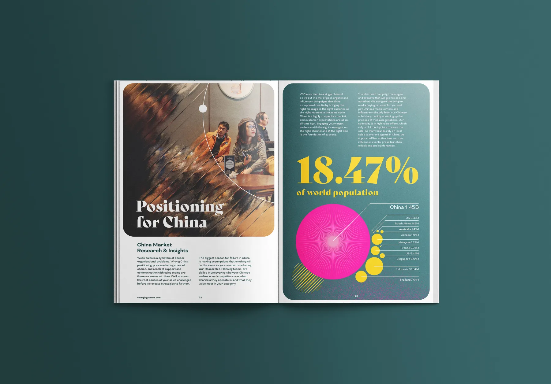
PHOTOGRAPHY
A technique was applied to photography to communicate an idea without the need for words. Using the circular ‘lens’ from the logo story, the simple contrast between an obstructed or distorted view of a scene and the framed clear focus within the circle reinforces the sense of ‘demystifying the landscape’.
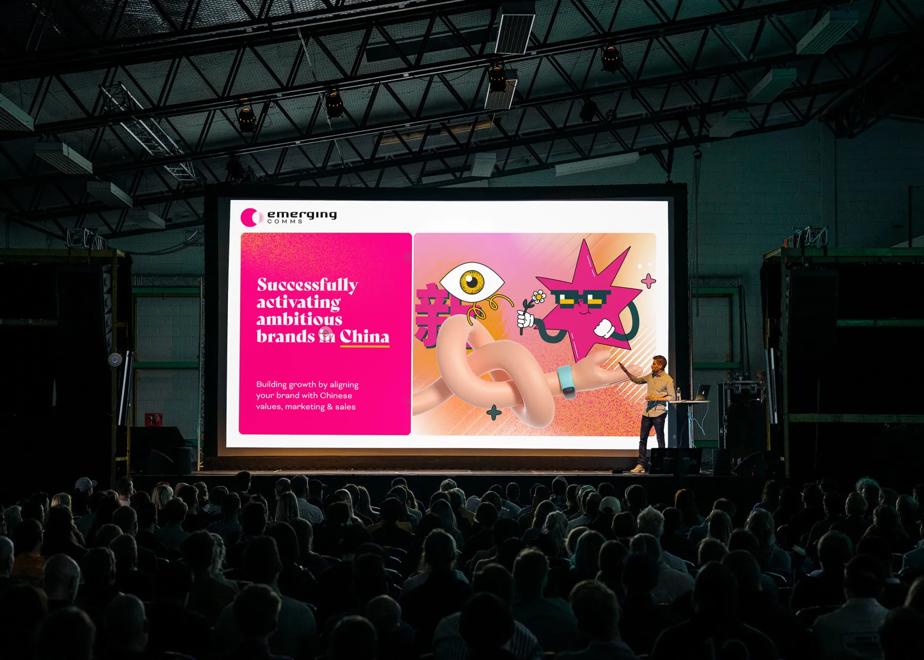
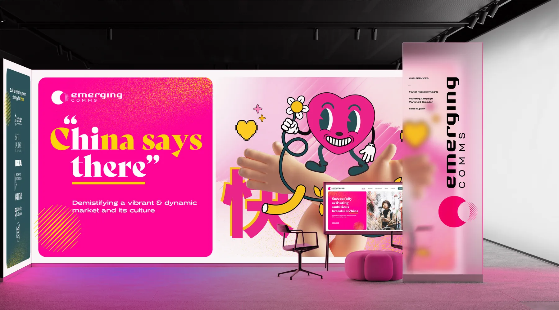
DISPLAY
The benefit of such a distinctive brand toolkit is its ability to add huge impact to presentation or display formats. From simple day-to-day powerpoint decks through to exhibition stands, the colour impact and graphic energy packs a real punch and demands attention. The character it projects adheres to the brand, the company and the team communicating that Emerging Comms are as dynamic as their identity.
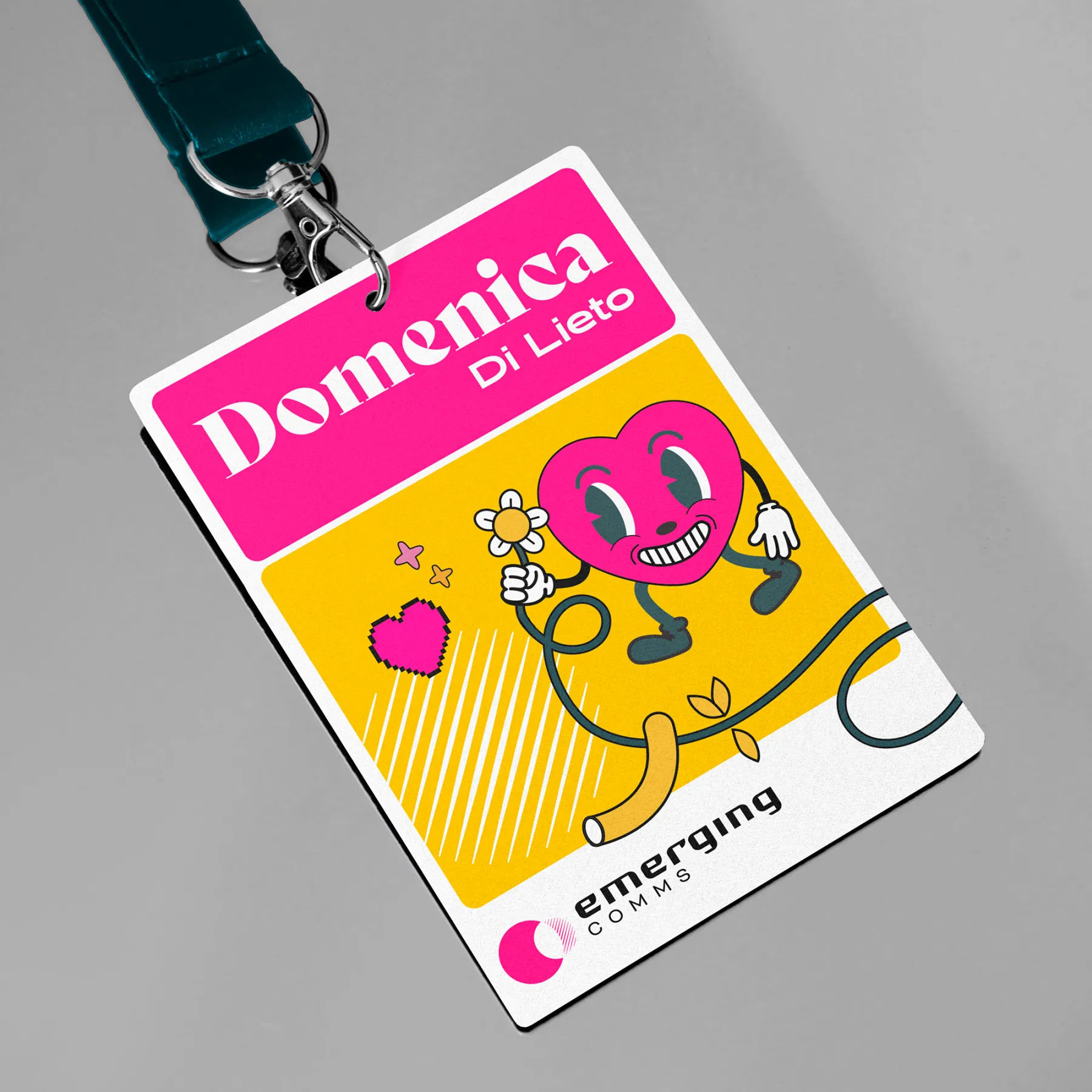
Promotional
Our design scheme presents opportunities to be playful and disrupt the norms, whether that be using our illustrative components to add life to materials, or to deliver data in surprising or more impactful ways.
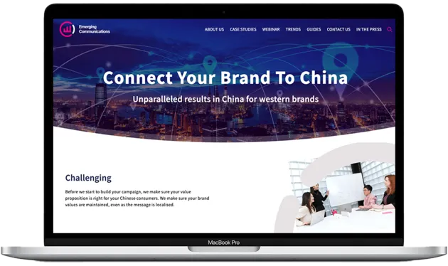
DIGITAL
The Emerging Comms toolkit has all the components needed to provide fresh, exciting and distinctive digital assets from the website to social media. It delivers design structure with vibrancy and character.
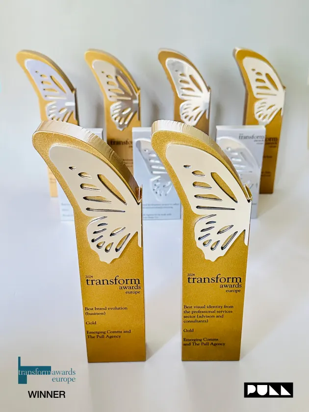
AWARD WINNING
Pull London has a proud and successful association with the Transform Awards, a program that is judged by clients rather than peers. The Emerging Comms project garnered two Gold Awards:
Best Visual Identity from the Professional Services Sector
Best Brand Evolution – Business