We unlocked the essence of Gak's destination store to create a new and unifying brand identity
- Client Gak
- Scope Brand Strategy & Visual Identity
digit uplift
in sales
A new identity to unite Gak's Brighton store & online presence
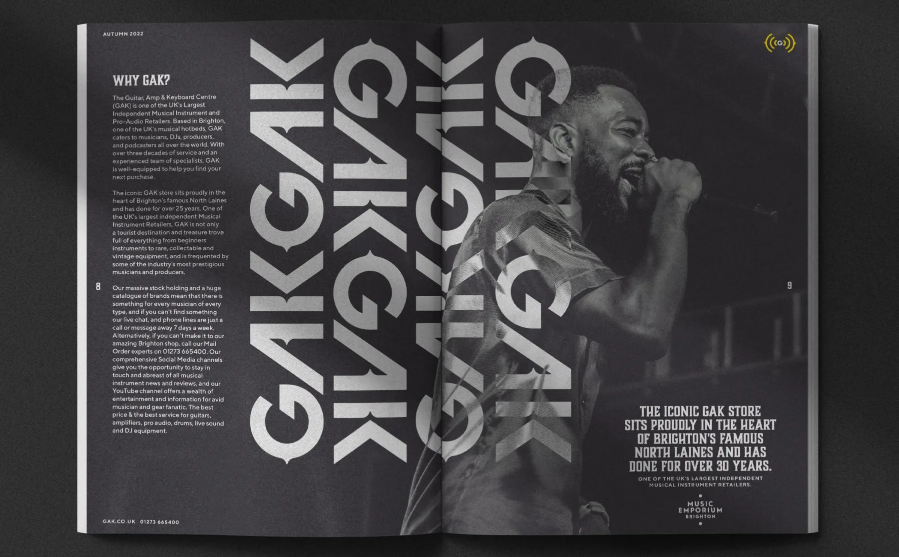
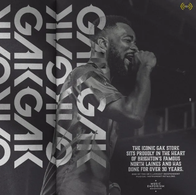
GAK (Guitars Amps and Keyboards) is an online business with a store in the bustling North Lanes of Brighton. Over the years, the store had become a landmark site and destination venue for musicians across Britain, however, its identity was not shared with any of the brand's other digital assets like its website, YouTube channel or social media.
While Gak's heritage was steeped in the music-making and vibrant culture of Brighton, nothing about the digital version of its branding reflected to this. To unite the identity of Gak's legendary store with its online presence, GAK approached The Pull Agency.
A scientific approach to create new identities
Pull builds new identities for existing brands on research and development. And in order for an identity to ‘tell a better story’, Pull first needed to systematically understand how the brand was already perceived and who its target audiences were.
To do this, Pull conducted quantitative research to define the brand’s personality, and also drew insights from GAK staff members and customers. Using Pull’s own methodology, we benchmarked the brand against its peers with a Brand Healthcheck™ and developed a Brand Blueprint™. The Blueprint defined GAK’s brand fundamentals, including: Vision, Purpose, Personality, Promise and Narrative.
After this process of discovery, the creative team were unleashed on solving the client’s problem and unifying their visual identity across all touch points.
Creating a new visual identity
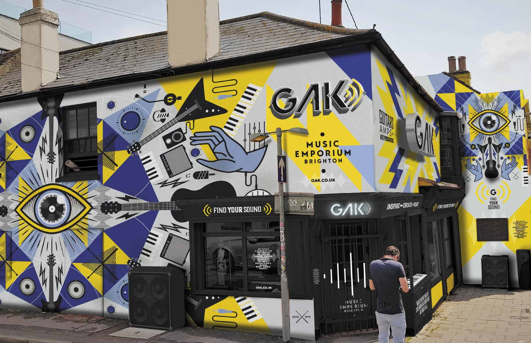
Combining these insights with what makes Brighton and GAK unique, we created a visual identity that was anchored in both the history of Brighton and the world of independent music-making. This inspired a unified visual language around the key attributes defining the GAK brand:
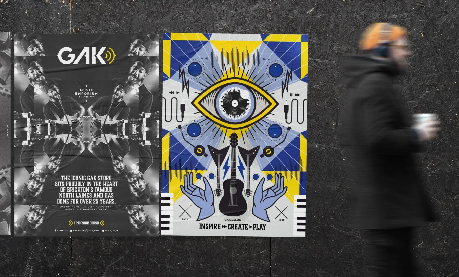
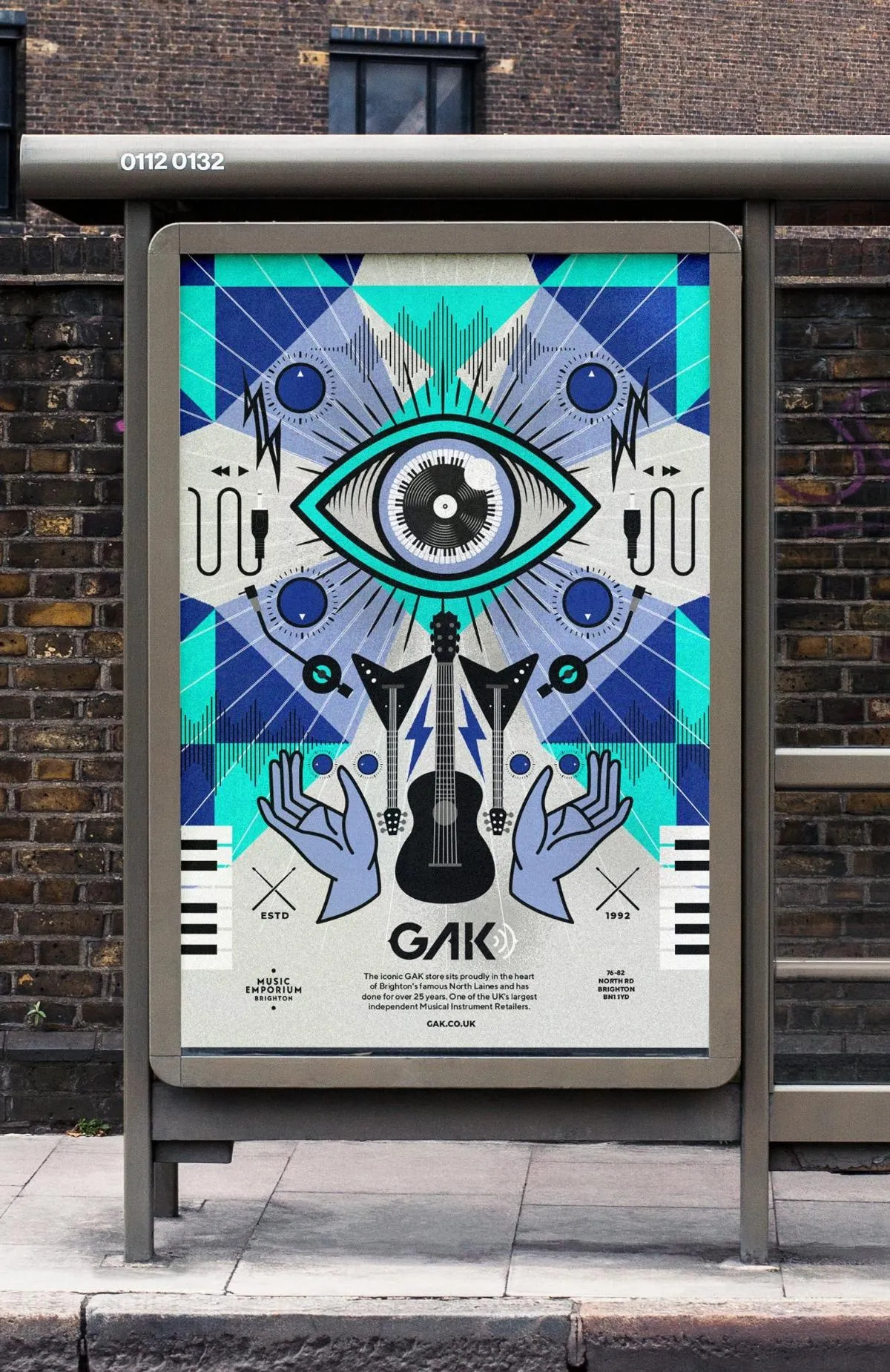
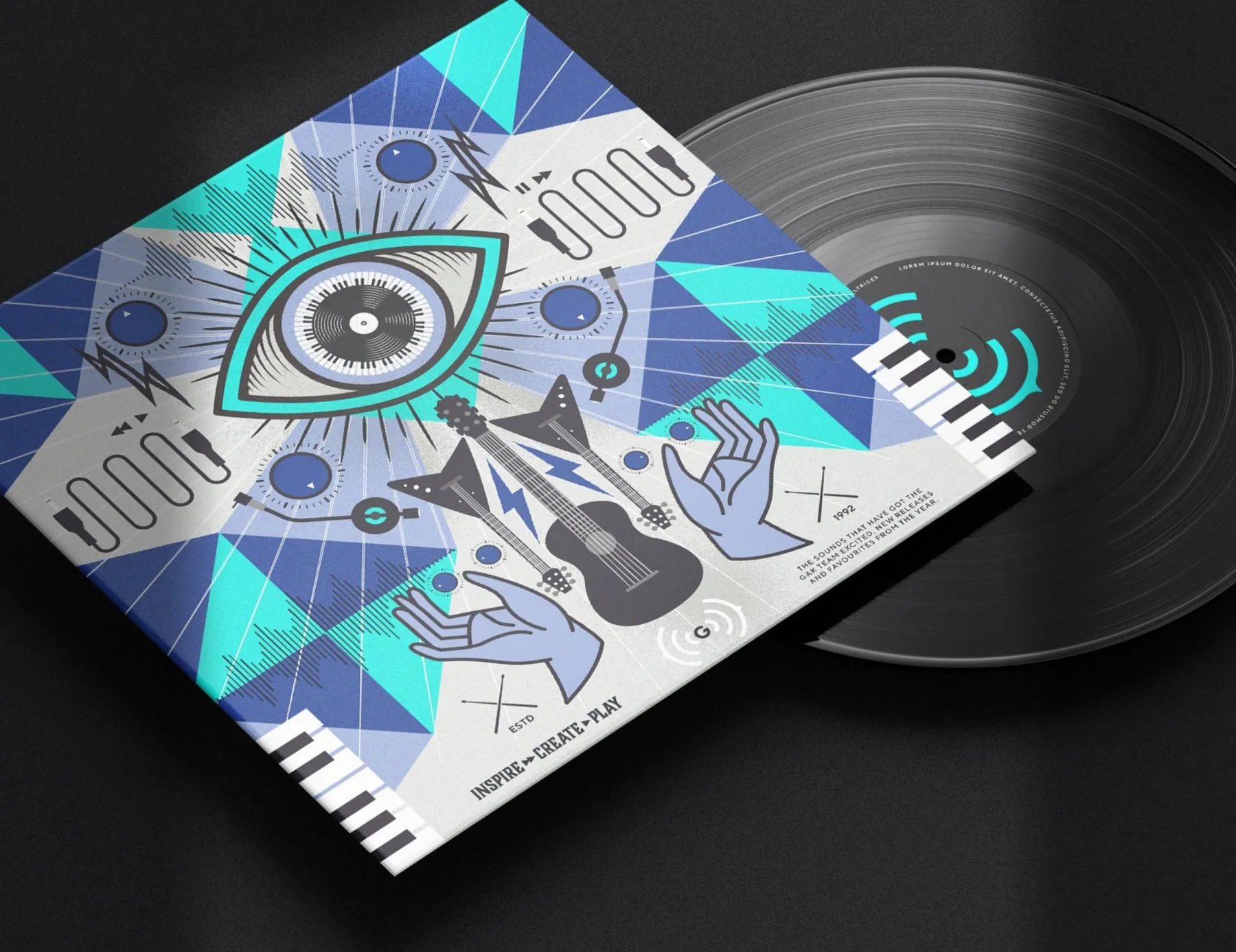
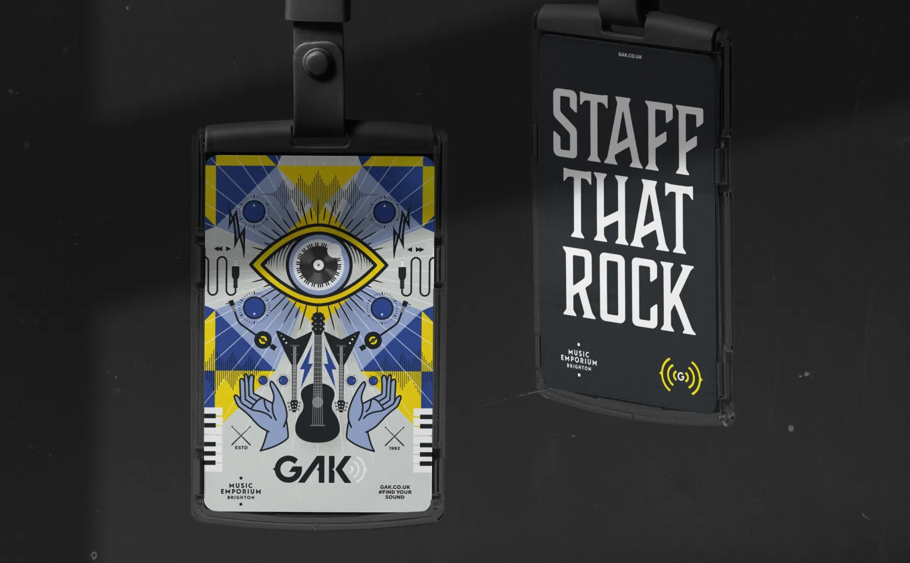
Iconic, historic and symbolic, Brighton emanates creativity and is a melting pot for culture, art and music. It celebrates pride in being different yet with wide appeal. This holds just as true for GAK’s essence as more than a simple music retailer. GAK as a ‘place of wonder’ and its role as more of a marketplace was brought to life through the creative concept of a music ‘Emporium’ and musical kaleidoscope.
Identifying the core audience
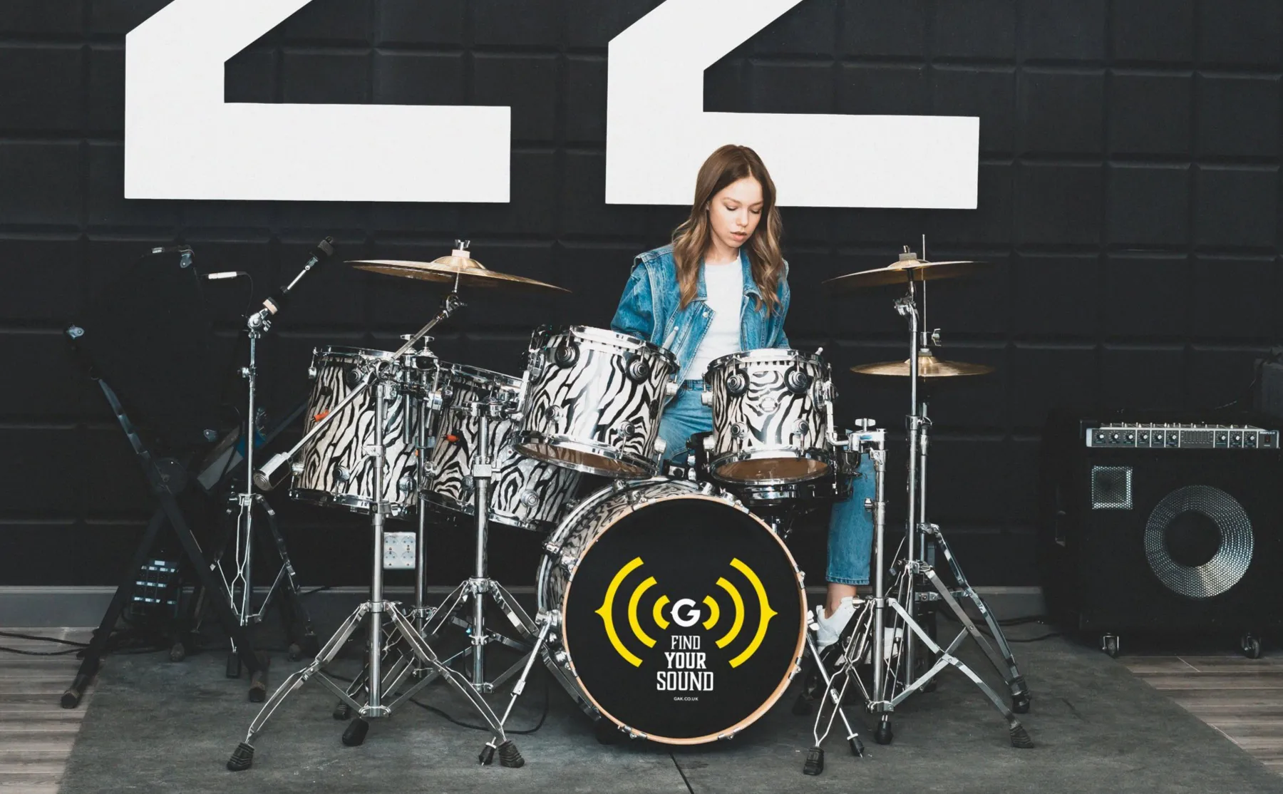
As part of the process, we discovered two key customer personas. An older ‘Rocker’ and a younger music-maker with a tech approach to making music, often collaborating online from their bedrooms. GAK appealed strongly to both these communities with their history of democratising music making and their roots in Brighton.
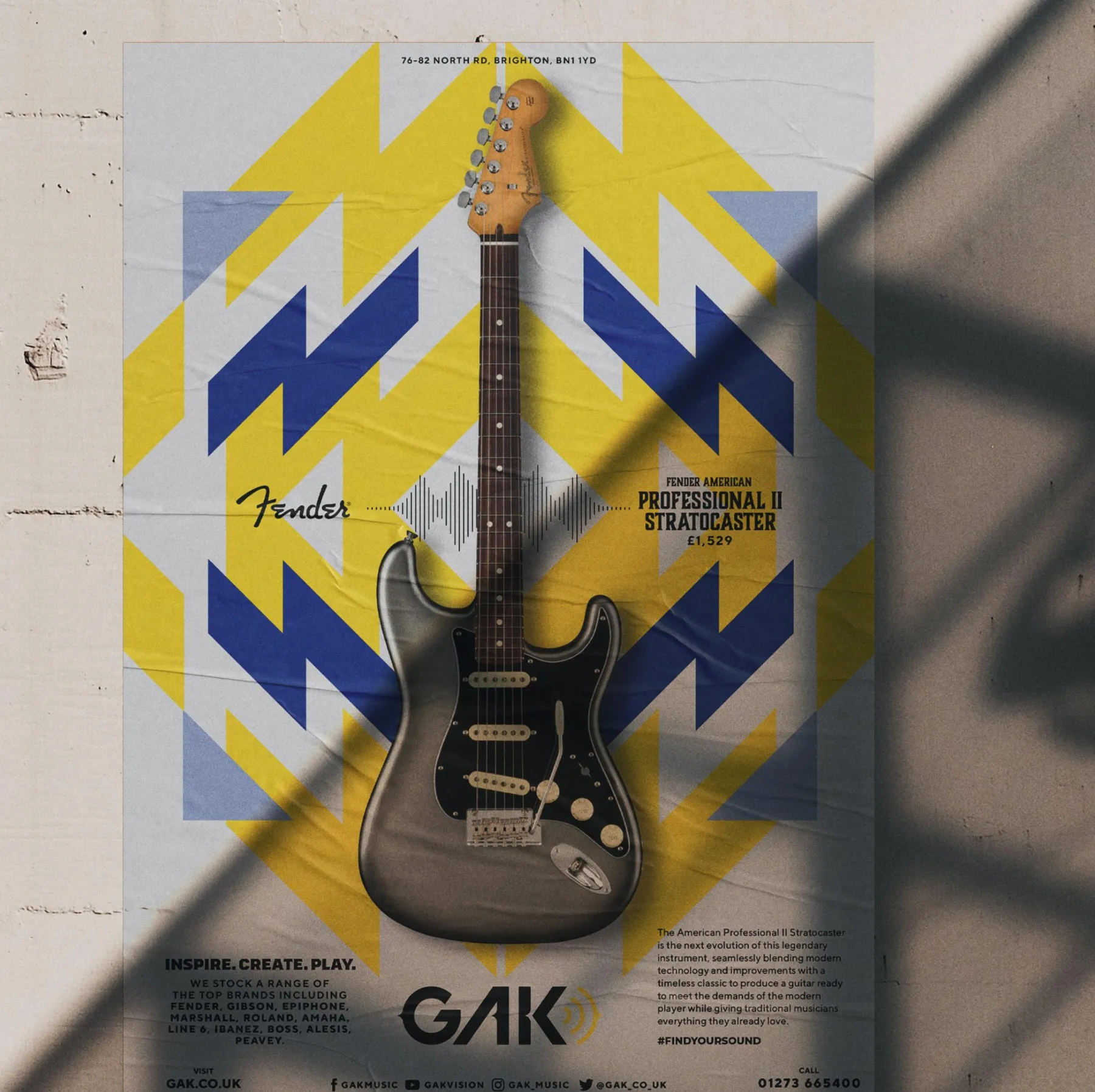
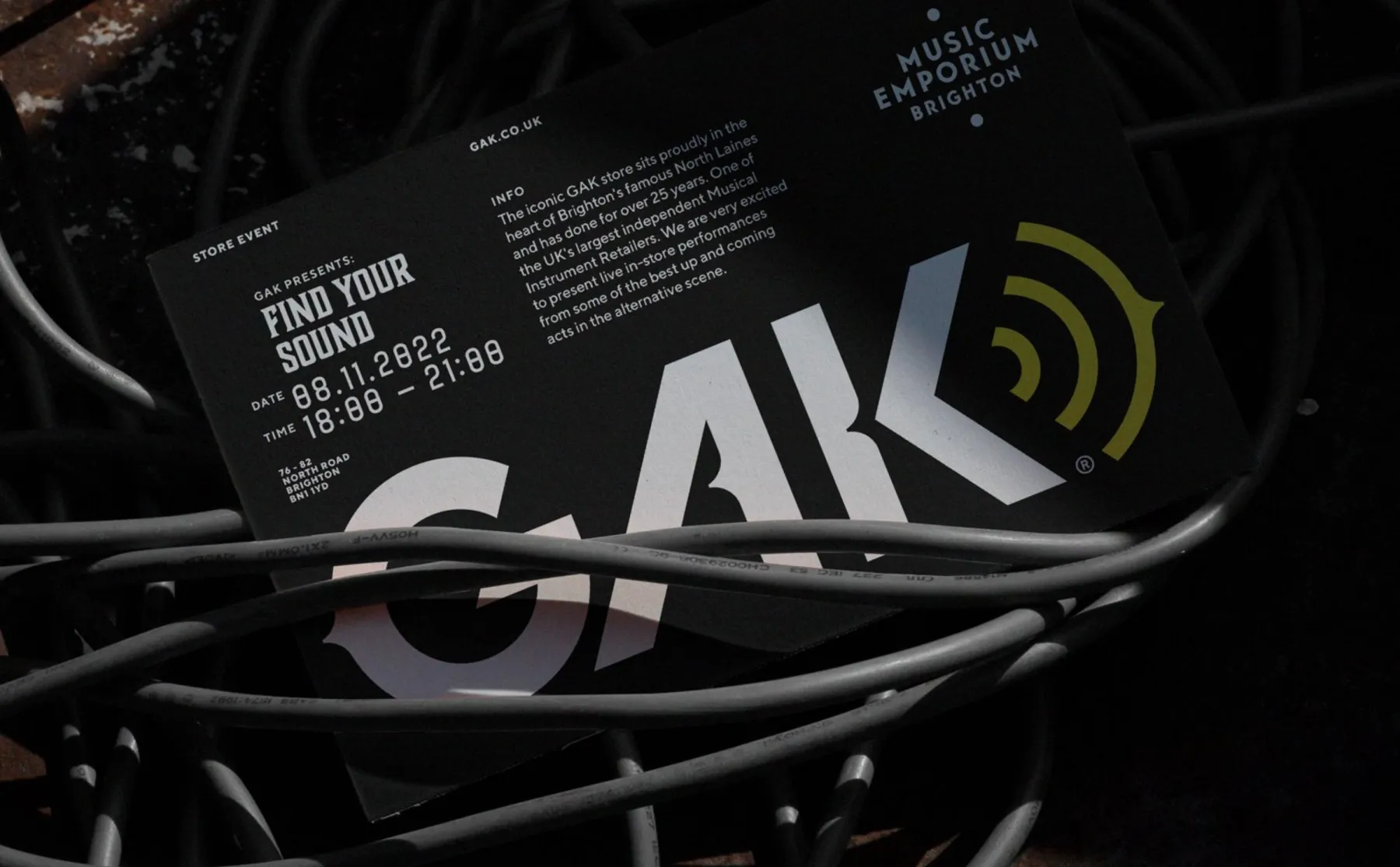
This inspired the logo with its cross-genre appeal and a characterful logotype that is influenced by the theme of Music Emporium whilst the soundwaves create energy and movement. The logo marque also acts as a unifying graphic device throughout the visual identity.


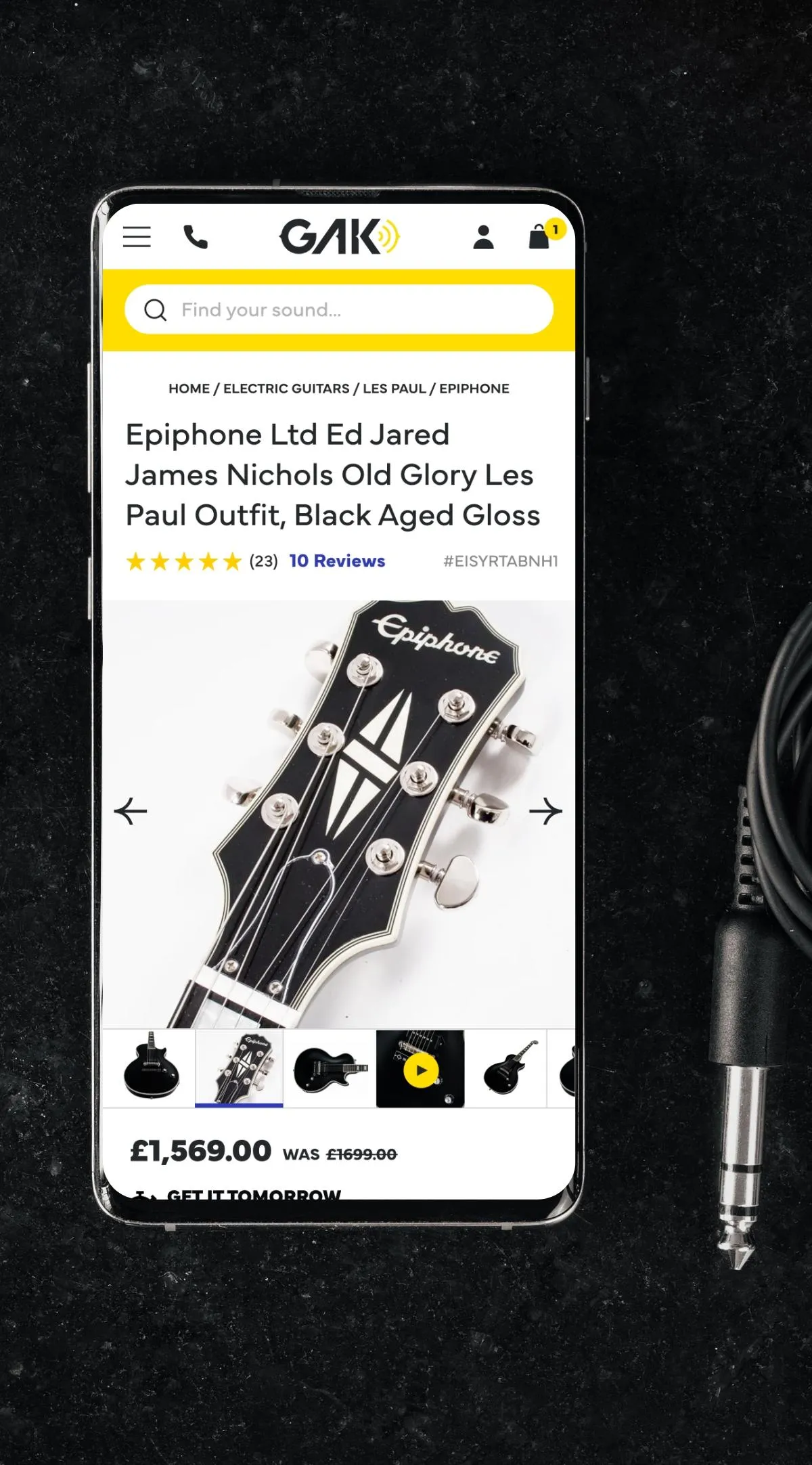
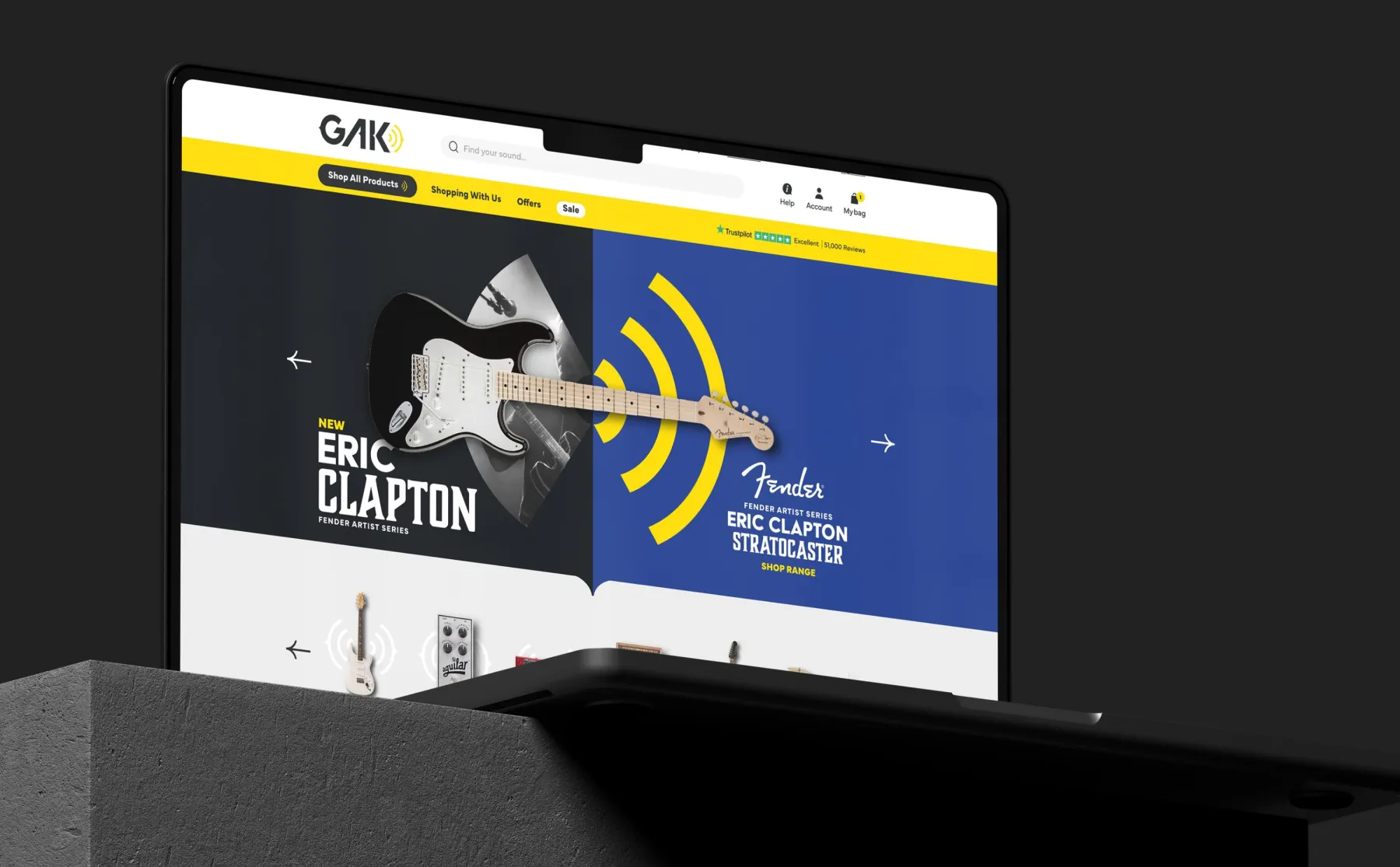
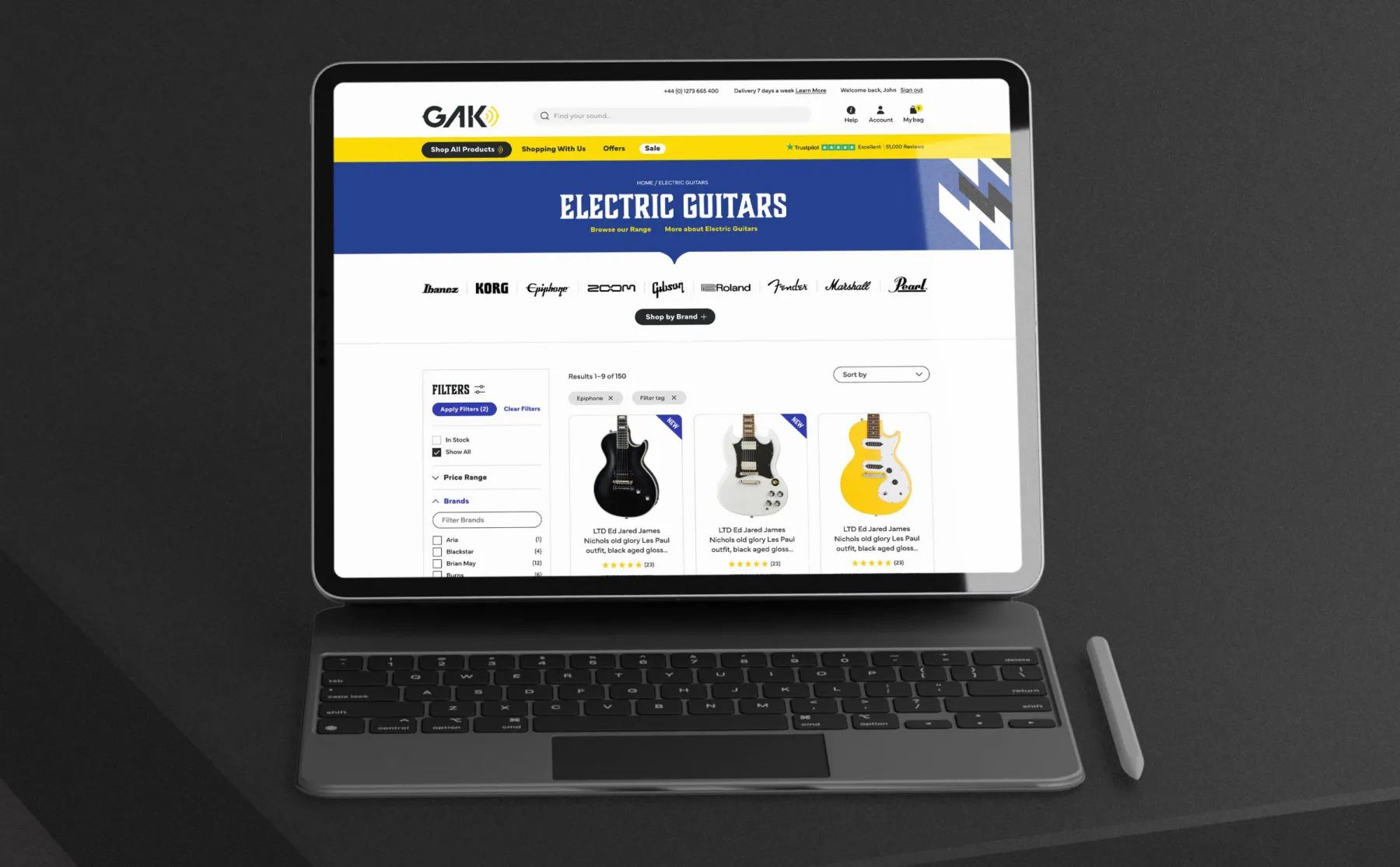
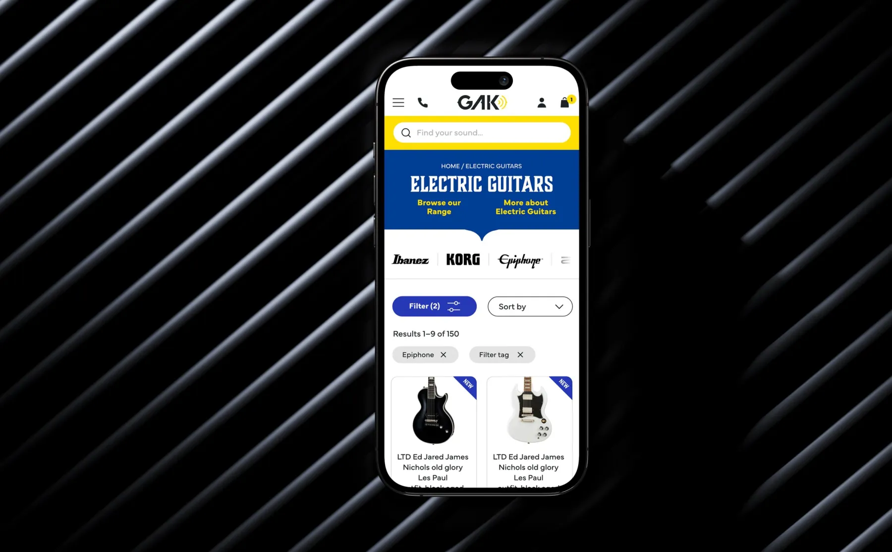
Bringing the brand personality to life online
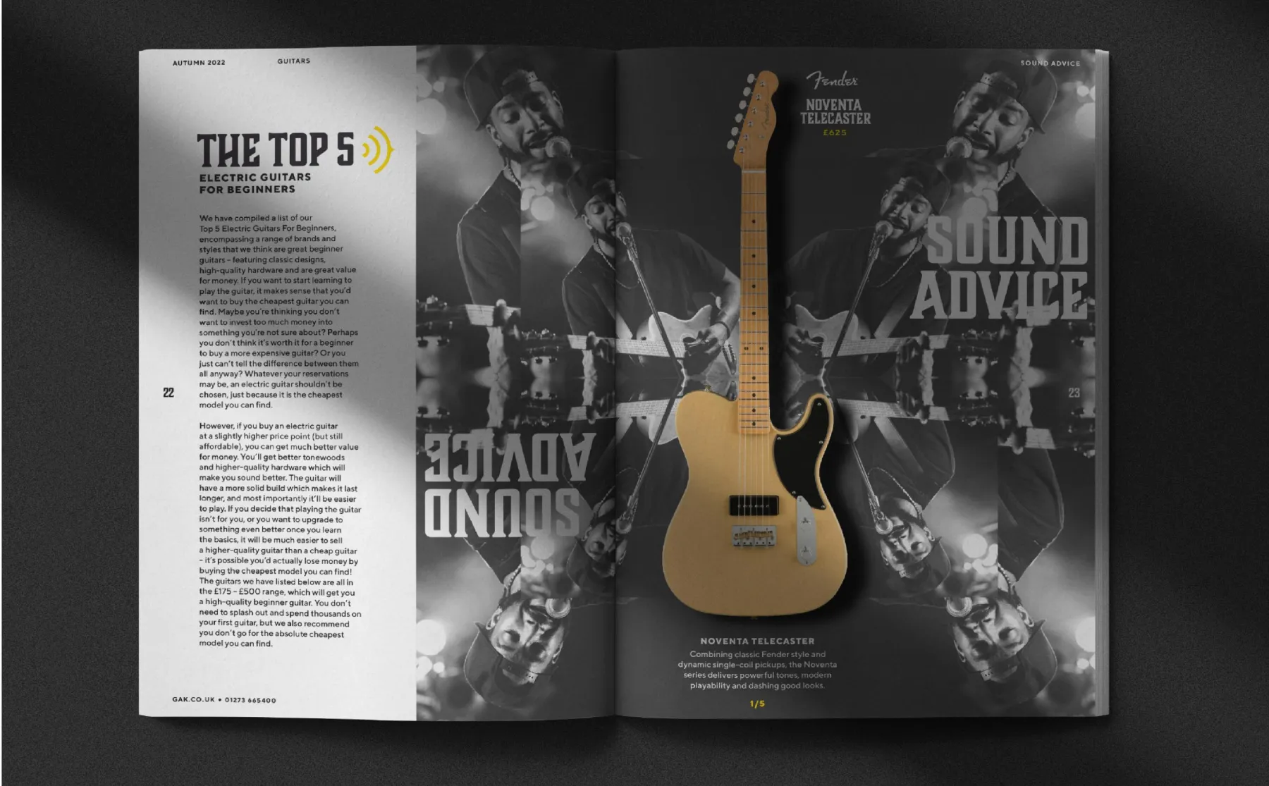
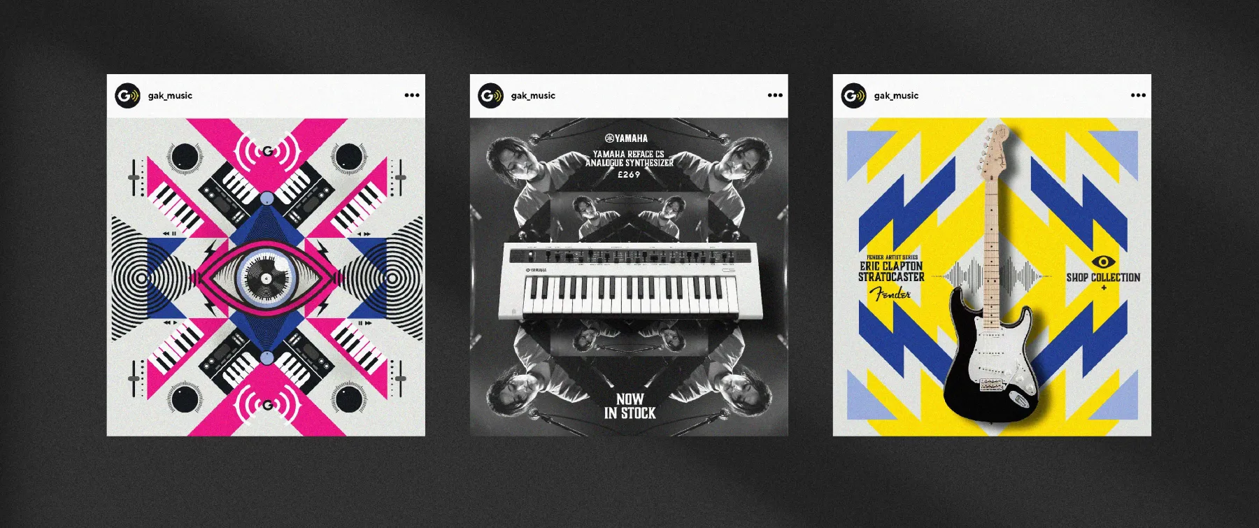
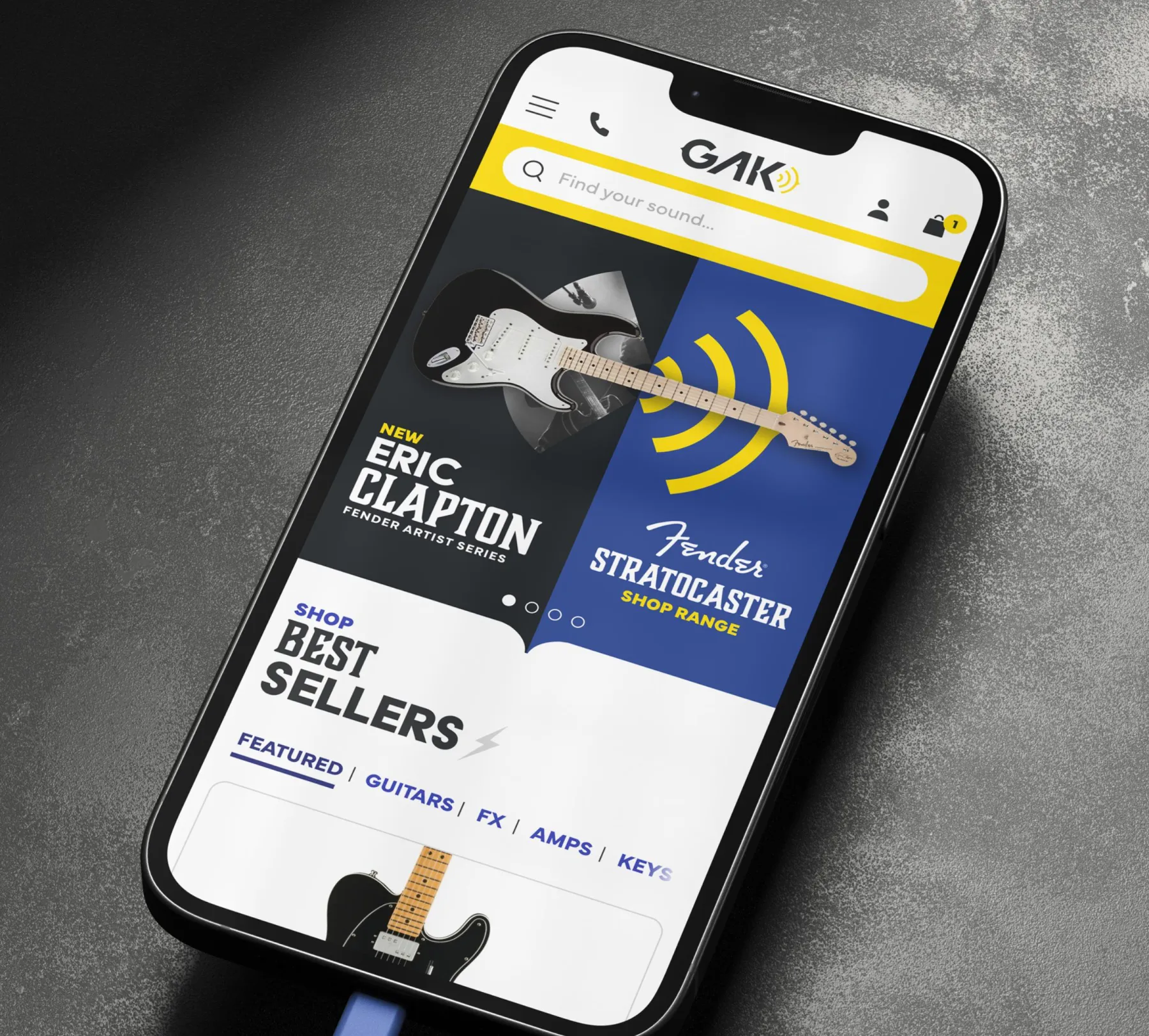
The lion’s share of GAKs revenue comes from its online operation. As such, its digital presence needed to pack a punch. The new brand gave us the toolkit to deliver a distinct, yet user-friendly experience both on desktop and mobile. Online activity was front of mind when developing the identity components, offering a strong, characterful mix of graphic styles and elements to bring channels to life.
The Results
The brand foundational work and new visual identity were instrumental in the GAK team securing investment from private equity partner, Luke Johnson’s Risk Capital Partners in late 2021.
GAK relaunched its in-store point of sale, website design and social media in 2022 and the volume of feedback online was testament to how positively the new visual identity was received. 2022 was GAK’s best ever year for sales, sustaining good growth achieved during the lockdown-driven years of 2020 and 2021.
Following the successful online and in-store execution, GAK started the full facelift of its storefront in Brighton in late 2022.
“We are very pleased and proud of the new face of GAK that Pull has created with us and I am so pleased to see how warmly and positively it has been received by all the GAK team, customers and suppliers alike. ”