We overhauled Right Guard's Facebook visual identity, increasing engagement by 78%
- Client Right Guard
- Scope Brand Strategy \ Campaigning
Strengthening brand presence whilst increasing Facebook engagement
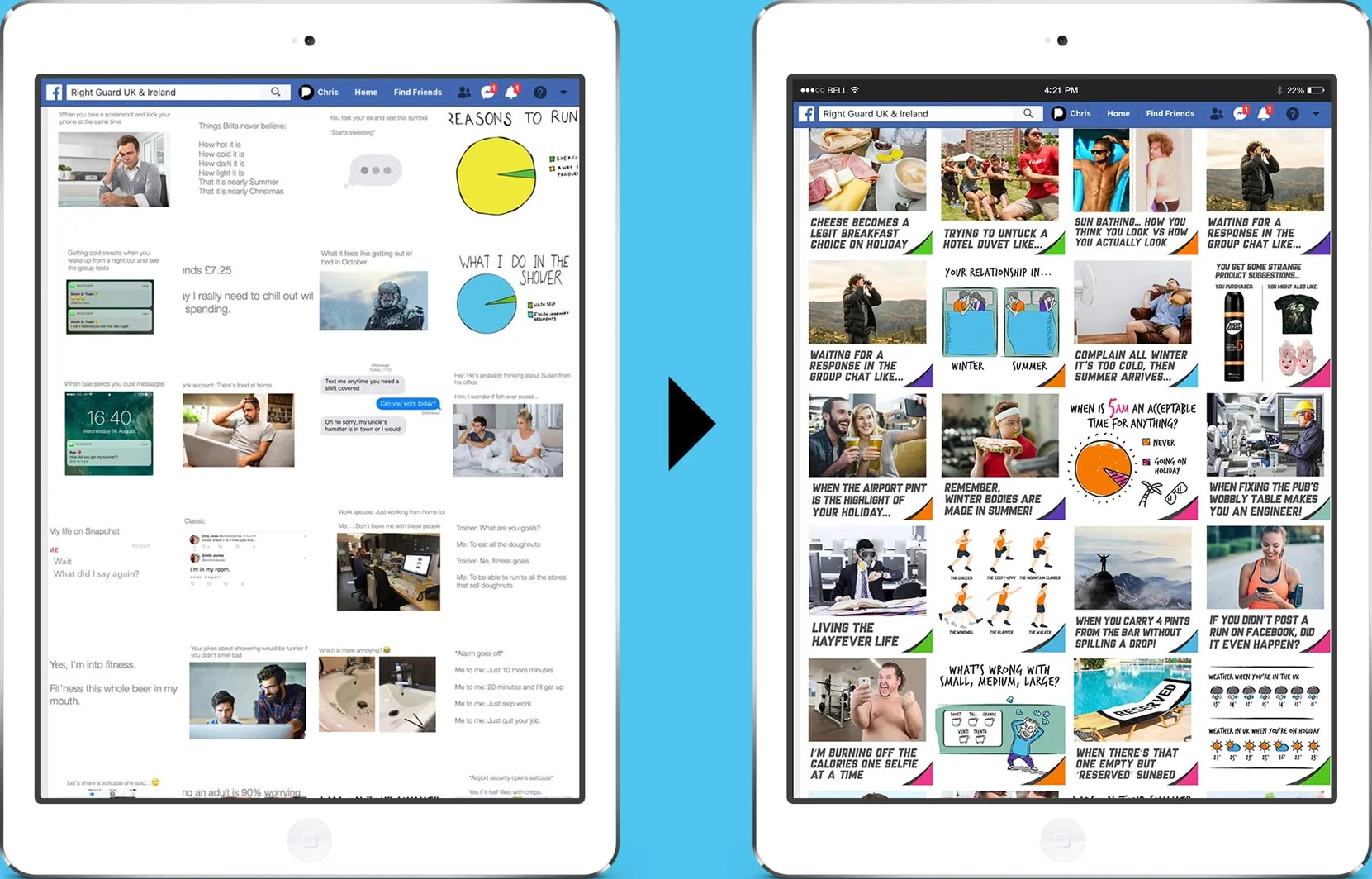
Right Guard were creating meme-style posts in-line with their positioning as the brand with ‘the driest sense of humour’. And these were doing well. However, the Right Guard brand was taking a back seat in these posts. If a friend had shared it, you might never have known it was created by Right Guard.
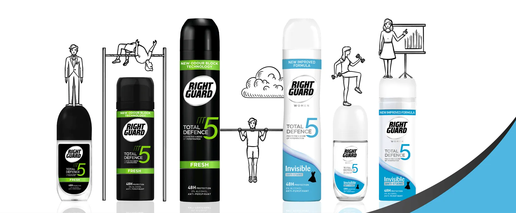
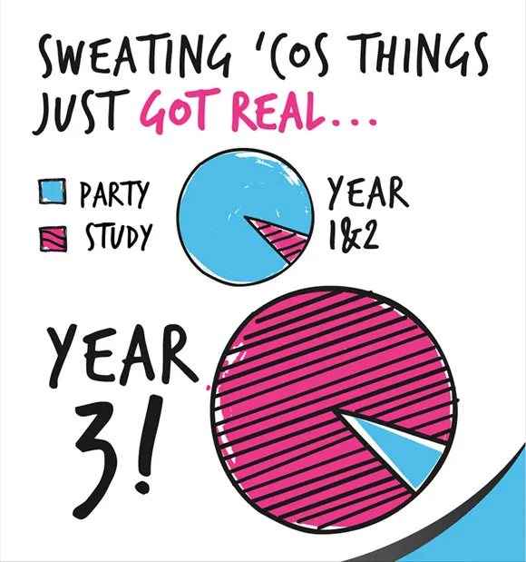
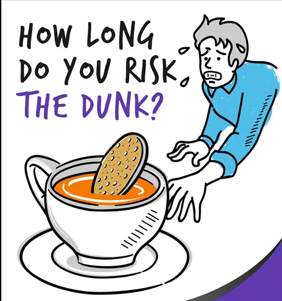
Pull created a strong visual ownable illustration style, which clearly came from Right Guard. This ensured that when the posts were shared the brand message was not lost. The new visual style was also an overwhelming success, resulting in an increase of 78% in engagement within the first 6 months
The Challenge
For almost 60 years, Right Guard have been helping people start their day right.
Born in the 1960s, Right Guard has grown to become one of the world’s most trusted deodorants, keeping millions of people dry and giving them the confidence all day long.
In the UK, Right Guard have positioned themselves as champions of the underdog. As they put it, they’re your trusted mate that lets you ‘Do you’ so you don’t have to ‘sweat the small stuff’.
The challenge for Pull was to come up with a way to retain their strong social tone of voice, while also coming up with a strategy that allowed them to brand these posts and reach a wider female audience.
If that wasn’t enough of a challenge, Facebook announced algorithm changes at the start of 2018, reducing the space & visibility available to brands within the news feed. Our challenge was clear: how do you make your brand stand out when Facebook has reduced.
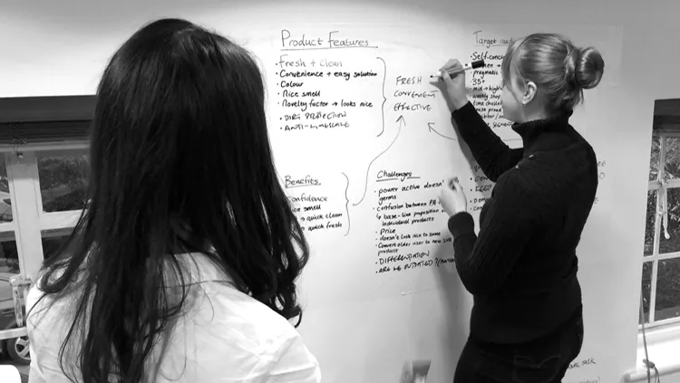
What did we do?
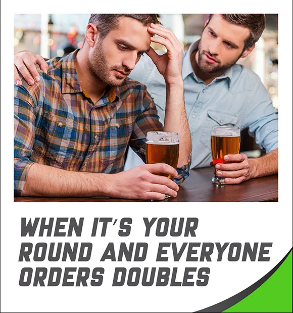
We didn’t want to just stick a logo on the posts. This would undermine the meme-style and authenticity, resulting in less engagement. So, we looked at other brand elements and ways to incorporate these into the posts.
For post captions, we selected a font similar to the logo. This was combined with a colour pallete lifted from the Right Guard cans. We also developed an ownable illustration style, reducing the client’s reliance on stock imagery and creating a more flexible approach.
Pull knew Facebook’s algorithm changes were geared towards engagement. Posts with more would be favoured over those with fewer. This had always been the case but with the reduction in space available to brands, it was more important than ever.
Analysing their previous posts, we identified a trend. The content was largely aimed at men, yet on previous posts females were far more likely to comment or share. We realised that by adjusting the post content to depict more scenarios relatable to both sexes, we could drive greater engagement, increase our presence on people’s feed and, combined with the new creative approach, drive greater brand awareness.
“It’s been great working with you to take our social media content to the next level”
What they said
"It’s been great working with you all to successfully achieve the objectives we set out in 2017 to take our social media content to the next level. The transition from non-branded post, to branded post went a lot more smoothly than I thought - which is great and a testament to the great work you guys did in the brief initially, but then implementing the branded element on our posts. Great job."
Ieuan Evans
Brand Manager, Right Guard UK