

BRAND ARCHITECTURE FOR SMALLER BRANDS
Why everything that works for bigger brands will work for you too
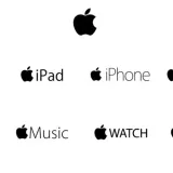
In my last article, I surmised that the best users of brand architecture were brand purists like P&G, L’Oréal and Kellogg’s who have unfailingly stuck to their brand architecture guns over many decades, and Apple whom I believe are now exemplars of an ultra-purist Omnibrand approach that has emerged.
So how does that purity of approach work if you are a much smaller business than any of these? Does it apply and if so how?
Let’s look at a case study. What follows is fictitious. Any resemblance to a brand living or dead is purely coincidental. But it is the kind of real life dilemma we encounter from time to time. Sadly, achieving the required ‘simplicity beyond complexity’ - one of our favourite challenges at Pull - is often too much for otherwise successful owner-operated businesses to get their heads around.
So imagine you were a UK family-based yogurt business based in the picturesque English Lake District county of Cumbria and the business was called Scafell (named after the highest mountain in the Lake District - Scafell Pike). Sold locally across the north of England, you are very proud of the origins of your family business.
Your flagship product is Scafell Organic Yogurt. But you also make flavoured yogurt. You manufacture own label product too for a couple of UK grocery retailers. You get a good premium for your popular organic yoghurt.
Your flavoured yogurt uses the Scafell name too, and you also have a range of dairy creams which use the Scafell name. Scafell Organic, natural yogurt, flavoured yogurt and creams all have different versions of your Scafell logotype, some include a depiction of Scafell, some don’t and some say ‘Cumbria’ to denote source of origin. You also have a kid’s yogurt that has its own identity and is designed to appeal directly to kids. All these product ranges also have pack designs created separately by different designers in isolation from each other.
One of the retailers that you supply for their own label yogurt is on the brink of listing your Scafell Organic Yogurt, and say that they would take it and likely later take more of your range, but that your brand identity is very confusing. What do you do?
So maybe let’s start by defining some objectives, and from that it should be possible to formulate a strategy.
BRAND GOAL
Bear in mind that your brand goal as always is maximum physical and mental availability. The two are related. Whatever the profit mechanics your brand offers retailers, they won’t list your product if they don’t think the brand will be recognised by consumers or be promoted by you. The sales of your brand will pretty much be linearly related to physical availability – if you double your distribution you will double your sales and market share. As we explored in my last article, your brand architecture must serve these purposes.
SO A GOOD STRATEGY FOR THE ARCHITECTURE WOULD BE
To create a distinct and memorable identity that can easily be applied to all current and future products.
So how would that translate into an action plan?
Well firstly, let’s look at which brand architecture model will suit Scafell the best.
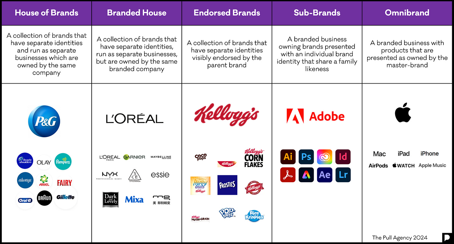
We have a brand. It has a small but enthusiastic following, and we have distribution with some smaller retailers. So we can dismiss house of brands. This works where you have a set of products that appear unrelated to the consumer and all need their own brand names. Branded House? No, for similar reasons. Sub-brands? Probably not, as your related dairy products won’t be living ‘separate lives’ as the Adobe sub-brands featured sometimes do. We will park Omnibrand for now as we are not asking people to enter ‘Scafell World’ in a similar way to entering the tech walled-garden that is Apple. It will be important for our products, situated on-shelf in different categories, to both ‘belong’ to some of the norms in that category, and have some of their own personality.
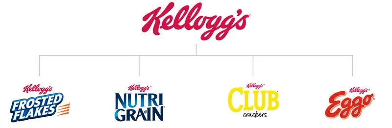
This leaves the Endorsed brand category like Kellogg’s.
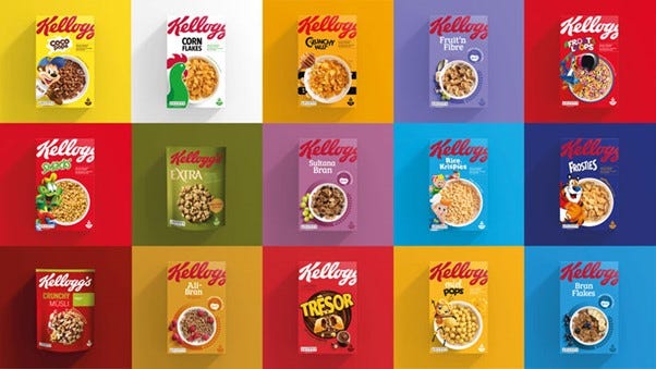
Kellogg’s provide a good role model for a case like Scafell. Kellogg’s revised their visual strategy in 2019. These were/are the key characteristics of their brand architecture strategy:
Dialled-up endorser logo Kellogg’s which dominates endorsed brand
‘Formula’ for each endorsed brand in terms of pack design layout consistent for both adult and kids’ products
Show the product inside the pack on the outside
Colour code for products
Consistent colour palette across range
Design specifically created for on-shelf impact
This is what we would recommend to our hypothetical client. We would also make recommendations in three other areas:
Own label manufacture: Don’t do it (this might be somewhat tongue-in-cheek. It might be a step too far, but the issue is – if you are both a branded and own-label supplier – you will end up competing with both yourself and your customer.)
Get your brand foundations in place with a Brand Blueprint™ covering Vision, Mission, Personality and Narrative. From that you can define your brand personality and a coherent identity strategy (like Kellogg’s did).
Make sure you get all your brand-name basics in place too – URLs, trademarks etc.
So overall this is what we would propose we do regarding brand architecture and identity design:
Use the brand personality identified in the Brand Blueprint™ as the basis for creating a highly distinct brand identity, including a logotype and small number of lock-up variations that can represent the brand overall and be used on all product packaging and applications.
Determine whether and how to use identifiers and brand elements such as ‘Cumbria, ‘Lake District’ and ‘Scafell’. Create a consistently applied approach.
Design a related look for each main range of products and a related look for each different product. Follow a logical process (see Kellogg’s above).
Use the brand logotype in a dominant and consistent fashion across the entire endorsed brand range.
Clearly this is a major effort and could be seen as quite daunting. However, every brand we see that has this challenge and doesn’t address it in our experience goes though many iterations of identity in different ways across their product range in short order. They also tend to add product in a somewhat haphazard way with a rationale and look that can further confuse stockists and consumers. The great beauty of getting your brand architecture sorted is that if you do it right you will probably never need to do it again.
Posted 27 February 2024 by Chris Bullick