

Why brands need to be more individual, not less

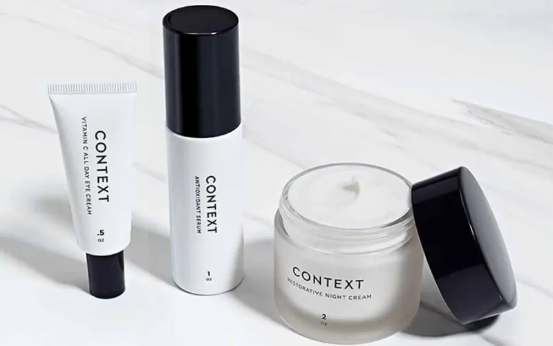
You’ll have seen one. A container, sitting there on the shelf in your favourite retailer. Perhaps there’s even one or two in your house. Inside, some skin cream or other potion. Not that you’d know it from the packaging. Almost always white. A stacked black font (probably Sans Serif). Not much else in the way of information or distinguishing features.
Without wanting to take aim at any brand in particular, the almost ubiquitous presence within the cosmetics sector – and branding as a whole – of the stripped back, minimalist packaging, is plaguing shelves from Space NK to Superdrug up and down the land. These designs are in danger of evolving to the point of being so boring, so anti-brand that they’re devoid of all personality.
This article makes the case for the importance of individual expressionism to today’s consumer (and all their associated social networks). They have a need and a desire to be unique with their personalities and values, yet it seems to me that most cosmetic brands homogenise their design approach. As if uber-stripped back design style and uber-minimalism is the only way to achieve an upmarket look.
To me this seems like a dangerous trend, especially as so much is said and written about the behaviours of millennial consumers and their preference for experiential purchases (events, travel etc.) over material purchases. More than ever, brands need to think more creatively about the way they communicate their values and messages in order to captivate an ever more challenging audience. Surely this has to start right back at the beginning with their story and brand?
Another trend that seems to be playing a part in decision making is Androgyny, and maybe that’s the challenge that is vexing so many brands. Perhaps the thought is that by stripping everything away you remove all evidence of a perceived gender bias.
Surely, brands should be responding to consumer behaviour by trying to be more individual, creating a brand style and experience that is unique, vibrant and engaging? Isn’t it better to stand for something rather than nothing at all? In today’s cosmetic marketplace it seems like a huge opportunity to me!
Don’t get me wrong, from a design perspective I’m not suggesting that all work needs to be a kaleidoscopic nightmare of colour and display fonts! I, as much as any other designer, drool (probably unhealthily) over beautiful, skilfully administered typography and a sensitive use of white space. But I just can’t bring myself to believe in a retail brand whose sole solution to visual identity relies upon an indistinct piece of type (often not even enough to define it as a wordmark!).
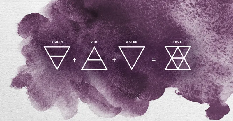
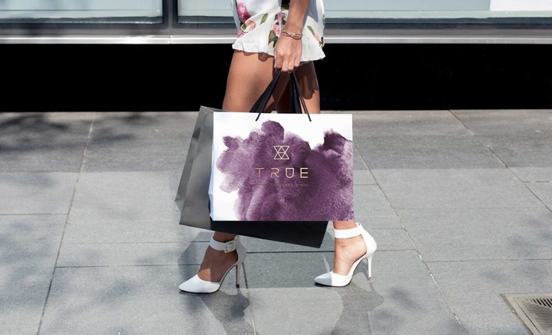
I speak as a Creative Director whose team of creatives has recently completed the visual identity for a new cosmetic brand, TRUE Skincare. If ever there was a brand that tempted the designer to rollout a lazy, faceless identity, it would be one that revolves around natural, organic ingredients, ethics and honesty! However, we worked hard to avoid that trap! We got down to the tough job of visually interpreting the essence of what TRUE means and developed a visual language that was distinct and evocative yet graceful. It wasn’t about adding superfluous layers that just become barriers to engagement, or an attempt to ‘up the hype’ through complex messaging, rather using design to communicate the brand’s values, and frankly make more of an effort to connect with consumers!
Far be it for me to say whether we were successful or not, and it’s too early for sales to tell the story (though we’ve heard positive feedback from the likes of Vogue UK), but what I do know is it has personality, identity and meaning – and therefore a good chance of longevity. And the often overlooked consequence of developing an identity with purpose – the client felt energised the moment they saw the visual story, and continues to be enthused about the possibilities for TRUE!
For me, developing and maintaining ‘an identity’, not discarding it, is critical for brands in today’s landscape. But equally the rules are changing. We’re in a challenging period where traditional values are being questioned by an open-minded and vivacious generation, unhindered by all previous preconceptions. Fluidity of identity design is becoming more important, even to the point of allowing personalisation of the things we consume. So, visual identity has to work harder, but the answer is not to strip it away completely.
This is a trend that doesn’t just stop at the beauty industry. A post recently did the rounds on illustrating how the likes of Google, airbnb, Spotify and Pinterest had all abandoned their old logotypes, jettisoning their playfulness and a whole heap of attitude and personality for more sanitised, san-serif, modern styles (although just how modern is up for debate – lest we forget brands of the 1960s using Helvetica to eradicate any hint of cursive).
But at Pull, we disagree with using “digital” to excuse away the bland. I don’t buy into the thinking that the digital space dictates a need to strip out the personality from a brand or logo. I worry that this drive for a slick user interface and UX, streamlining everything to the nth degree to increase conversion rates, is creating an idea that brand personality is somehow superfluous. We are ending up with a whole bunch of faceless websites with little engagement. Are they saying that brand as a visual language isn’t relevant?
As the British retail landscape struggles to keep its head above water, those that thrive are the stores that offer more. Whether it’s through a highly personalised experience, an element of theatre with service or unique retail spaces, stores are having to do more to drag people off Amazon and through their doors. Yet there are countless examples of retailers whose minimalist websites and apps, bare to the point of brutalist in some cases, do not match the in-store experience. It shouldn’t be this way. I appreciate a need to remove barriers, but I cannot accept that brand personality should ever be seen as a barrier. It is an enrichment, a point of difference, of individuality and the very thing today’s consumers crave!
So, why shouldn’t visiting a website be as much of an event as visiting a fantastic, physical retail space? At Pull we recently had a challenge for a retailer with a 50-year history who, in the drive to ‘grow up’ over the years had lost much of the wonderful provenance that they had. Yet their largest revenue generator is now ecommerce, fuelled by a sophisticated YouTube operation. The job was to reconnect with all the richness of their past and with the culture of their customers, whilst embracing the future and technology. That’s why, when redeveloping their brand, and in particular their logo, we had to think responsively.
The brands such as Spotify above are probably more easily recalled as symbols or marques (it’s sad that their logotypes have become homogenised), yet there is a place and need for a logotype with good recall too. There’s no need to remove all trace of brand personality, rather consider the adaptability and recognition of form and build in the ability for the logo to operate successfully across multiple platforms through its component parts. I don’t think a logo needs to work less hard, just smarter!
At Pull, we say “everything has changed, nothing has changed.” It is important to remember that while media and technology have changed, human emotional responses remain. Consider, for example, the Bladerunner movies and their neo-noir vision of a future that now seems within our grasp. When I think of those movies, I see a dystopian Los Angeles, but one complete with hulking great billboards. Brands of the future will still have to hawk their wares, and to do that they’ll still need to connect with us on an emotional level. Brands have to do this by conveying their ethos and personality to us. And how do they do this? Through their design, form, packaging, brand, words, sounds and logos, as well as the experiences they offer.
Personally, I love the logo as a device and I don’t see it going away, only becoming more sophisticated. We are all well aware of brand consisting of many components over and above a logo, but surely if there is one component that is recalled or utilised more it must be the logo as the primary visual identity element.
So, in short, as Creative Director at The Pull Agency I won’t be advocating an ‘anti-brand’ approach to design any-time soon!
Posted 29 March 2018 by Darren Cornwall