New year, new trends? The 2019 design landscape
New year, new trends? Well that’s what I thought. Trends can be easy to identify after they’ve been and gone but they can be very difficult to spot in advance or at the time. Here at Pull, the design team like to have our finger on the pulse (it’s not unusual for us to be designing work two years in advance), whether that’s looking at new trends for the upcoming year, or identifying those set to dominate from one year to the next.
So, lets take a look at what 2019 might have in store.
Gradients are here to stay
Instagram realy kicked off the gradient frenzy when they updated their logo a couple of years ago. Since then, gradients or ‘colour transitions’ have been everyhwere. Simple one colour logos and branding don’t seem to be enough anymore and that isn’t about to change in 2019. In fact, expect them to be bolder than ever!
At a time when design is becoming more digital than ever, advancements in screen and display technology might have a part to play, with the use of HTML5 now allowing people to code gradients rather than having to manually make graphics for them, allowing vibrant and rich colours to be seen on screen.
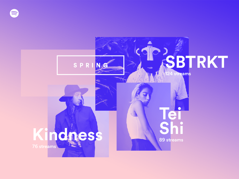
As well as gradiants, the oh-so-70s duotone is making a comeback. One look at Spotify’s iconic playlists will confirm this. Taking it a step further, 2019 is the year where old trends mash with the new. Exhibit A: the ‘duotone gradient’.
The continuing evolution of motion graphics
With the seemingly never-ending progression of a computer’s ability to better process and display web pages, motion graphics are more important than ever. Small animations on websites, digital ads or in app design instantly make these a more engaging experience for the user.
This year, there’s a real shift towards movement in typography, better known as Kinetic Typography. As designers, we’re taught not to stretch or distort letters, but I think sometimes rules are there to broken. Recently I have seen some incredible examples of typography being stretched, twisted, pixelated and rotated, but crucially, always with a purpose - to create engagement with the audience and take the design to the next level. An example of this is the rebranding of the media network ‘Basketball Forever’ designed by creative studio NotReal, focusing on the visual language circulating around the essence of each word ‘Basketball’ and ‘Forever’ resulting in themes of movement, continuity and speed that is seen in the way that the text has been animated.
Typography is stronger than ever
Sticking with typography, another gowing trend is the shift to bold typography. As seen earlier, it was a crucial design element used in the Basketball Forever Identity, being the main focal point. While this is very much a 2019 trend, Adidas have long been the kings of this, giving prominence to bold type across much of their marketing over the years. In addition to typography dominating print campaigns, it’s also cleverly used in video, as witnessed by the recent Honda Civic advert where the typographic elements interact with the car and mimic the style of the road markings.
Structured layouts are a thing of the past
With many designers over the years adhering to a rigid-grid based designs, companies have started to experiment away from this, playing with elements like typography, geometric shapes and images. Layouts are now starting to break free from predictable grids to create an asymmetrical layout. These new, unexpected – and at times, uncomfortable - layouts capture attention because they’re so different and unique from what we normally see. Last year at Pull we challenged this exact thought while developing concepts for a brochure for Schwarzkopf Professional. This project allowed us to really explore breaking the rules with grids, creating something that took us out of our comfort zone, yet delivering a dynamic, strong concept representing the interconnectivity of business and creativity, something important to our client. Surely this must prove that breaking free from predictable grids are a thing of the future, or at least for this year.
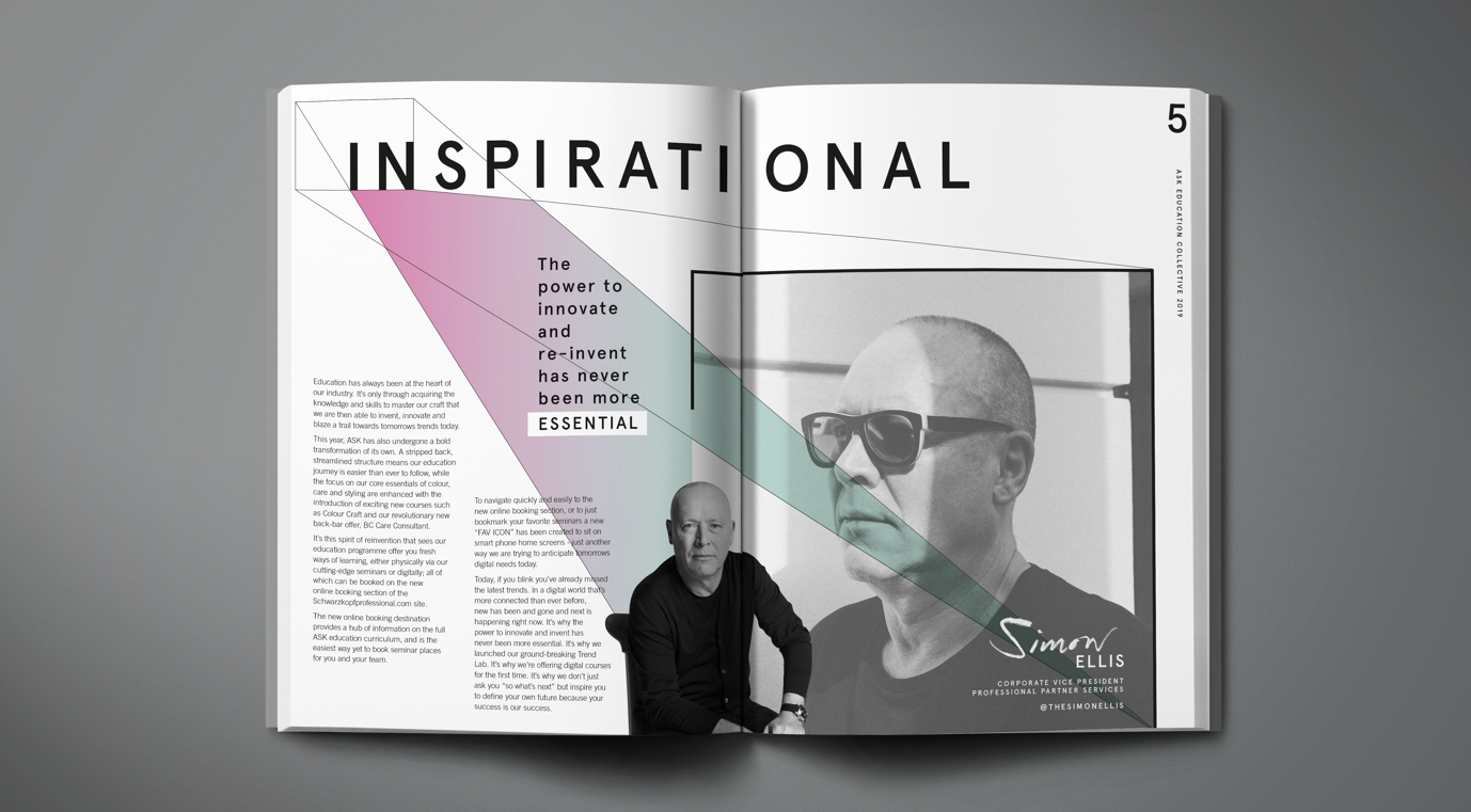
One final point on all of these trends. While I expect to see them dominate 2019, that doesn’t mean they’ll automatically be right for your brand or the latest client brief. In the case of Schwarzkopf’s ASK brochure that I mentioned earlier, gradients worked beautifully for the design language helping to represent the interconnectivity between business and creativity through the transition of colour, but maybe this wouldn’t be suitable for every client.
You only have to look at another of our clients, Andertons, to see what I mean. In this case the design language doesn’t use flat colours, instead utilising a range of dark textures capturing raw emotion and hard work helping to give a more authentic feel of real music and real spaces, something that wouldn’t have been so easily conveyed with a gradient device. You can’t simply adapt a trend to fit any brand.
Posted 18 January 2019