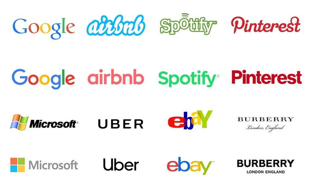
“Yet another logo in a character-less sans-serif font” is a frequently repeated phrase heard when we are looking at a new brand that has launched or a rebrand is revealed here in the studio at Pull.
What we’re referring to is the shift we’ve witnessed towards a sans-serif, typographic style logo across all industries and businesses, from the tech giants to the historic fashion houses, newly emerged start-ups, to the established corporate. Our Creative Director, Darren Cornwall, has some strong feelings about the ‘watering down’ of the visual brand identity that he has expressed about the new BT logo and how we are
one step away from binary and how it’s
time for brands to be brave! However, as this trend has swept the globe, I think that there must be something behind it for it to have become such a dominant trend across all sectors.
Minimalism, what is it and where has it come from? The dictionary definition of Minimalism is:
Minimalism (adjective) -
Belonging or relating to a style of art, design and theatre that uses the smallest range of materials and colours possible, and only very simple shapes or forms.
However, this definition is a little flat and hardly provides the full scope of the origins of the movement. Minimalism began in a post WWII era as a reaction against the strong visuals of Abstract Expressionism, which focused on self-denial and emotional intensity. This resulted in design that can be seen as chaotic, rebellious and spontaneous, think of a Jackson Pollock painting, that’s Abstract Expressionism!
Minimalism, in sharp contrast, looks at form, colour and space and reduces them in the pursuit of their essential nature. The philosophy goes, when one can’t remove anything else from the design to further improve it, Minimalism has been achieved. When it is looked at in this form, Minimalism is purely the process of removing excess.
A refined aesthetic is certainly nothing new, but in design it has definitely seen a resurgence over the past few years. Alongside Minimalism there are many other movements such as Bauhaus (A revolutionary German art school operating from 1919 – 1933). Bauhaus students focused on function over form, there is also the Swiss approach to design, which uses negative space to draw attention to the content, the Scandinavian aesthetic which promotes the beauty and simplicity of nature, and the Japanese principal of wabi-sabi which centres on the beauty in transience and imperfection. The common thread that runs through all of these movements is the removal of excess and the honing of simplicity.
And, if there is one way to define our current culture, it is one of excess. Consumerism is huge, each one of us will possess millions of items in our lives, we are connected to more people than ever due to the wonders of technology, obesity is on the rise as we can get our cravings delivered to us without even leaving the house, we share every component of our daily lives (cue instagrammable food photo – we’ve all done it…), the list can go on and on! With all of this bombardment and the problems it is creating, is it any surprise that we, and particularly the Millennial and Gen-Z generations to which I belong, are engaging with brands that are promoting a simpler aesthetic in the hope that it reflects the values of the brand?
So with trust in brands having
fallen further over the past year than in recorded history. I find it unsurprising that brands are leaning on their visual identities to help to rebuild consumer trust! With 63% of people agreeing with this statement:
“A good reputation may get me to try a product – but unless I come to trust the company behind the product I will soon stop buying it, regardless of its reputation.”
– Edelman Trust Barometer Global Report
It is a logical move for brands to use every weapon in their arsenal to try to build consumer trust, with their visual identity being a key tool.
A brand that truly embodies the ideals of Minimalism in the core company values that the business is built upon, to the visual identity and messaging is The Ordinary. This upstart brand disrupted the stagnating beauty arena of deceitful marketing messages, lack of integrity and huge profit mark-ups with its honest, ridiculously low-priced, science-based formulations.
The Ordinary is a largely online retailer, is only marketed through its social media channels, but has achieved astronomical growth by being completely transparent about their products, pricing and values. This is demonstrated time and again in the visual identity of the brand, their Minimalist and science-based aesthetic and strict avoidance of model imagery has built them a cult following of consumers who cannot stop raving about the brand. Packaging is as refined as possible, retail spaces clinical and photography makes the product the hero while beautifully introducing the ingredients, an embodiment of minimalism.
However, this is one example of a brand where it is wholly appropriate to their brand mission to embody the features of Minimalism as it is true to the values of who they are. There are many other beauty brands who don’t have values that lend themselves to this visual style who are still trying to emulate it, why are they doing this? Do they see the success of beauty brands who are holding strict values such as no animal cruelty, pure ingredients, transparency and are imitating the design style of these in an attempt to accrue the same following without committing to the philosophy of the design? Are they recognising a visual trend and attempting to ride the same wave? Or do they see a simple design as a quick win, with less thought and effort applied to it?
It is the brands who are attempting to use this refined approach that visually promises transparency and honesty, but fall down when closer examined, that erodes consumer trust. In these cases, I completely support the view that Minimalism is not for every brand! But should the brands who initiated the move towards Minimalism and have executed it well, be smeared with the same brush because there has been some poor adoption and imitations by brands who don’t have a cohesive approach to their brand strategy?
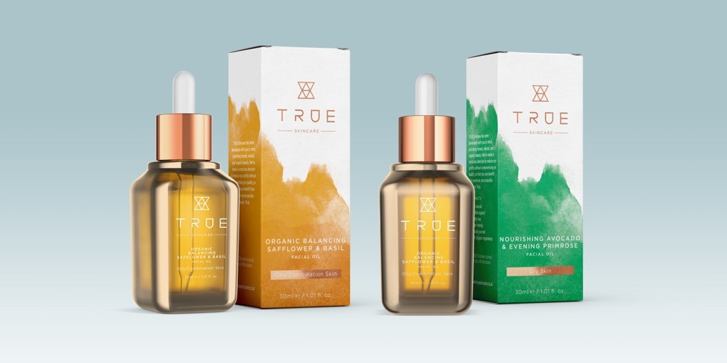
We were approached to create the brand identity by a company called TRUE, they create a range of organic skincare products to help with individual skin problems. They are certified organic and cruelty free. Our approach to the branding work was to explore what ‘true’ means in a natural sense and this led us to the four elements and how they have been visualised over time. Our designer Sophie Awcock took this approach and refined the symbolism of the elements to form a logo that has meaning and character but also holds true to the principles of Minimalism.


Some of the biggest adopters of the Minimalism trend have been the tech giants, such as Google, Uber and Spotify. When these brands have been debated, the arguments for the movement towards a sans-serif logotype tend to centre around the legibility and responsiveness of these digital brands and how well they perform on a range of screens and sizes.
However, I think the more compelling argument for the simplification and similarities between these logos is that they are styled to look more and more like a word, rather than a name. This draws them closer to becoming a verb, and distances them from remaining a noun. This allows them an easier transition to the voice enabled technologies that are becoming a larger feature of our lives. Google, the original success story of a company name becoming a verb (“just Google it”), is just the beginning. This is happening for the other brands as well; I frequently catch myself saying “we’ll Uber there”. It’s hard to measure how much the generic styling of these names contributes to how we interact with them and ultimately end up using them in our day to day lives. But the argument is made particularly compelling by widespread similarities in the visual styles of these large tech companies that have become an integral part of our everyday existence all adopting an incredibly similar sans-serif appearance.

To conclude, the global trend towards a minimal logo and visual aesthetic has been widely adopted across a range of sectors. I think this is driven by a number of factors, a push against the consumerist culture of today, a need for honesty and transparency from brands we interact with, an increasing awareness of the importance of the ethics and values of a company and, in some cases, a change driven by technological developments to change what a brand is and how it is recognised
The brands that have embraced these values and have recognised Minimalism as the design philosophy that truly communicates their offering are the ones that communicate the most successfully. Of course, there are many examples of brands recognising a design trend and then try to retro-fit it to work for them, these are the ones who are creating a bad name for this trend. The ones who have no substance behind the pretty, refined visuals they share and promote but don’t embody. As always, the visual style of a brand should be a pure communication of who they are and anything less than that results in a weak brand that can be easily torn apart by the critics of the world.
Posted 10 July 2019 by